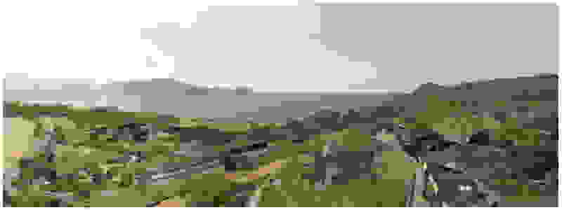
Having adopted the architectural language of modernism as shaped by Nikos Valsamakis and Mies van der Rohe, Mplusm focus on how this language can generate meaning: on the one hand, how space can become a montage of bodily experiences — a cinematic narrative — and on the other, how it can embody illusions and optical deceptions — materials that resemble others, reflections, mystery, blurring, and spatial ambiguity.

In front of the past, overlooking the future
The Laurel Leaf Garland
Quarry House
Present and Future tense
Brick House
Dummy Project
Building the Sky
Trencadis
Hideaway Pool Suites, Canaves Oia Epitome
Works
In front of the past, overlooking the future

The monumental lineup here is impressive: the National Technical University (1862-1878) by Lysandros Kaftantzoglou directly across the street and the Archeological Museum (1866-1889) by Ludwig Lange / Ernst Ziller on the left. As if this frontal staging of neoclassical architecture was not enough, the Lycabettus hill’s curved outline looms at the background, the ultimate Athenian landmark, reminiscent of the Sugarloaf Mountain in Rio de Janeiro. Both the Museum and the University partake in a similar architectural agenda: a layering of marble colonnades in front of terracotta walls, a dialogue enriched by the greenery in the open spaces at the foreground. The apartment on the seventh floor overlooks these historical landmarks and its renovation reassembles deep colors with white walls. Responding to the large terrace, we chose to enlarge all windows, selecting a warm grey for the exterior facades, walls painted white in the interior.


Early on we noticed the clients’ deep understanding of Italian and Scandinavian design. This was not only impressive, it also led to a certain reversal of the typical design development: at the very outset the collection of furniture was almost complete and we were meant to design the house around them. Thus, the color of the interior walls became a subject of discussion: were we to emulate a white gallery setting or could we introduce colors to match different textures? The renovation eventually combines both approaches -the very articulation of spaces seemed to favor it: the formation of two boxes, one for the kitchen and one for the dressing closet are underlined by the bold use of color. The first box is the kitchen, lined with Rimadesio sliding glass doors it is finished with Karnazeiko marble (from Argolida, Peloponnese) and frames a view towards the sprawling apartment buildings towards Acropolis. This box is replicated by the lacquered volume housing a small library. It is concealed behind a sliding panel that replicates as a door leading to the bedrooms.


After this door follows the corridor lined with black and white prints and painted terracotta. This color looks as if it relates to the monumental neoclassical buildings across the street -in reality it was selected as the perfect match to the terrazzo floor of the entry hall. Marble does reappear in the master bath -here Oasis Green (from Tinos), so as to match the wooden finish at part of the interior. We think this renovation achieved a quite unique balance between vintage furniture (escaping easy attribution from contemporary production brands), along with Greek marble surfaces (their inclusion to such a large percent within the interior finishes, started to remind us of Milanese interiors, a familiar environment for the clients themselves).

The Laurel Leaf Garland

In contrast to our recent renovation of the three-story monument by Ziller (Monument Hotel), this project, across the same square in Psiri neighborhood, has a different agenda: The two houses on Agiou Dimitriou Street feature a listed façade and can be extended upwards. Apart from the expected stepped section of the addition (result of the sky exposure plane), the main question was what will be the character of the new facade, visible from the adjacent square of Agios Dimitrios church. How it will stand out as new and at the same time maintain some connection with the lower part. Robin Standefer and Stephen Alesch allude to this search for the “unique yet familiar.” In terms of similarity, the role of proportions remained for us important: that the new openings would be oblong, vertical, like the neoclassical ones immediately bellow. In their rhythmic repetition, there was no point in aligning new and old openings -the windows in the two adjoined neoclassical buildings of the base had their own rhythms and due to the setbacks of the extension, any alignment would never be perceived.


For the inspiration from the listed façade, we focused on its details. Indeed, something unique has initially escaped our attention: a garland of laurel leaves was repeated three times above its windows. Initially when we singled out this decorative element as a starting point to form a new facade texture, we did not realize the quiet coexistence of this small detail within architecture. But then, gradually, we began to recognize it in other places as well: carved on a marble lintel on Prassa Street or in a plaster version of it, on the axis of a façade on Patision Street, opposite the Polytechnic University. These had become simplified, flat versions of the laurel band which used to decorative primarily semicircular mouldings: the torus at the base of a column as applied to Trajan’s column or the extensive golden mouldings on the frames of the vaults designed by the architect E. M. Barry in National Gallery in London.


In our renovation, the bay leaf garland is enlarged and expanded to emulate a surface with a fish-scale structure: the new facades are to be formed of semicircular ceramic tiles, similar to those used by architect Eli Modiano on the excellent roof (a Mansart type with minimal deviation from the vertical, interrupted only by circular skylights) of the old customs offices in the port of Thessaloniki. The decorative detail of the listed building and the scaly “armor” of the new facade partake into a new dialogue, the latter in the tones of the light-colored terracotta, forming a kind of new vertical “roof” where the only actual slope is to be witnessed in the lintels themselves: they meet the parapet at an angle, emphasizing the vertical proportions of the openings and bring the thickness of the wall to a sharp edge.


In the internal layout of the hotel, we kept the impressive wooden staircase that connects the ground floor to the first floor. And we even created an identical one in the same place for the descent to the basement. A new vertical staircase and elevator core is placed at the rear of the building to serve all levels. We also maintained a skylight in the separating wall so that the hall to the rooms retains natural light on each level.

Quarry House

The similarity here with the marble quarry is not literal, in terms of the material itself -this particular residence may have followed the design of the Garden House in P. Psychiko, but marble finishes have not been chosen for the facades. On the contrary, the relationship with stone quarrying refers to the process of extracting volumes, since indeed behind the absolutely monolithic facade two large “blocks” have been removed to a depth of four meters. These voids form two gardens, one visible on the ground floor opposite the entrance and the second elevated, visible exclusively from the master bath on the first floor. A common feature of both gardens is the fact that they are both walled-in, like vases within the residence. These “secret gardens” manage to be completely invisible from the street, as the first floor spans its opaque and undisturbed façade hovering above the fence. In this way, the master bath manages paradoxically, to be completely transparent on both sides and, at the same time, completely invisible to visitors and neighbors. The house is divided into rectangular spaces between which, on the ground floor, diagonal relationships are created: From the entry of the house, the first garden “deflects” our movement and gaze diagonally, in a view that ends at the pool. A similar reverse diagonal relationship exists between the living room and the dining room, the latter being the only space in the house that protrudes into the garden.


Above the first floor, which opens to the east and the garden, there is a smaller second floor, designed as a penthouse, containing the office and a guest room. A change of architectural vocabulary was here required, one enabled by the volume’s setback, as well as its cladding with metal panels. This penthouse is topping the wider first floor which is clad in a texture that reminds of quarries, of the mining process: with their grooves visible, a series of molded GRC concrete panels will be using gravel from the excavation. Standing occasionally on the edges of site excavations, we had already recognized the special beauty of the pink and beige rocks of this Athenian suburb. We wanted the return of the overlooked and discarded, this time celebrated, dignified, showcased on the elevation, restoring on a minute scale the identity of Filothei.


As part of this initial presentation, we did include our first renderings: on the interior design they witness echoes of the Case Study Houses, the series of houses built in Los Angeles in the 1960s. At first, this seemed a natural response when we found out that the owner grew up in an iconic house built in 1963: an emblematic architectural project on the Saronic Gulf that distilled principles of celebrated American modernism such as extensive glazing and large cantilevers. Indeed, the aesthetics of the 1960s proved to be common ground with the owners of the Quarry House -and although we will discontinue exposing the internal beams (a trademark within the architectural vocabulary of the 60s era), we realized that a new attraction was growing, this time to another iconic work of 1963: the Yale School of Architecture in New Haven, an emblematic work of brutalism with its bush-hammered concrete facades that exposed their aggregates.

Present and Future tense

It is relatively rare that a project is planned from the beginning to be done in two phases. Usually, the proposals deal with a building in its entirety, considering that this overall composition will be the one to be built all at once. In our case, for a plot of land in Kifissia, the request was to build initially a single-storey house and, in the future, with a delay of a few years, to make it possible to expand in height. With this logic, one had to plan the whole project and the first, smaller phase of the private residence should be equally studied.

The particularity of this gradual construction made us pursue two different routes. Will the before and after be different or homogeneous? That is, will the double construction phase be showcased in the end or not? The first solution considered that the first phase would be a single-storey villa and the future phase would be visible higher up as a series of enclosed “towers”. The reasoning was not only to preserve a privacy of the ground floor residence of the client from the apartments of the superstructure. It was also desired to achieve a contrast between an architecture of large openings and horizontality with a volume of vertical masses that channel light through interior voids. There has been an ambivalence for the inspiration -whether our scheme was referring to SANAA’s 21st Century Museum of Contemporary Art (Kanazawa, 2004, a huge circle featuring tower-like structures on top) or to the familiar, rooftop structures at Athenian apartment buildings (usually visible only from higher floors, a surreal lineage of an “invisible” small-scale architecture that escapes all categorization and contrasts with the disciplined, repetitive configuration of all lower floors). Our second proposal preserves a homogeneity between all the floors but instead of the usual parallel offset of their contours, it attempts to articulate different overlapping shapes: The three floors may thus proceed from the largest to the smallest but their very contours do not obey any legible rule. Equally they choose every time -as in a collage – to withdraw in other directions and in other outlines, so that the building seems to be created by joining points in space. However, the basic principle of this solution was to maintain a series of trees on the western side of the plot and highlight them through the mediation of the largest swimming pool that would fit within the plot.

Brick House

The two brothers that commissioned this project, during our first meeting, mentioned in passing Frank Lloyd Wright. The project they had in mind was a house in Nevada completed last year by Studio G, bearing a faint resemblance to the Prairie houses by Wright. In the days that followed, we singled out Wright’s Robie House in Chicago, built in 1910, when the architect was 43 years old and Frederick Robie, the client, was only a 24 years old businessman. This constitutes an iconic project because it clearly articulated the vocabulary of horizontal cantilevers that proved decisive both for the work of the great American architect (as in his famous Fallingwater House completed in 1935) as well as for a whole lineage of creators from Richard Neutra (in the ‘50s and ’60s), to contemporary works by Brazilians Marcio Kogan, Bernardes Arquitetura and Jacobsen Arquitetura. Robie House was structurally innovative in its use of metal beams to bridge large spans and it used predominantly brick, a material that reappears in two important proposals by Mies van der Rohe: in the monolithic sculptural Monument to Rosa Luxemburg (1926) and in the unrealized Brick House (1923). While both of these last projects survive through their black and white representations (photographs or drawings), we wanted for our clients to reestablish the warmth and horizontality of brick. Our proposal for this duplex has eschewed repetitive balconies at the perimeter (the trademarks of the Polykatoikia, the omnipresent Athenian apartment building). The narrow façade of our building, due to its monolithic massing, achieves an ambiguity of scale as well as visual privacy from the two adjacent apartment buildings -the owners requested this early on, since those are the only tall buildings in the neighborhood, while the rest remain one and two-story houses. At the terrace of the new penthouse, we placed a jacuzzi, so as to mirror the living room’s fireplace, one featuring a glass back.

Canaves Villa

We reach this villa by climbing steps from the side. They lead to the edge of the trapezoidal pool. The surface of the water itself becomes the main space of the rooms, the area of gathering, living, contemplating the view of the sunset above the planted roofs. A sunken seating area, a platform at water level, a pergola and a semi-outdoor space organize different functional zones in this area. From this submerged in the steep slope dwelling, the swimming pool stands out as the only prominent element, free on all three sides. The rooms are characterized by their vaulted interiors and, externally, the exclusive use of local volcanic stone. They remain bright and airy as, apart from their facade, they are also organized around a backyard. The interior design by MEMNEO architecture upgrades the spaces with beautiful selections of material and furniture, “weaving a narrative between the rugged beauty of its location and the practicalities of sculpting an innovative home, creating a space that embraces a profound sense of coexistence within the landscape” as they mention.

Dummy Project

The project they had in mind was a house in Nevada completed last year by Studio G, bearing a faint resemblance to the Prairie houses by Wright. In the days that followed, we singled out Wright’s Robie House in Chicago, built in 1910, when the architect was 43 years old and Frederick Robie, the client, was only a 24 years old businessman.
This constitutes an iconic project because it clearly articulated the vocabulary of horizontal cantilevers that proved decisive both for the work of the great American architect (as in his famous Fallingwater House completed in 1935) as well as for a whole lineage of creators from Richard Neutra (in the ‘50s and ’60s), to contemporary works by Brazilians Marcio Kogan, Bernardes Arquitetura and Jacobsen Arquitetura. Robie House was structurally innovative in its use of metal beams to bridge large spans and it used predominantly brick, a material that reappears in two important proposals by Mies van der Rohe: in the monolithic sculptural Monument to Rosa Luxemburg (1926) and in the unrealized Brick House (1923). While both of these last projects survive through their black and white representations (photographs or drawings), we wanted for our clients to reestablish the warmth and horizontality of brick.
Our proposal for this duplex has eschewed repetitive balconies at the perimeter (the trademarks of the Polykatoikia, the omnipresent Athenian apartment building). The narrow façade of our building, due to its monolithic massing, achieves an ambiguity of scale as well as visual privacy from the two adjacent apartment buildings -the owners requested this early on, since those are the only tall buildings in the neighborhood, while the rest remain one and two-story houses. At the terrace of the new penthouse, we placed a jacuzzi, so as to mirror the living room’s fireplace, one featuring a glass back.

Building the Sky

When designing this new visitor center, we wanted to keep as a starting point both the raw materials used by the company and the journey itself until the visitor’s arrival. Coming from the airport of Thessaloniki, the route through this particular open landscape -in a way part of the visit itself- has a special value: it offers a distant view of mountains whose foothills seem not to “rest’ on the intervening fertile green plains. The mountains seem to hover midair — an illusion caused by the dew at the horizon line, a gradation of tones worthy of the Japanese woodblock tradition Ukiyo-e.


As interesting as the landscape is, so is the dominant material that is transformed in the company’s facilities: flat and bent metal sheets are the raw materials of the whole manufacturing process, making us select the same material in the new building. The way in which landscape and metals inspire this architectural design is largely determined by the material processes employed in the company: organizing, painting, bracing, cutting, drilling, checking, securing. The new roof by analogy is formed by bent metal surfaces able to refract light, covered by a glass roof –their metal texture allows a gradation of light towards the perimeter. Having been oriented on the East-West axis, the bent sheets filter the glare of the setting sun, letting its low rays warm the edges of the roof with color.


Corresponding to the landscape that we traversed prior to arrival, the new visitor center seems to float: this is helped by the formation of its perimeter with cantilevers that visually separate the visitor center on the first floor from the work area on the ground floor. Having entered through the axial access to the first floor, the distant view to the mountains is framed by an expanse of shallow water. This water reflects ripples of light to the ceiling, marking the movement of the sun. To our right, the space is organized into three zones: The first consists of a lounge with two islands of furniture. A second zone is formed by a linear counter with the possibility of serving coffee and light refreshments -next to it planters create protected areas. The third zone is formed by the meeting and video area -a wall covered with woven metal forms n outer limit, offering the possibility of isolation with sliding walls. The above functions constitute areas within the otherwise uniform space of the upper floor, where the omnipresent roof of bent sheets flows uninterrupted overhead. In the same logic, the smaller closed spaces have a ceiling lower than the total free height – there is a kitchen for preparing light meals, toilets and an office space. On the left, departing from the first floor, a second ladder suspended by cables connects us to the ground floor. To its opposite, climbing plants descend, accentuating the open two-story space –glimpses to the ground floor workspace are possible through a skylight to our right. At the footprint of the staircase, a water pond accentuates the hovering staircase. The ground floor is a sheltered workspace, with offices strategically placed on the perimeter near the entrance and surrounded by metal panels interspersed with perforated elements to filter natural light.


The new visitor building a “new sky” is constructed. Graded colors, metallic textures and the experience of the upper floor as a green “floating” platform, makes the new building preserve memories of the landscape we crossed by road as visitors –the reading of the landscape and the company itself provide here the elements of the architectural inspiration.

Trencadis

Landscape

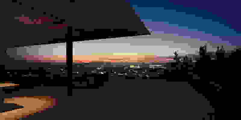
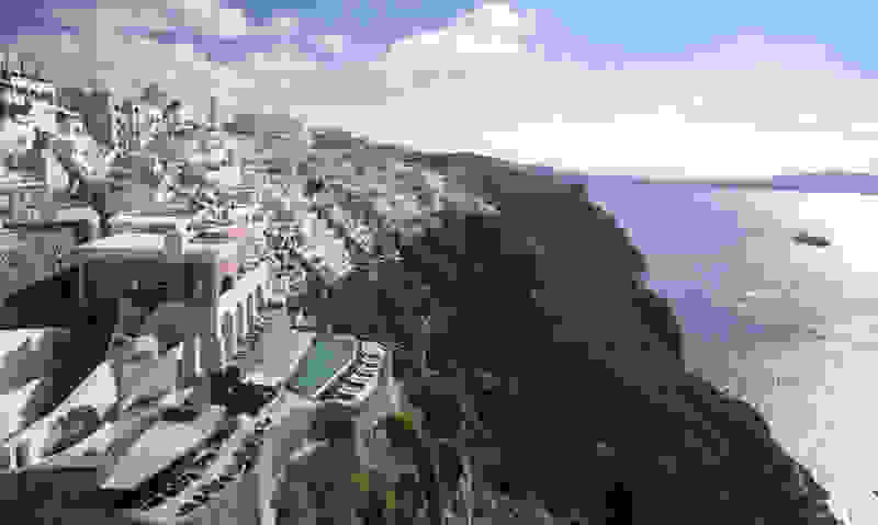
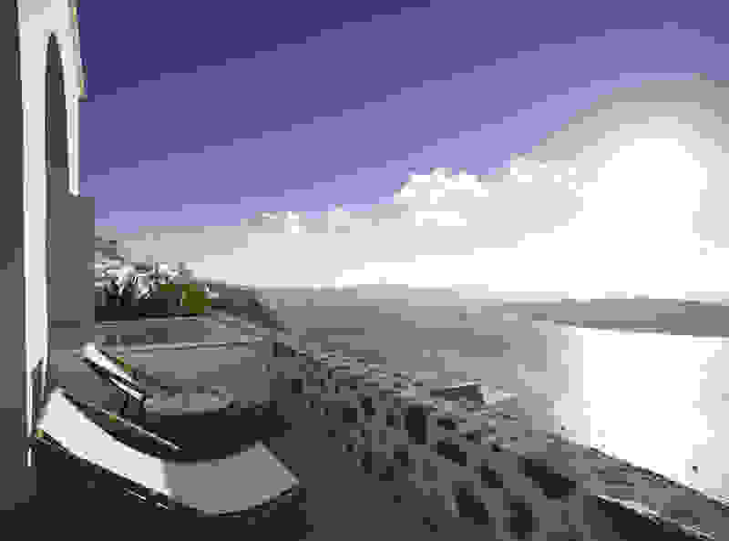
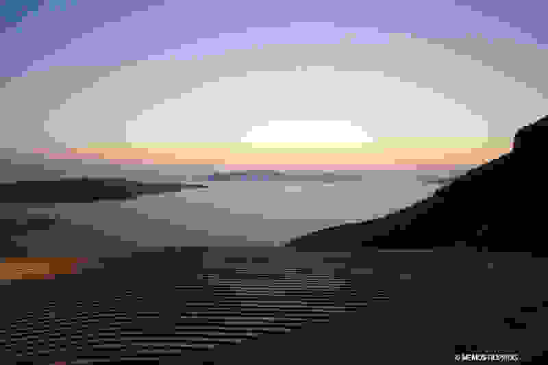
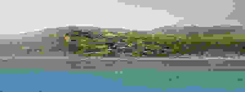
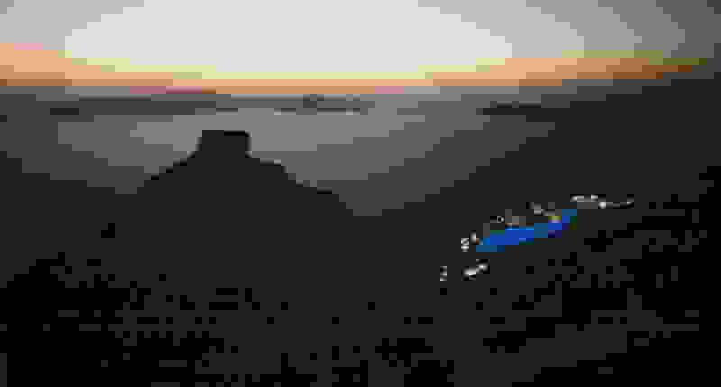
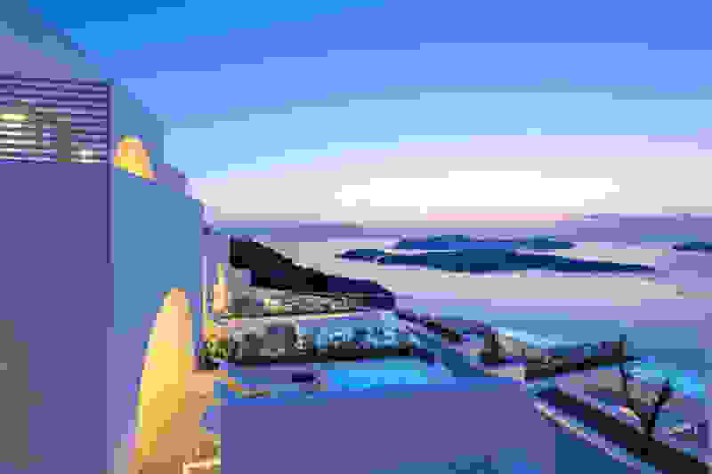
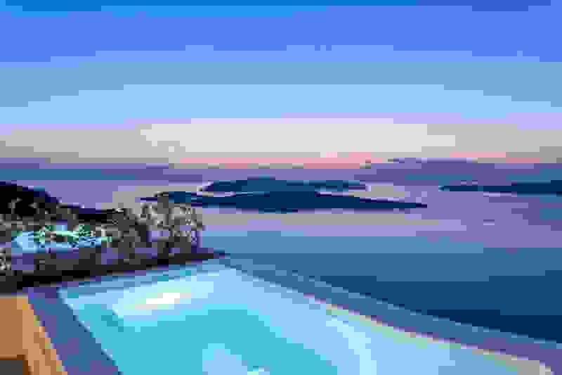
In Milos Bay, the island folds inwards, seemingly forming a lake -from there the view of Adamas and the surrounding villages is unique.

Achivadolimni, the largest beach on the island with white sand and shallow waters, is located at the southernmost point of this gulf. It took its name from the lake next to the beach which is full of hard clams.

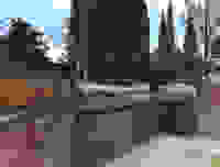
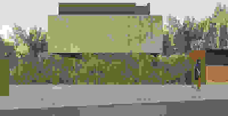
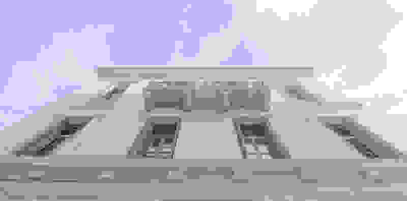
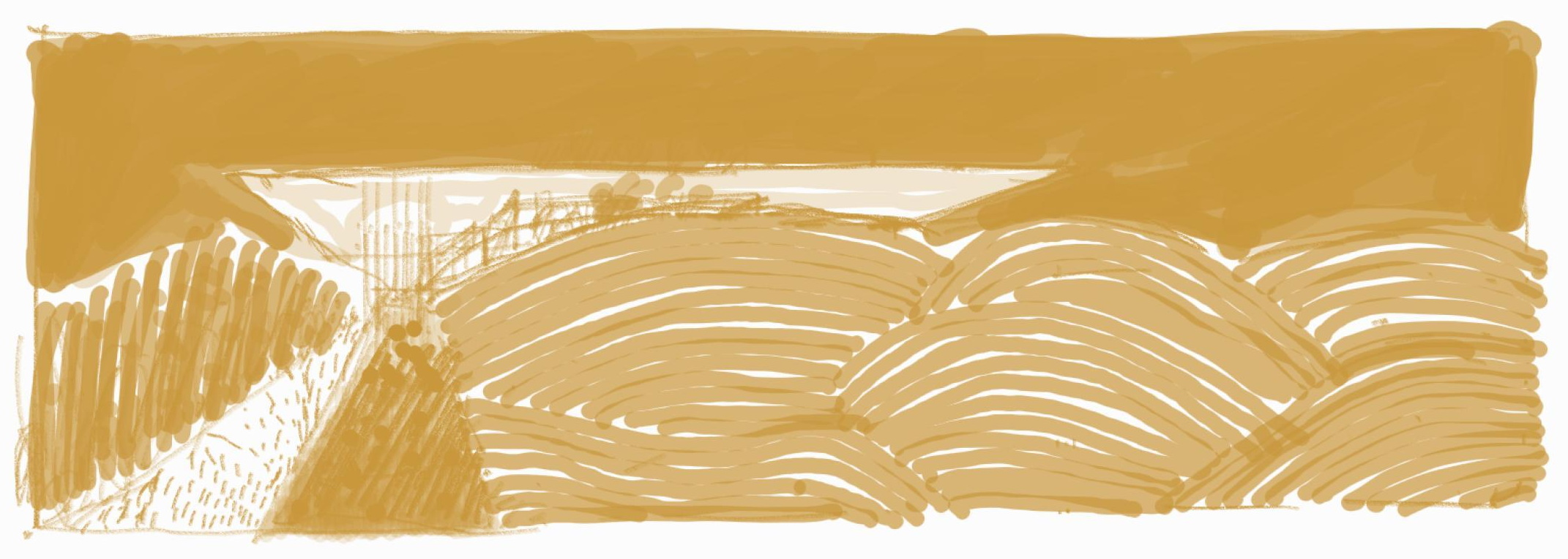
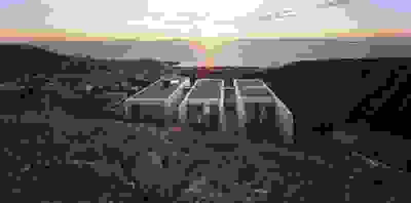
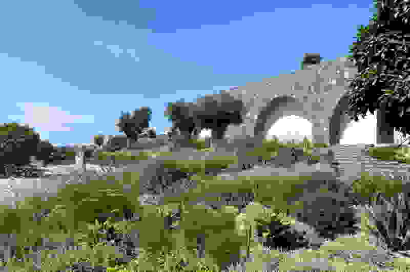
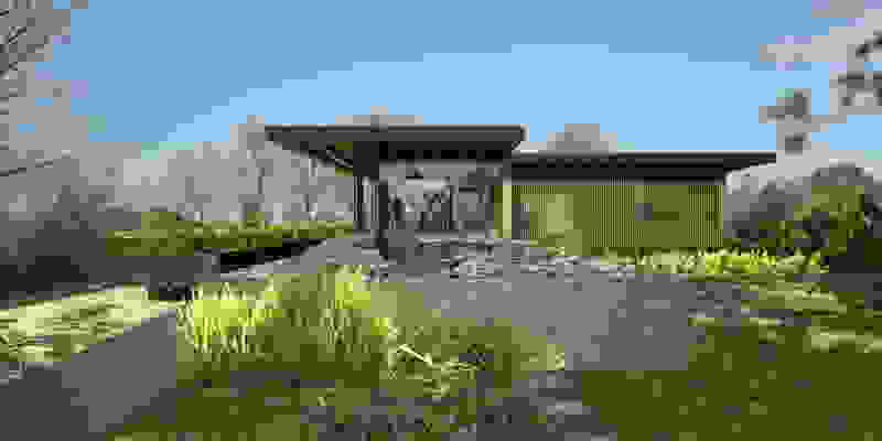
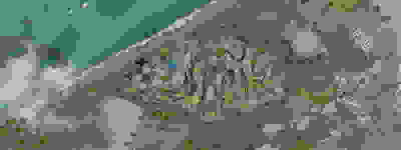
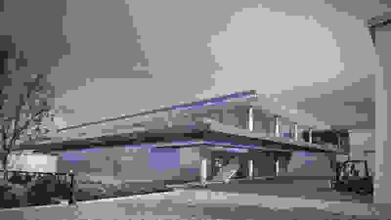
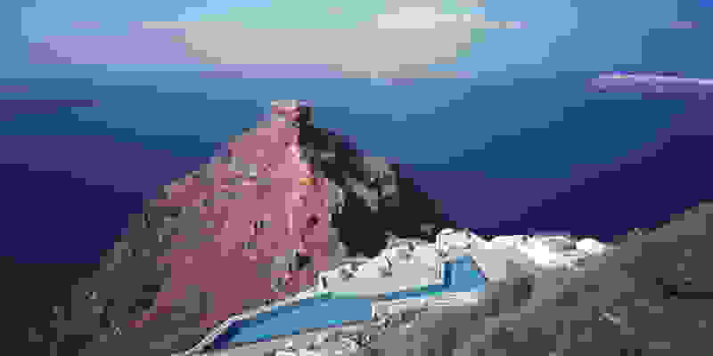
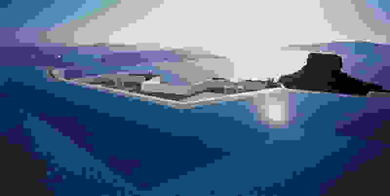
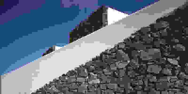
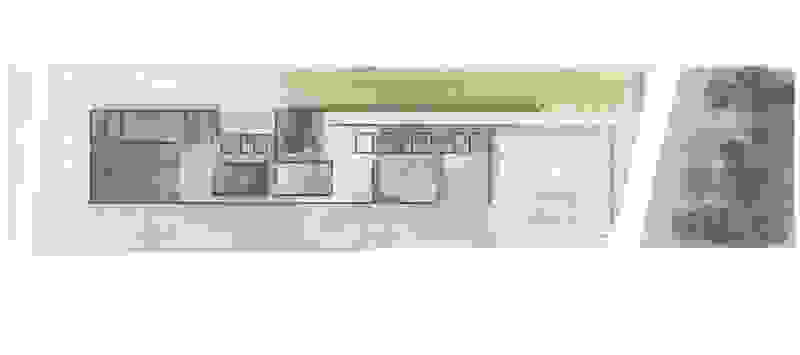
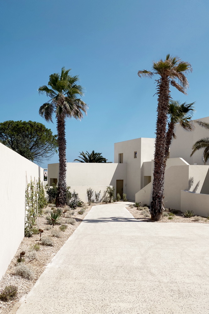
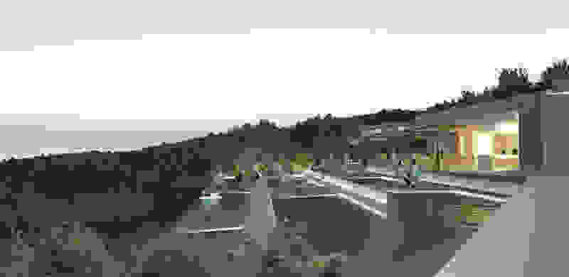
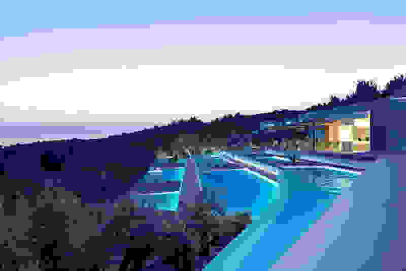
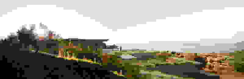
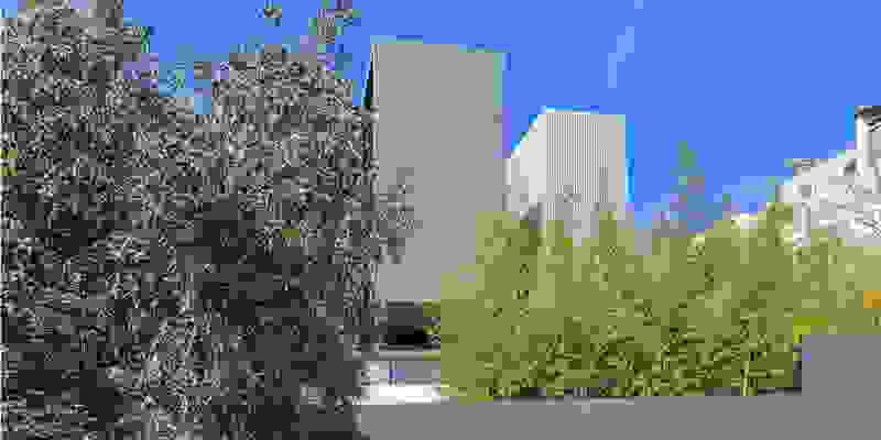
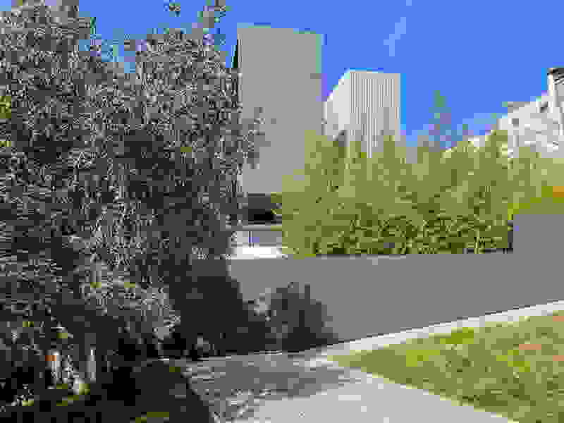
The plot of the Trencadís Hotel, with an area of 80 acres, is located two kilometers away from the island’s airport and culminates at the beach of Achivadolimni. The area was being operated by S&B company from 1954 to 1982 as a perlite mine, thus acquiring an amphitheater form. Today with its stepped section planted, fully integrated into the landscape, it has become an exemplar of restoration in the history of mines.

Simulation

 ‘‘Landscapes and places store memories, they save traces of lives long gone. What fascinates

me about those traces is that they are real, they are unique, they are always authentic. To me, landscapes are historical documents.’’

 (A Feeling of History, Peter Zumthor, Mari Lending, Scheidegger & Spiess, 2018)

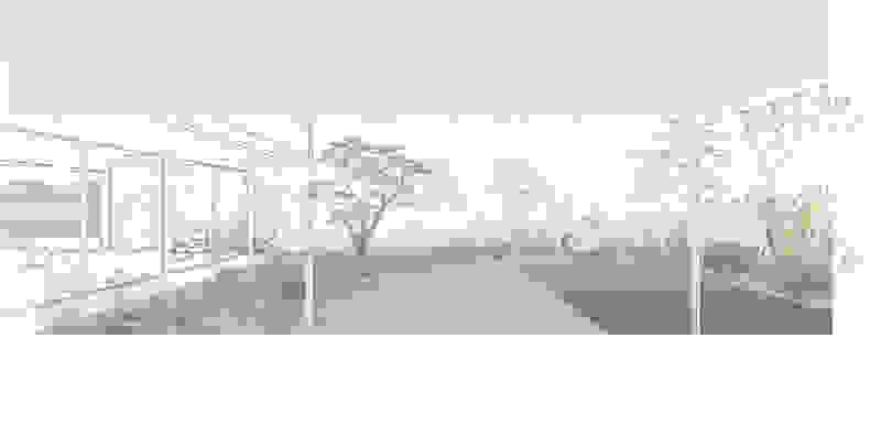
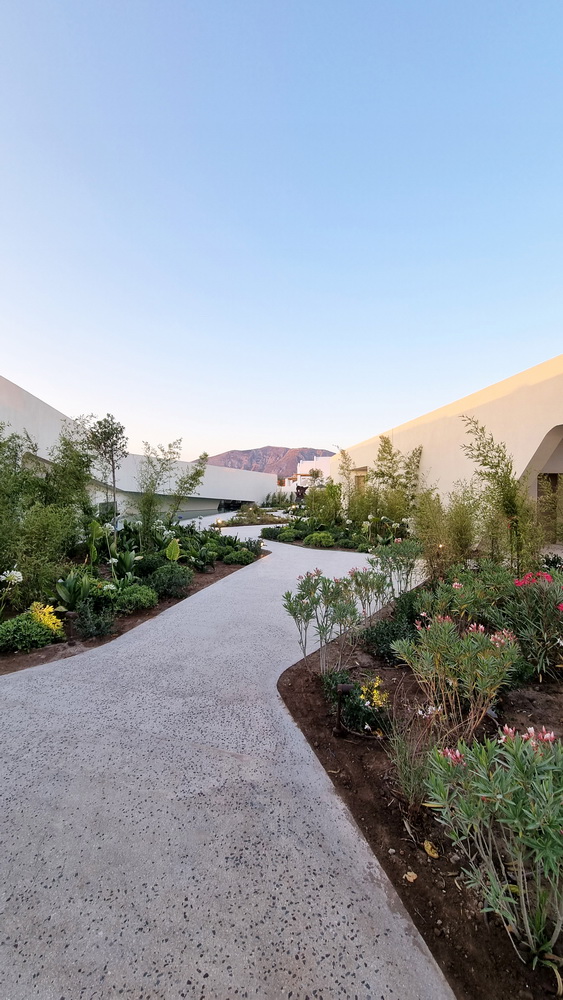
A design reconstruction is attempted here, which withdraws elements from the Cycladic landscape and uses objects such as rocks, trees, sea and semantic tools such as outdoor life, the small-scale approach and what constitutes the image we have of the Mediterranean rural landscape. The densely organized area of Milos, full of berms, vegetation and manmade interventions used for agriculture and husbandry, is used as a ground rule for the organization of the proposal. While the way of organizing a residential proposal has traditionally been the grid, here the principle is the messy and natural landscape of the Cyclades.

The ground rule is rewritten in order to receive uses such as hotel rooms, public areas and outdoor areas. The proposal starts from the architecture of the landscape, instead of integrating it as usual, much later, in the design process. The basic principle is the construction of randomness and the incorporation of the overall proposal to the Cycladic landscape.

The contours and geometries of the landscape of Milos, but also the way in which human activity is organized on the island, are shifted and adapted to the scale of the area, composing an outdoor carpet, consisted of private and public uses.

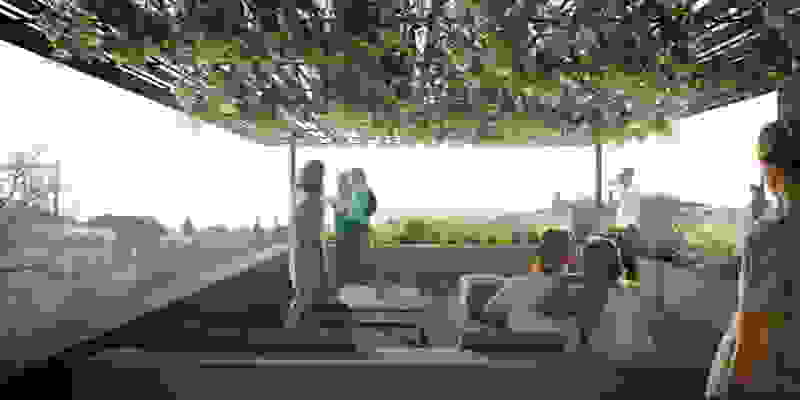
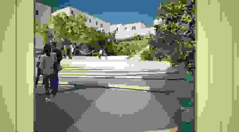
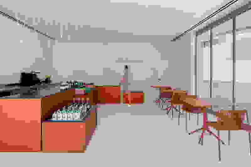
The expansion of the standard program of a hotel is attempted here, including functions such as the public square, the threshing floor, the vineyard, the quarry, in order to compose a multi-layered landscape that is part of the organization of the surrounding area and attempts to bring back memories and build new ones.

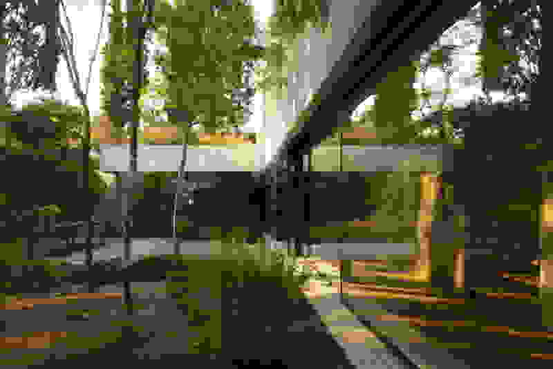
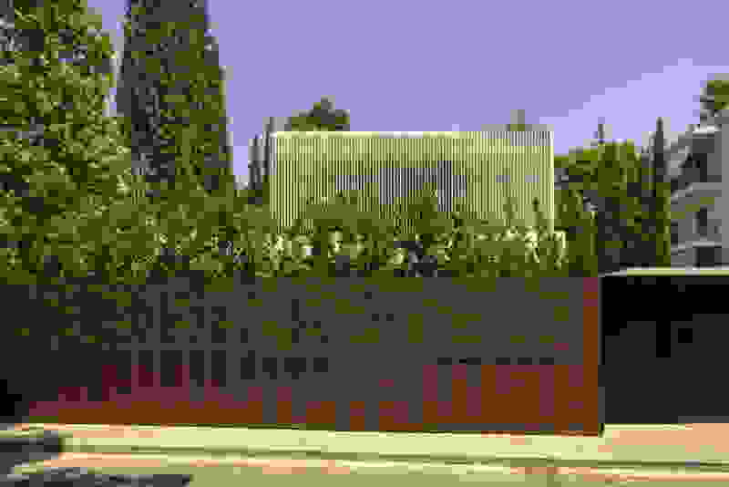
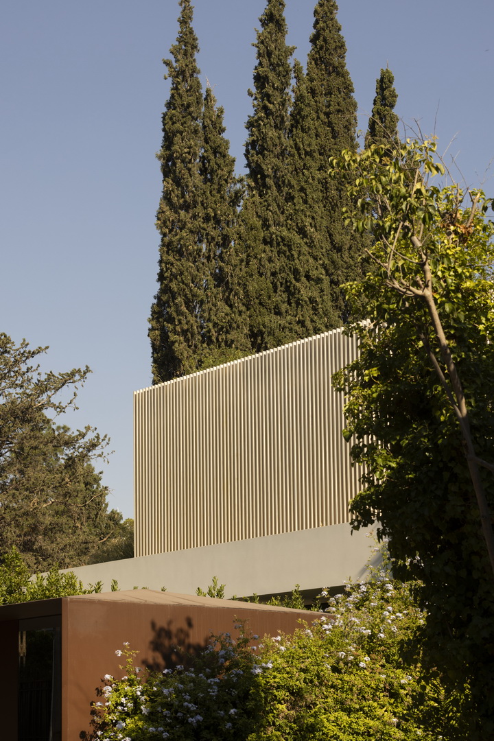
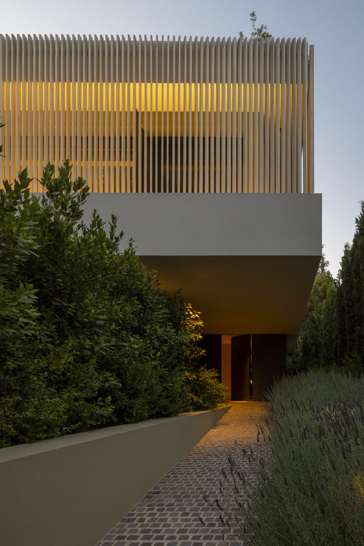
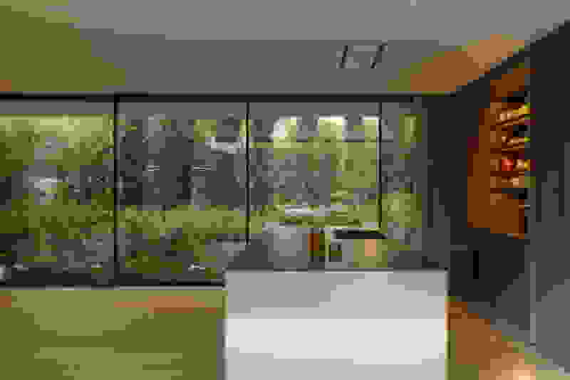
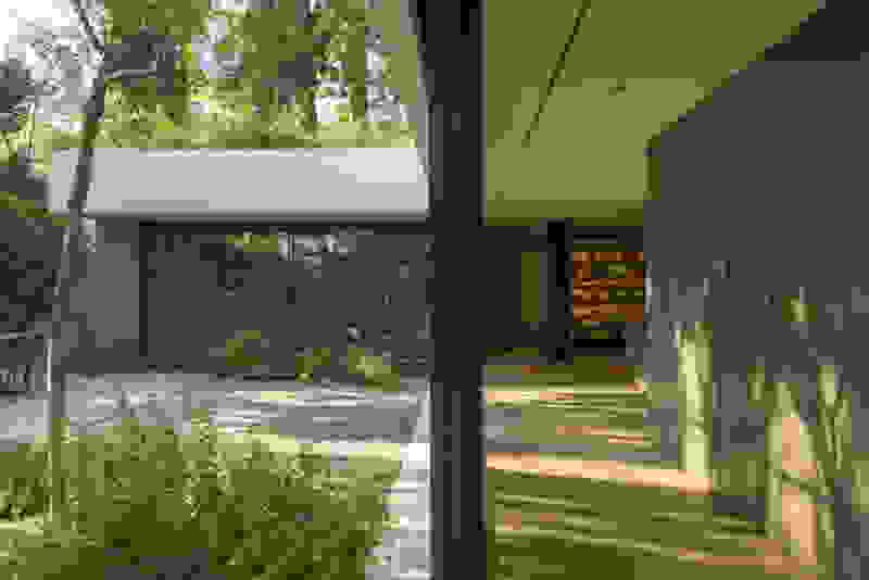
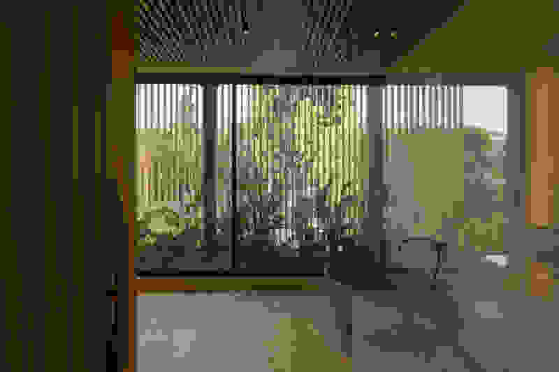
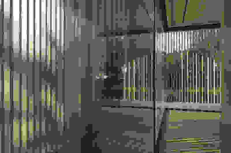
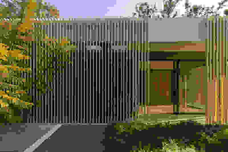
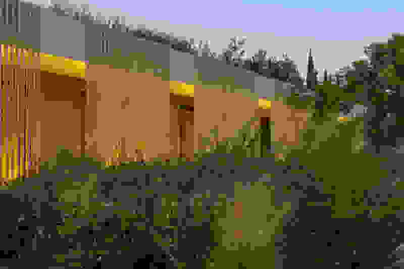
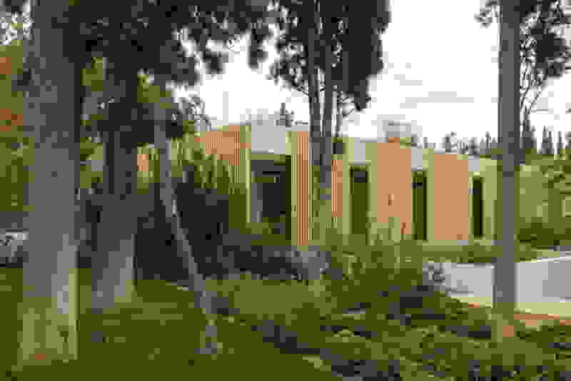
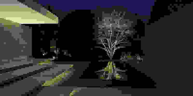
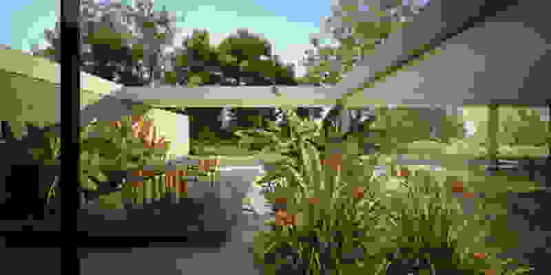
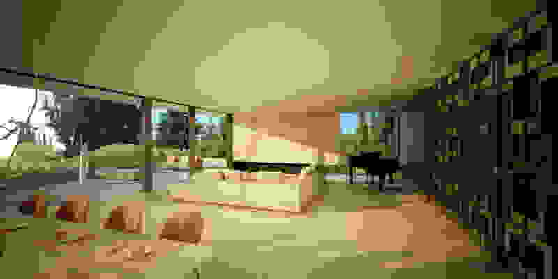
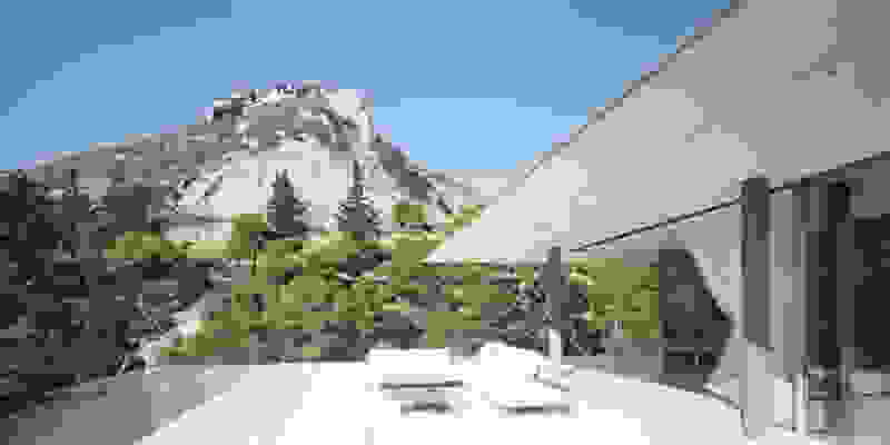
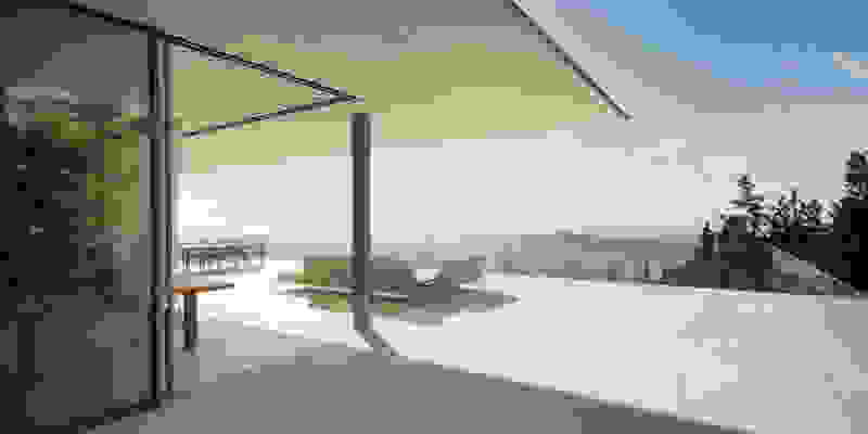
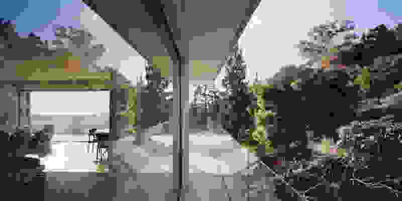
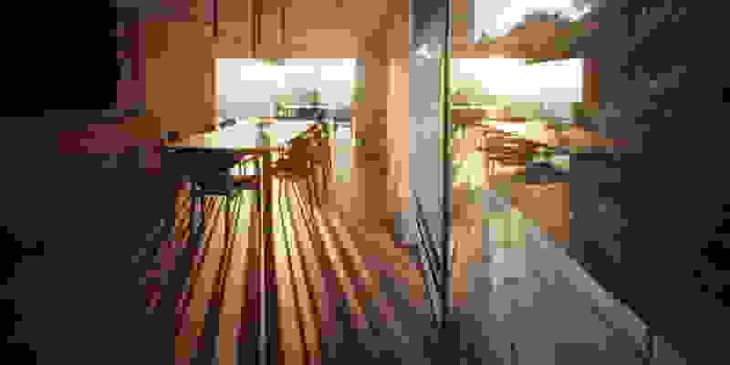
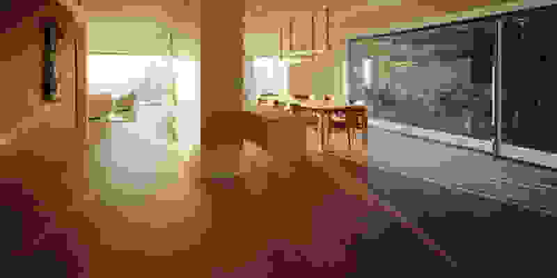
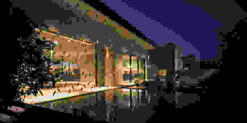
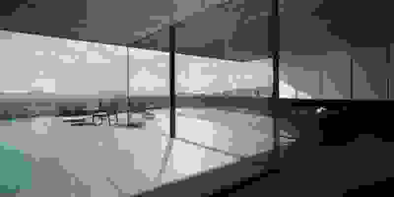
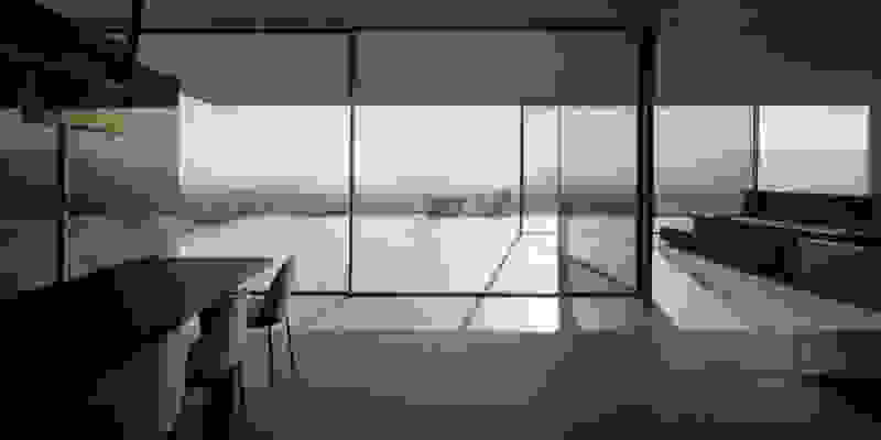
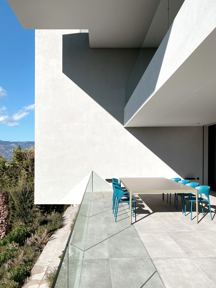
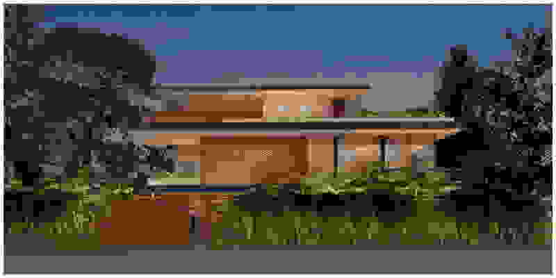
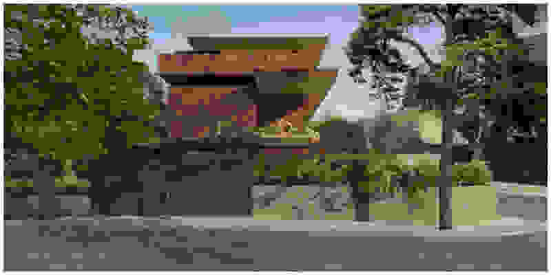
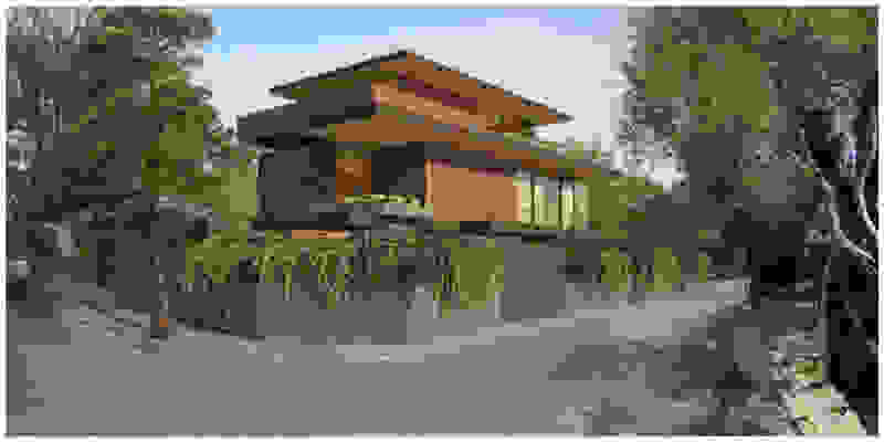
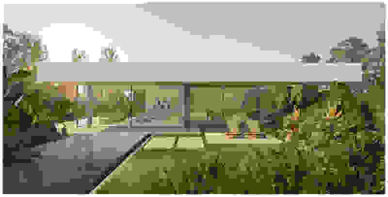
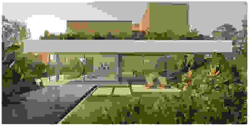
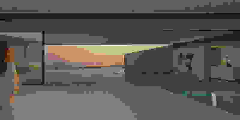
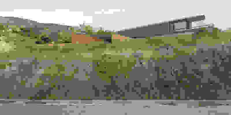
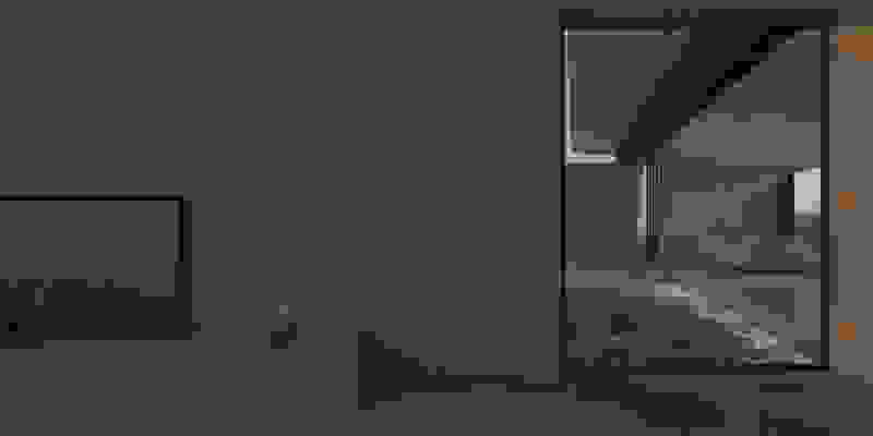
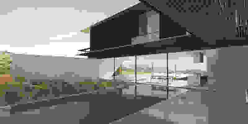
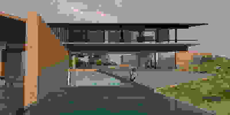
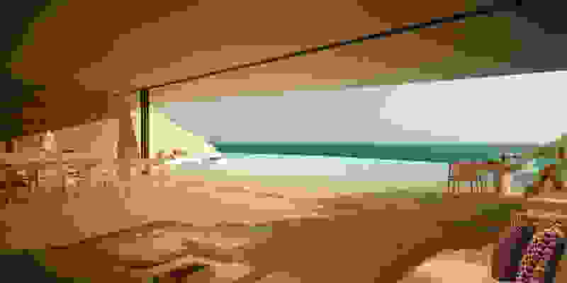
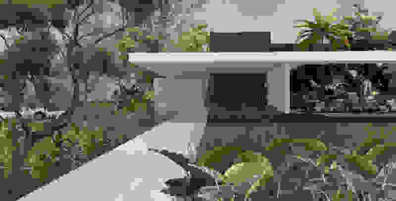
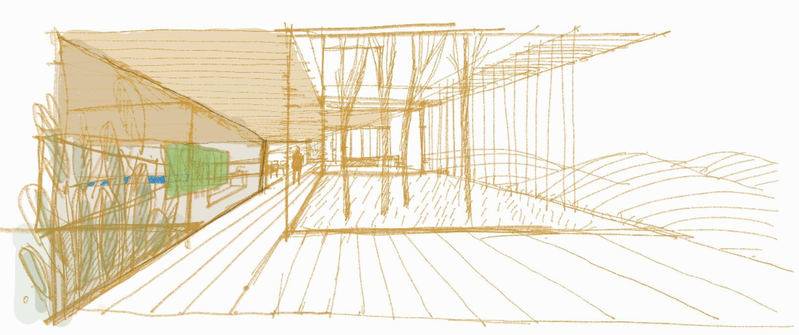
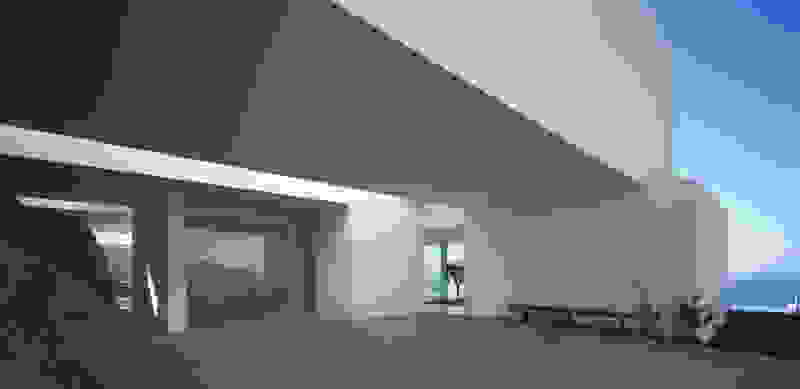
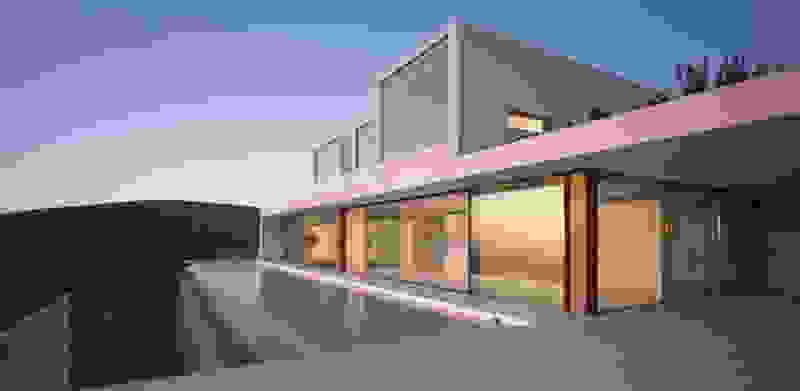
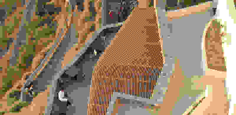
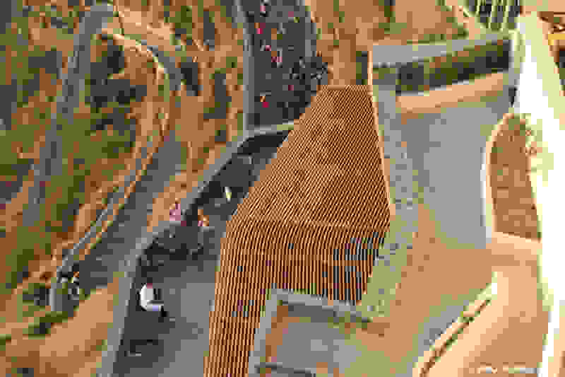
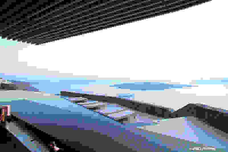
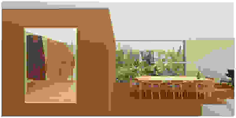
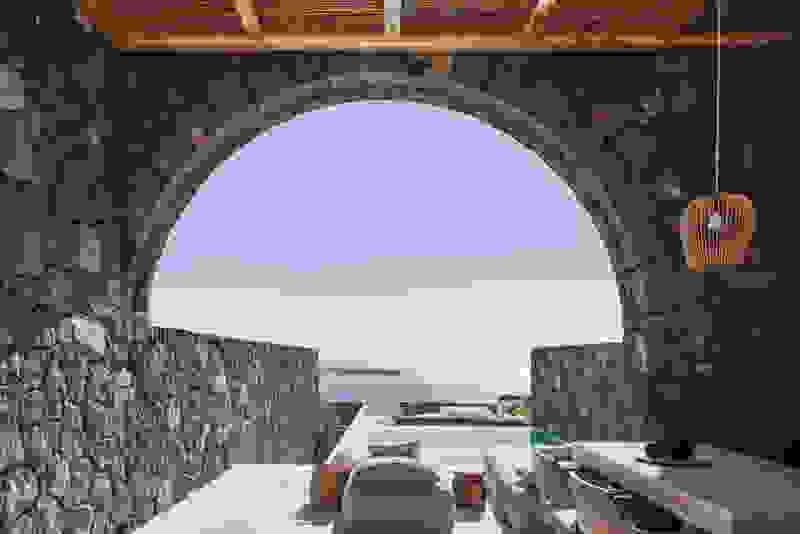
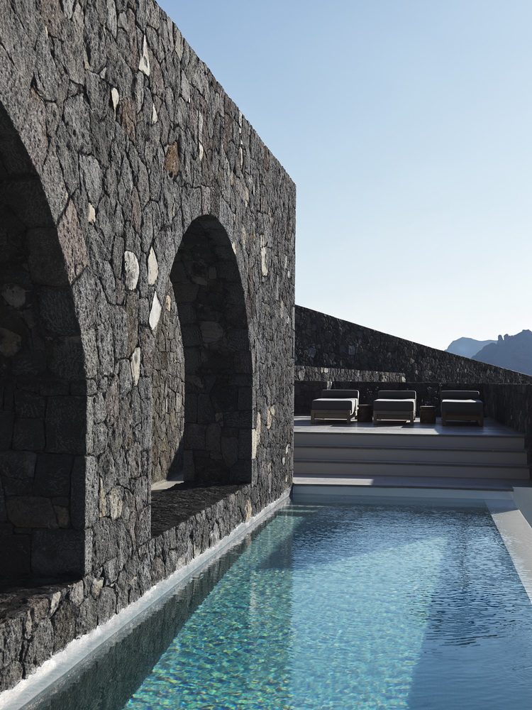
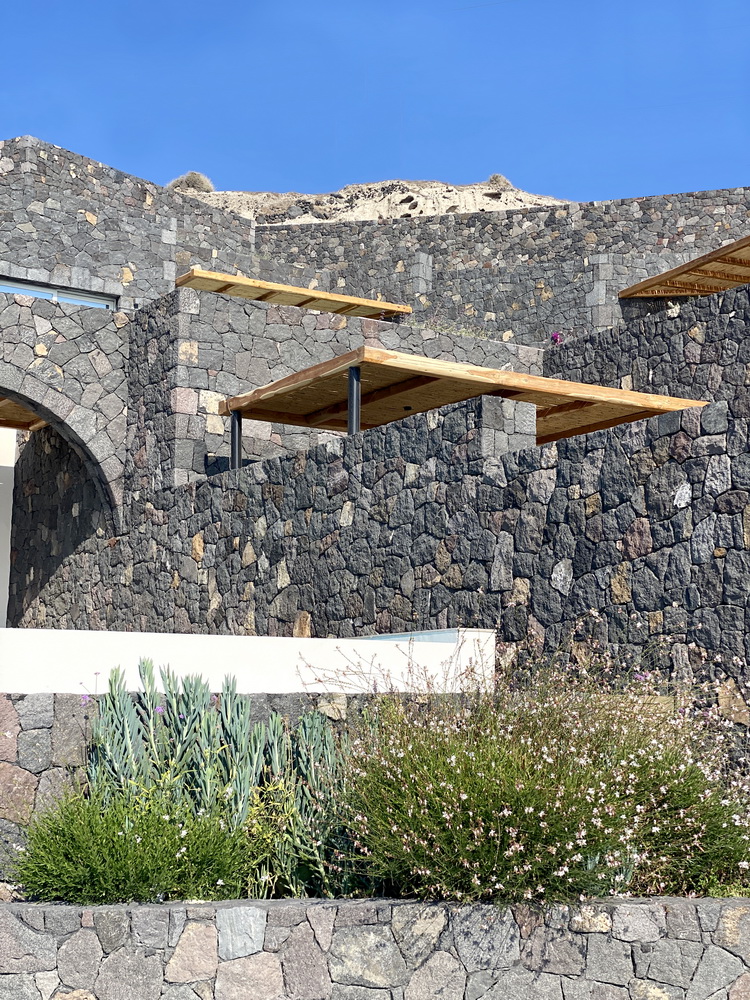
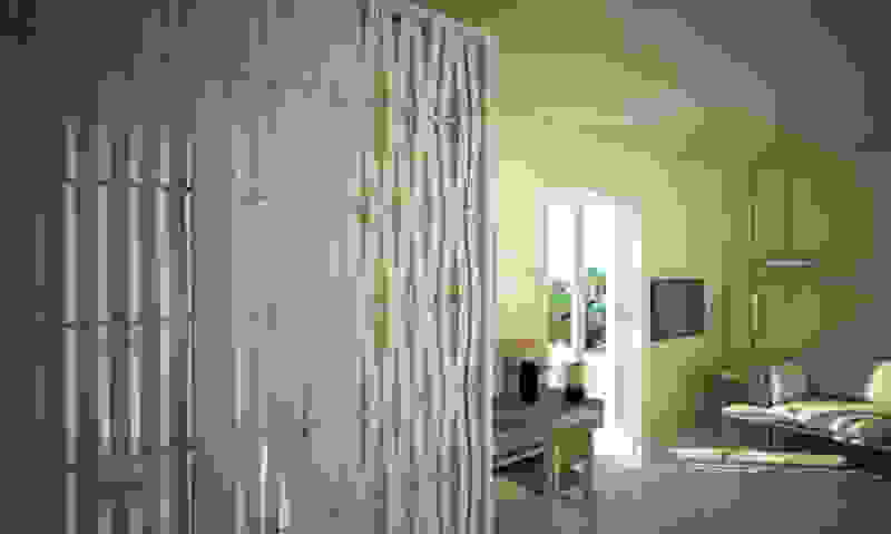
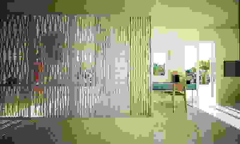
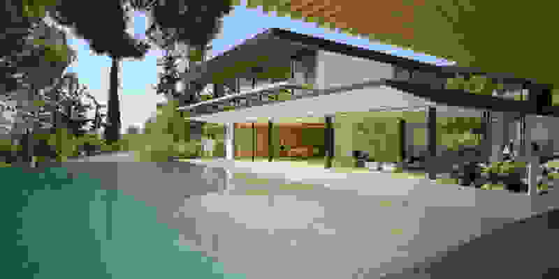
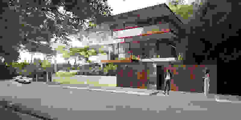
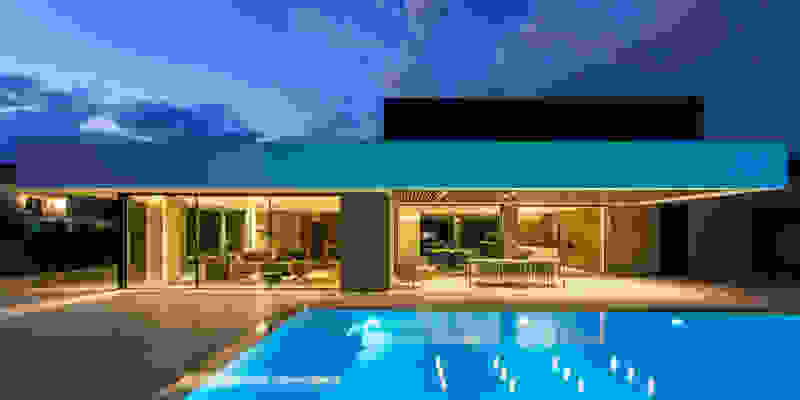
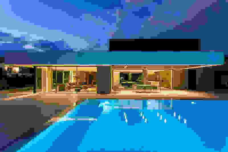
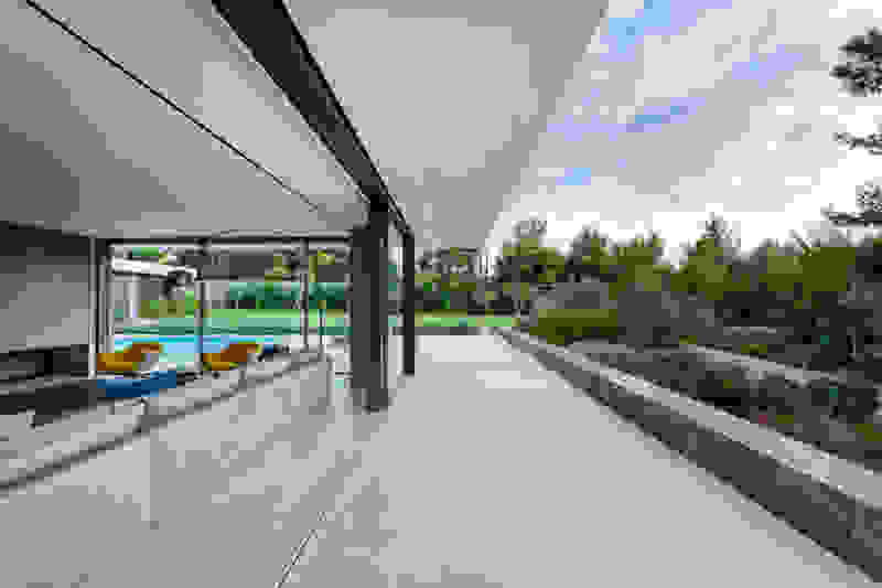
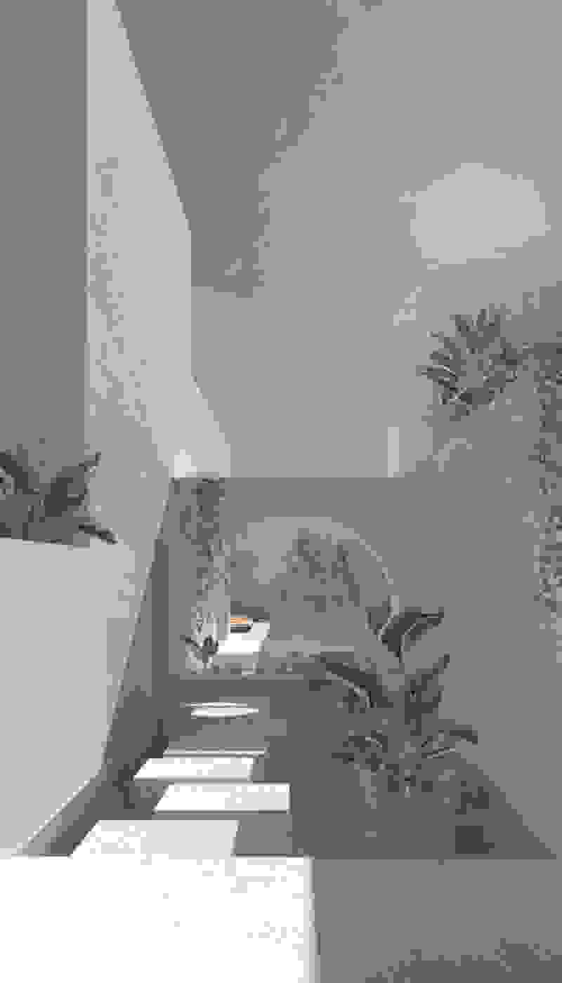
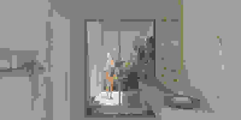
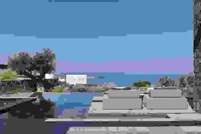
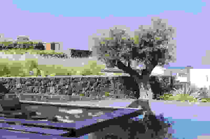
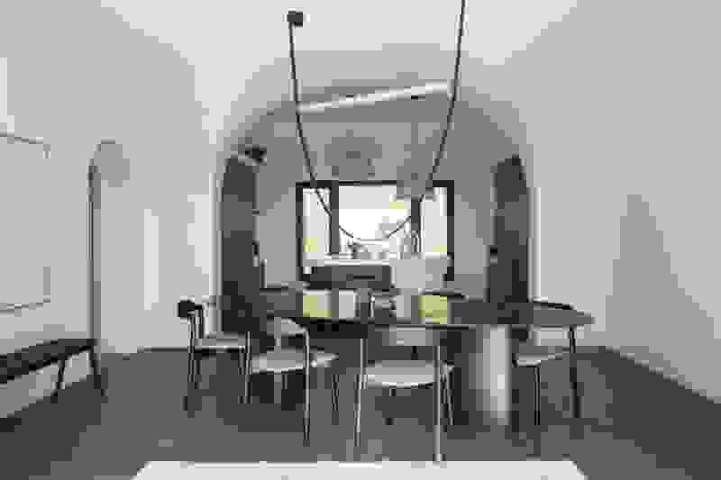
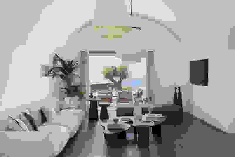
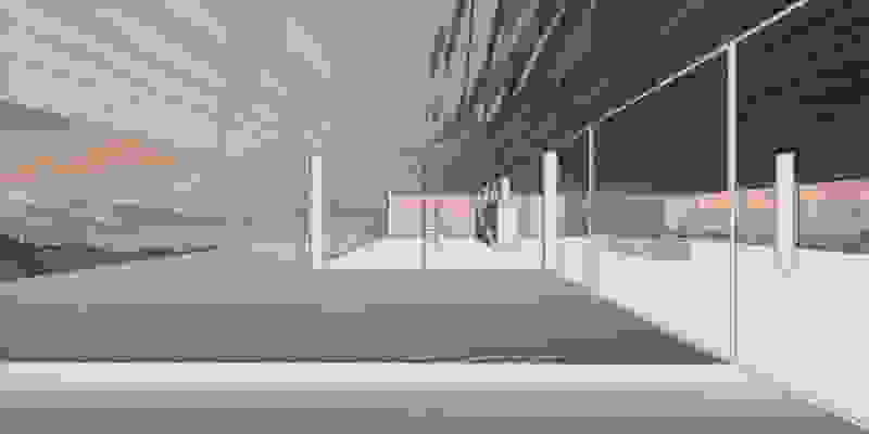
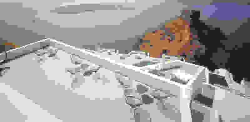
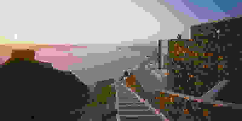
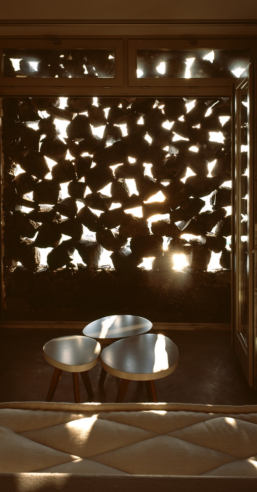
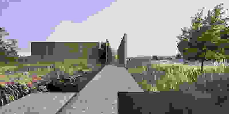
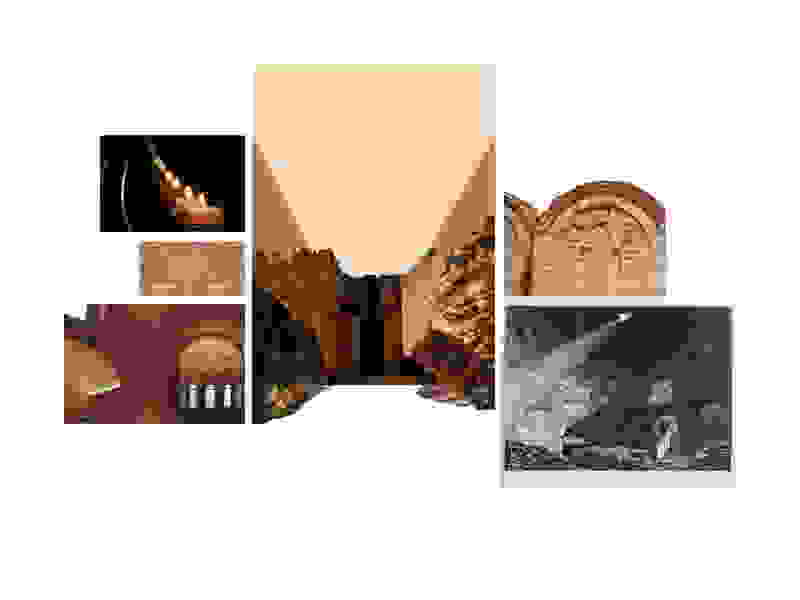
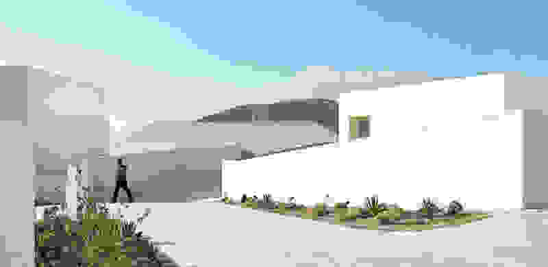
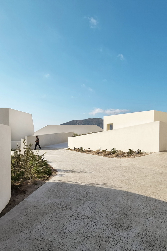
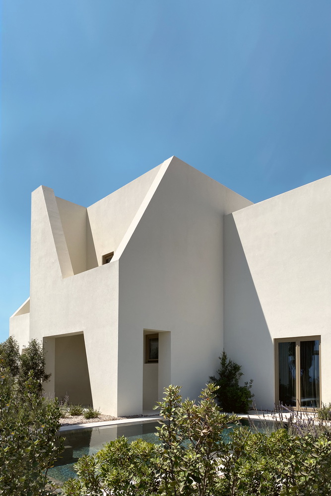
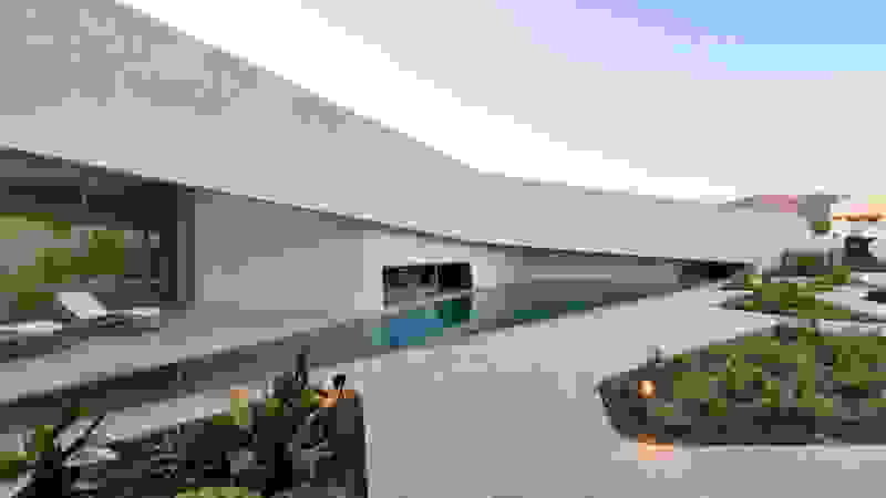
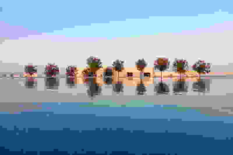
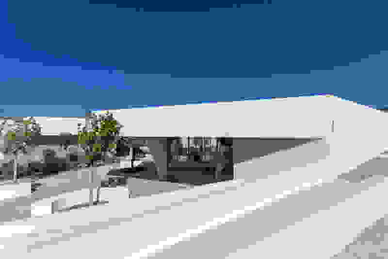
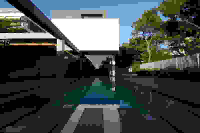
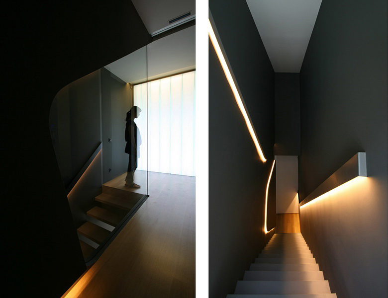
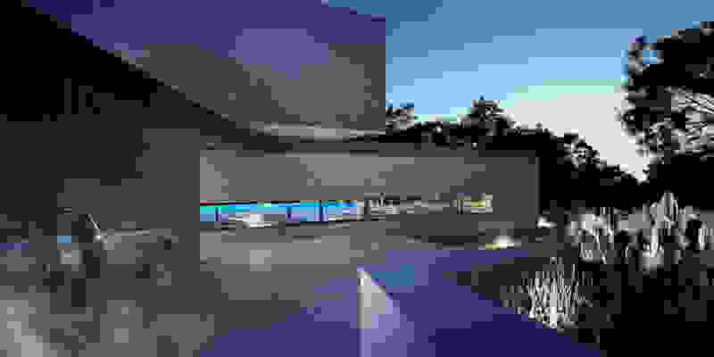
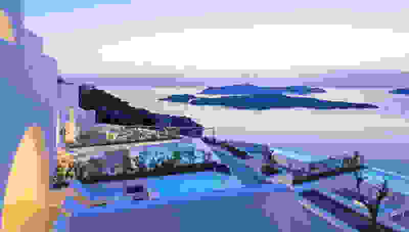
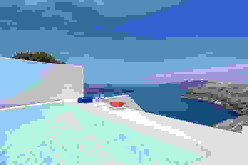
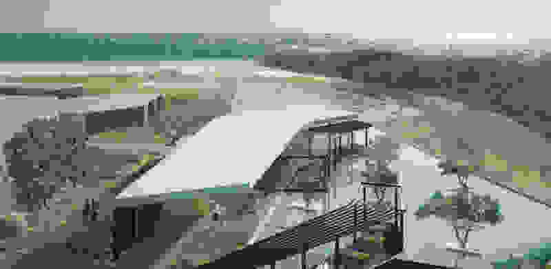
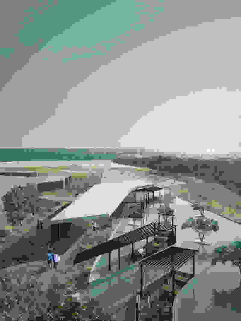
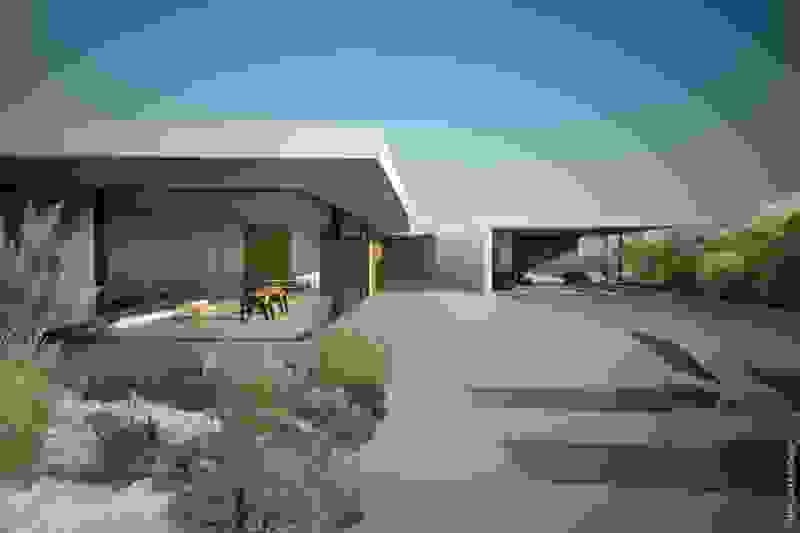
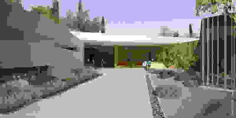
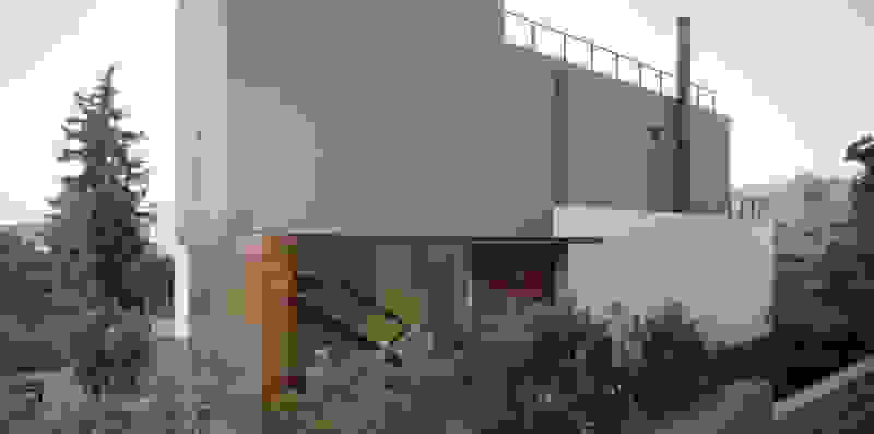
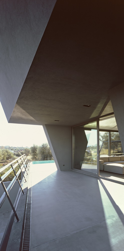
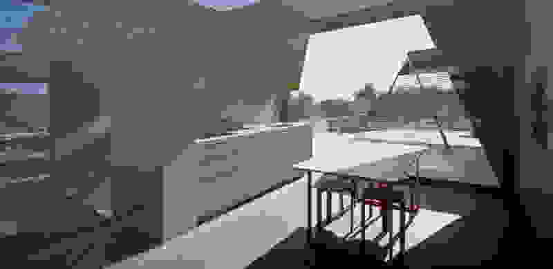
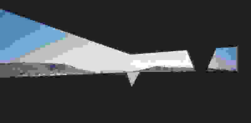
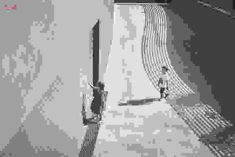
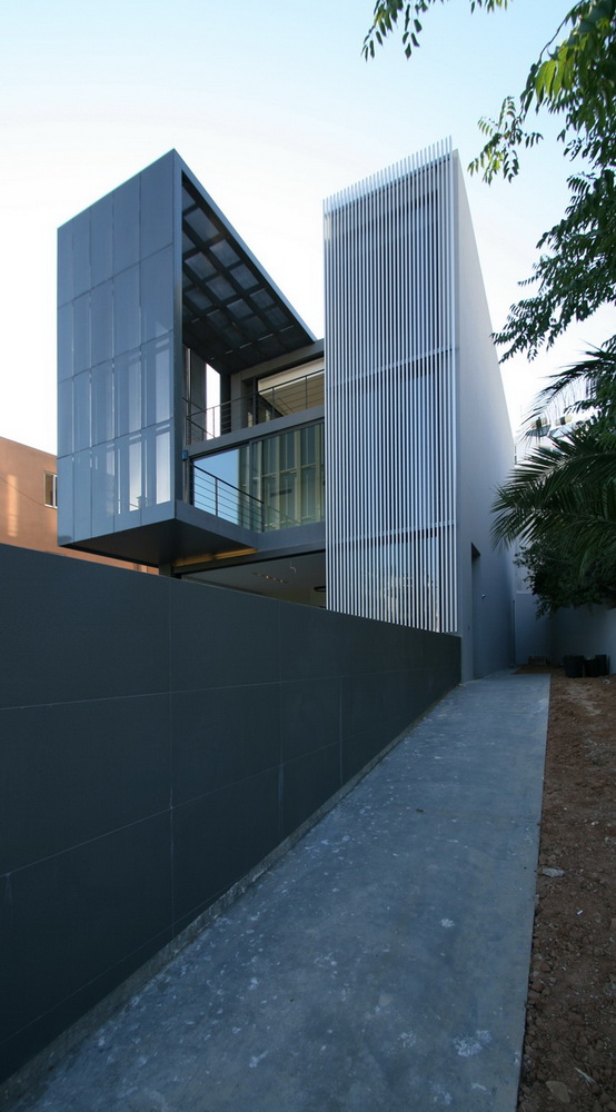
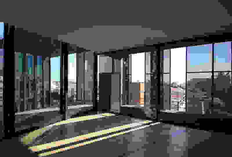
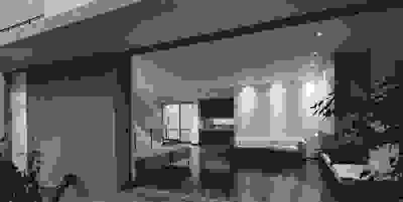
The intervention forms an architecture of landscape: Rooms with planted roofs are assembled on the slope, creating a discreet layering of terraces that seemingly pre-existed. Although the stepped section of the restored perlite mine could be considered as a starting point for the proposal, the new rooms deliberately do not form a recognizable geometry of repetitive curves. They draw inspiration from the neighboring landscape of Milos itself: instead of the legible “organization” and order of a tourist resort, Trencadís’ layout refers to plots and plantings with polygonal or curved outlines that fit together like fabrics on a rug. Thus the hotel is not simply lost within a slope with parallel terraces -it camouflages its own architecture in a planted landscape of irregular geometry. With planted terraces interjected and orientating rooms to different sections of the panoramic view, one is actually inhabiting the very landscape of Milos.

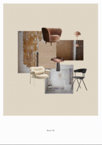
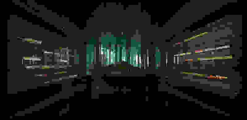
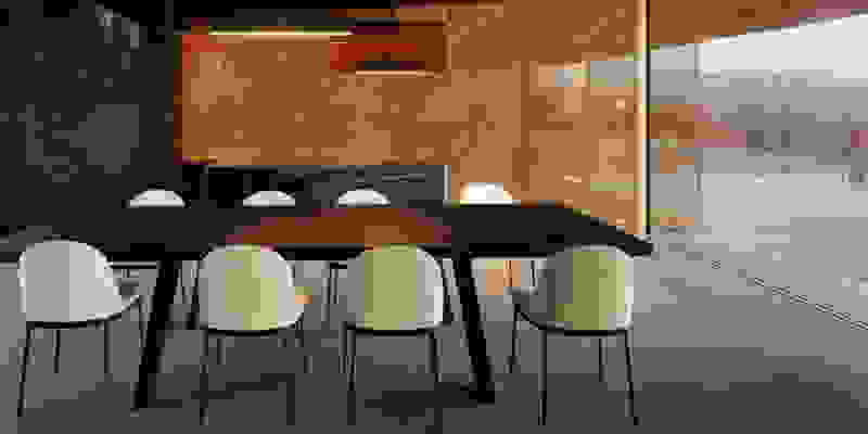
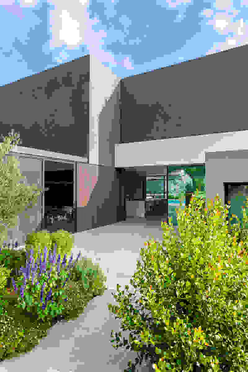
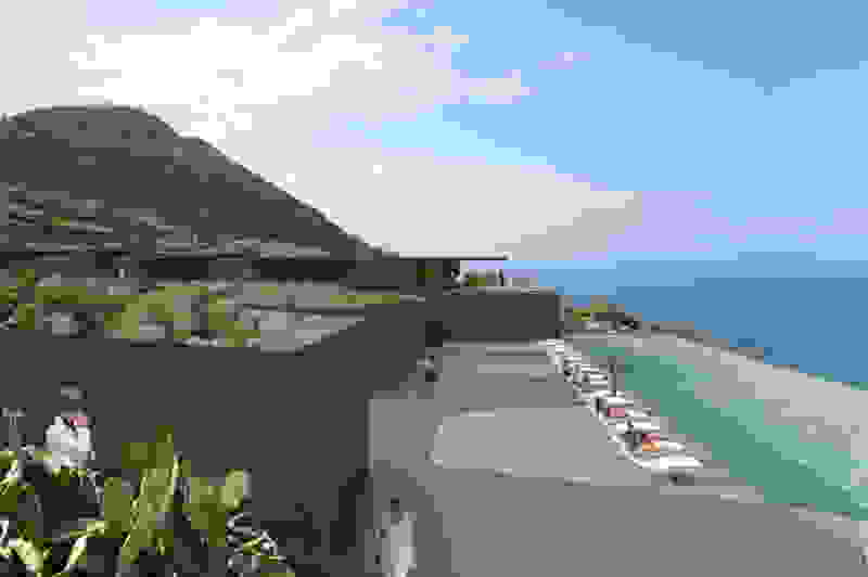
If landscape design on sloped terrains typically idealizes the harmonious, ordered curves of a vineyard or a rice paddy, Trencadís refers to the Cycladic landscape of variety and chance. From afar, the lines and colors are unified like the fluid stone walls carved by Antonio Gaudi -with few straight lines, his facades are decorated with Trencadís, the colorful mosaics, made of fragments of ceramic tiles. In the new hotel at Achivadolimni, ceramic tiles, lava, mosaic, perlite, quarry, obsidian, become the new references.

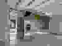
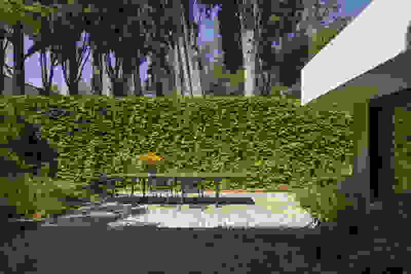
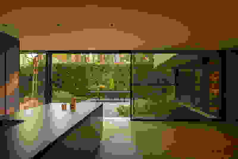
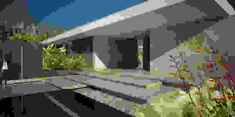
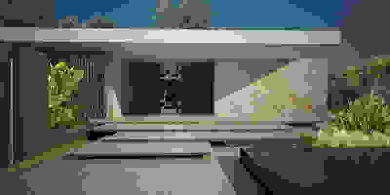
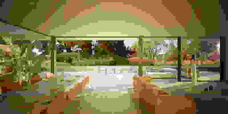
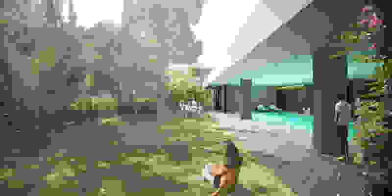
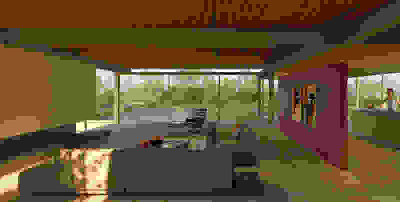
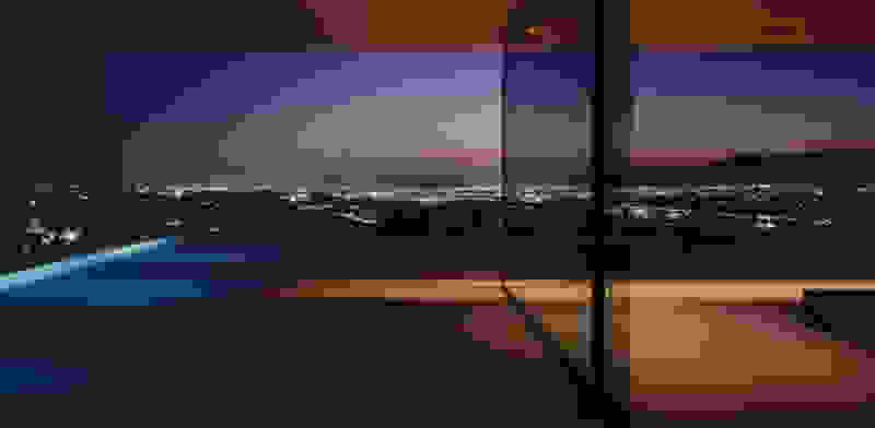
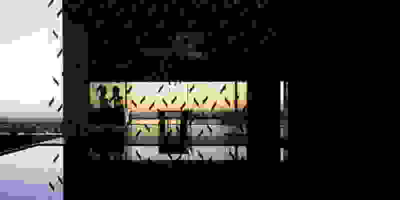
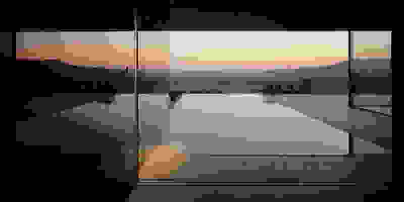
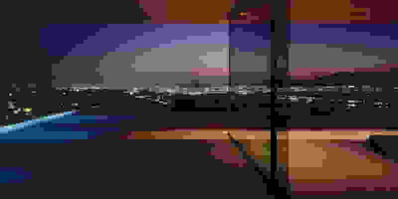
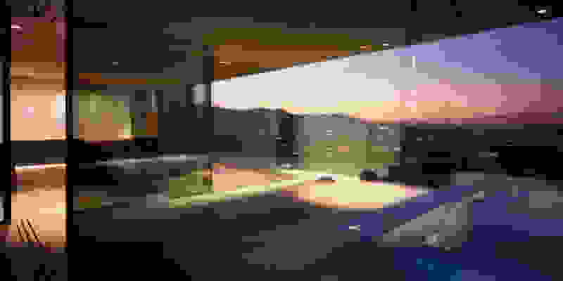
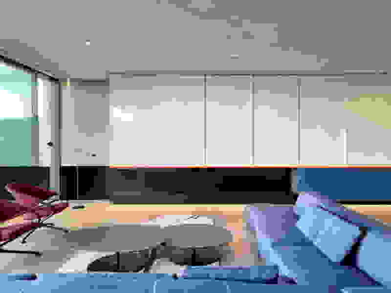
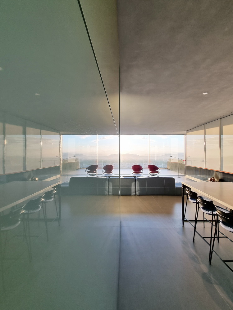
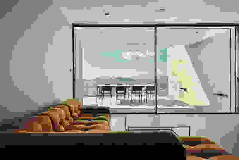
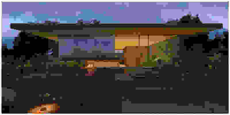
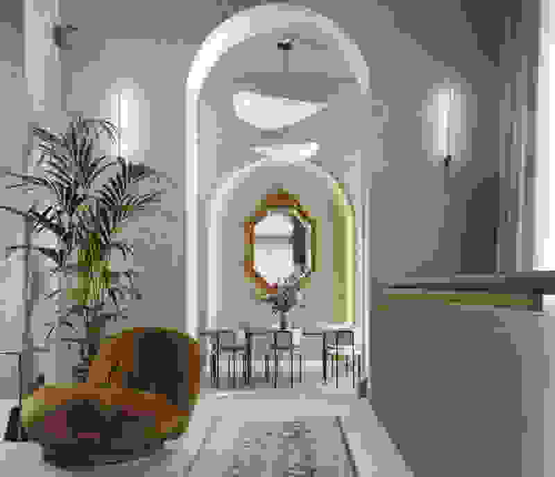
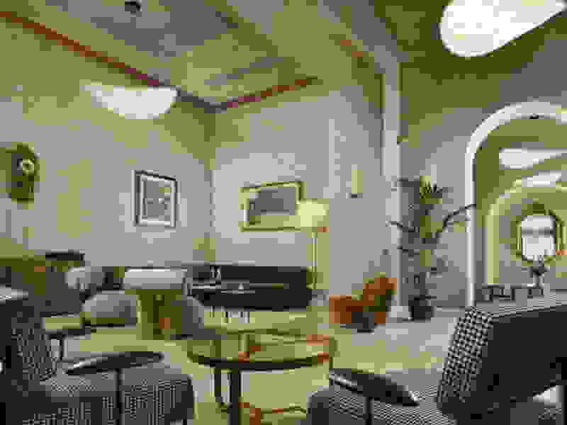
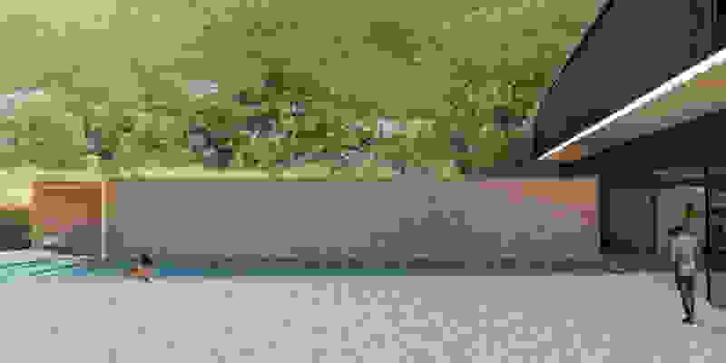
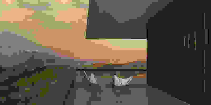
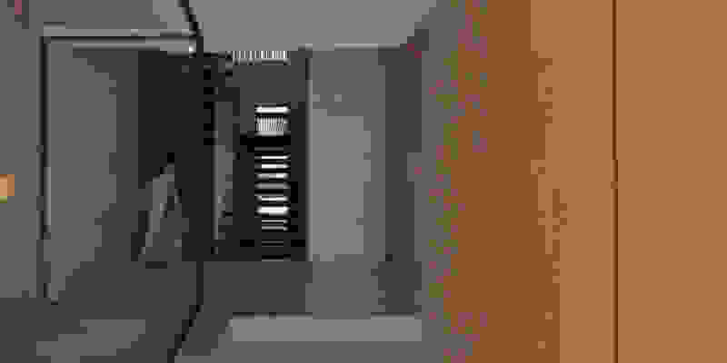
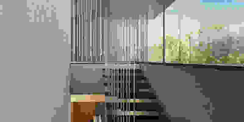
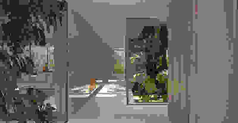
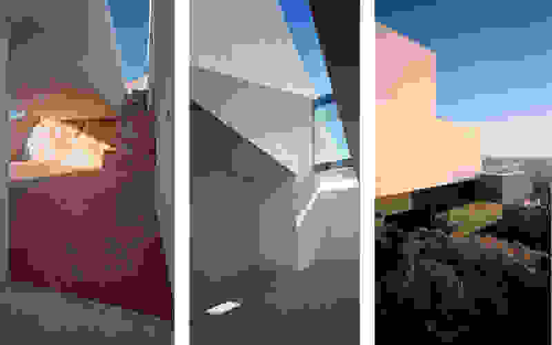
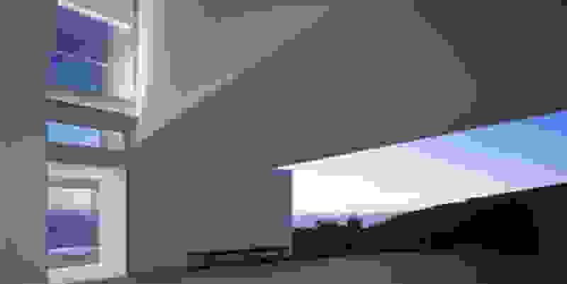
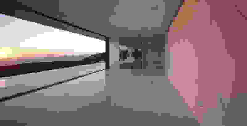
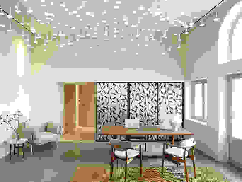
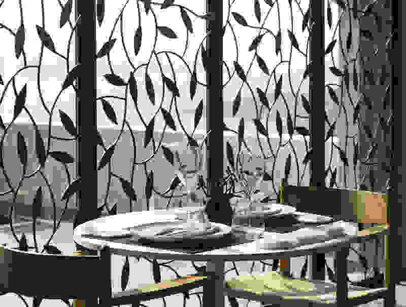
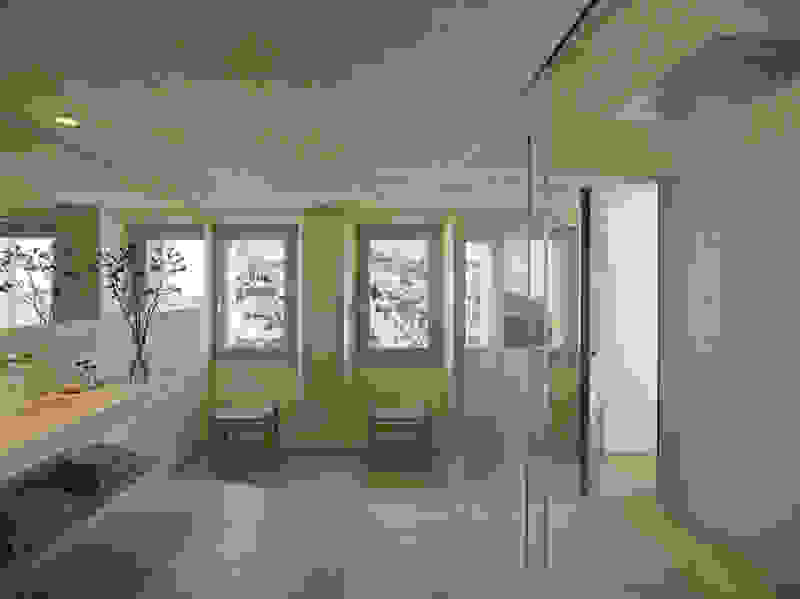
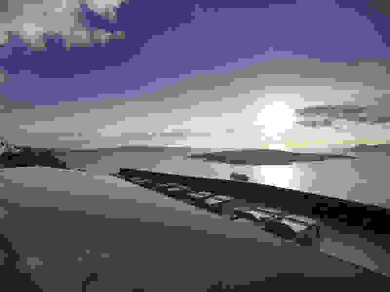
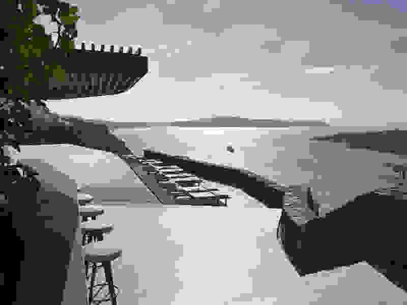
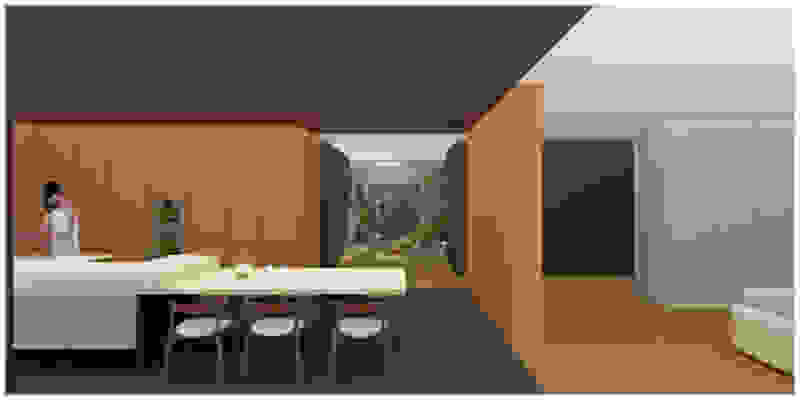
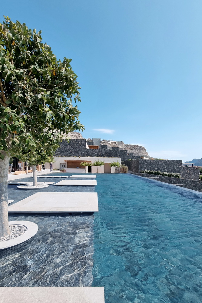
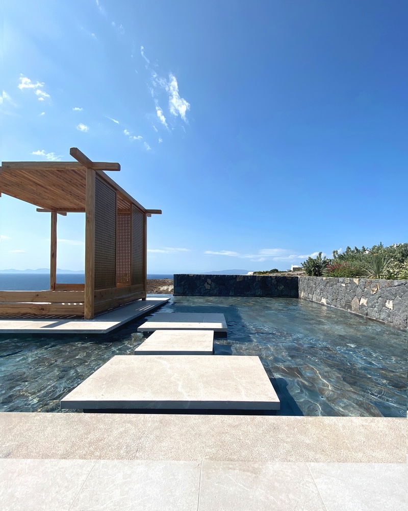
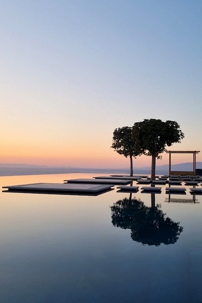
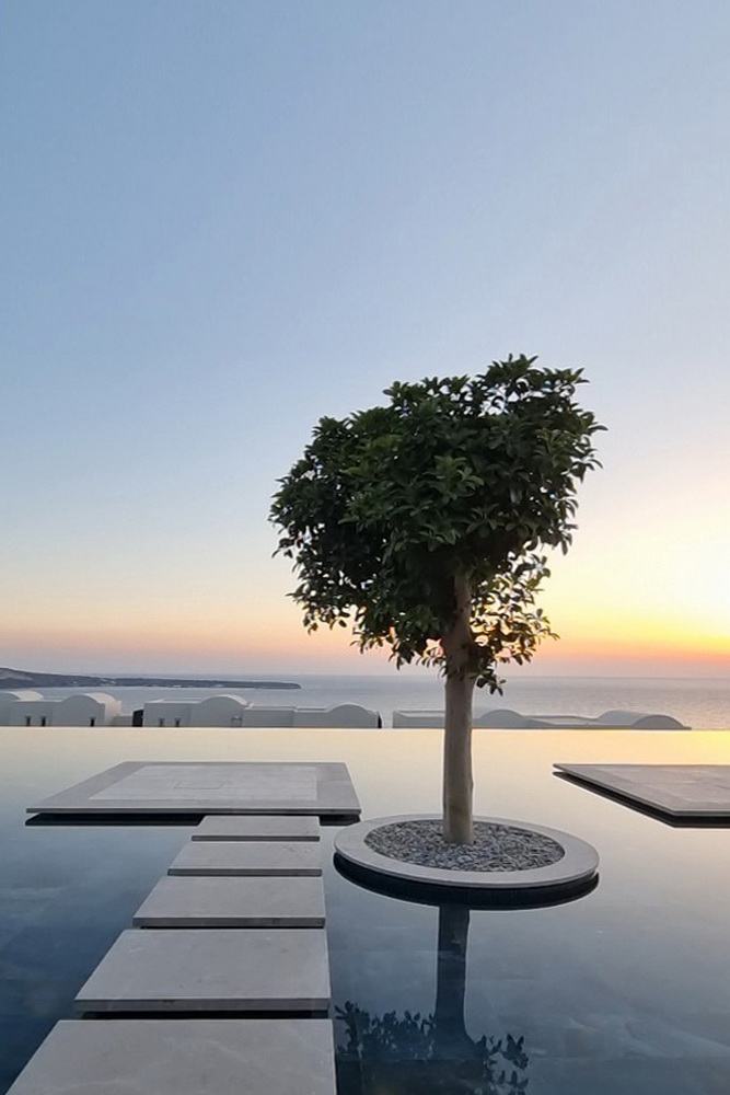
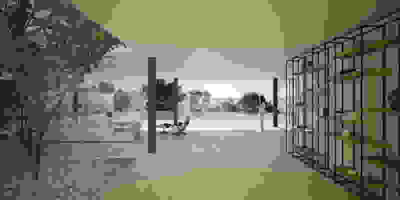
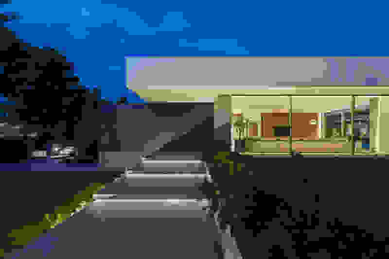
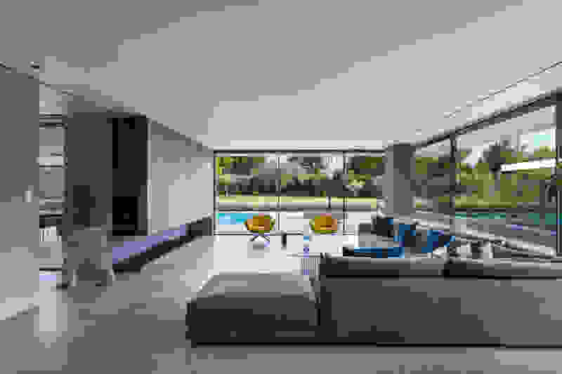
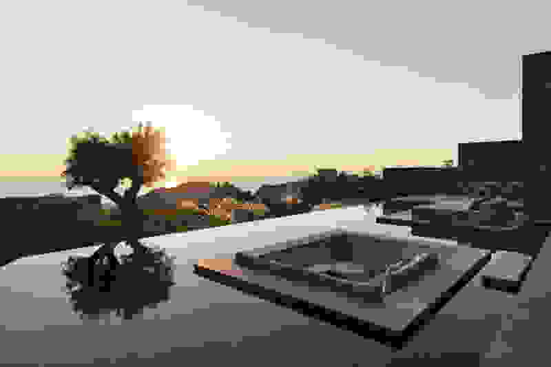
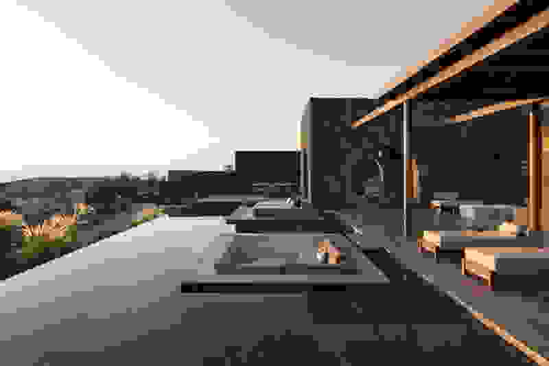
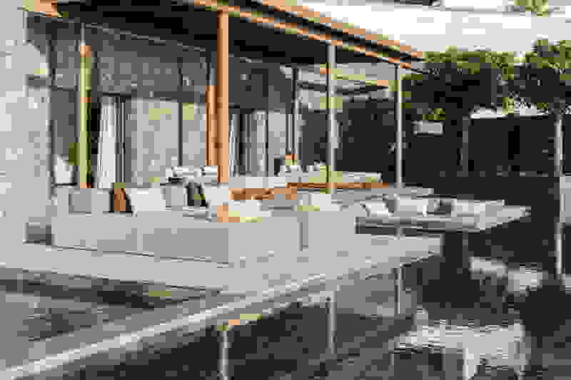
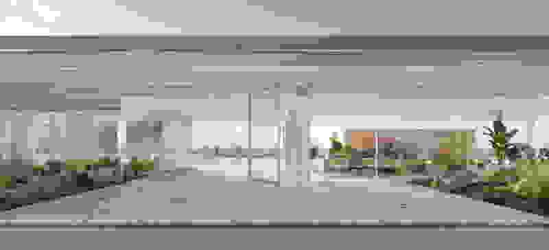
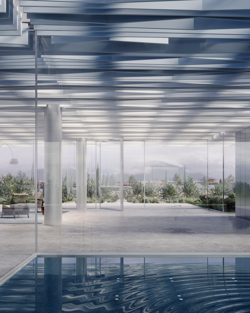
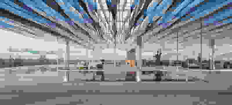
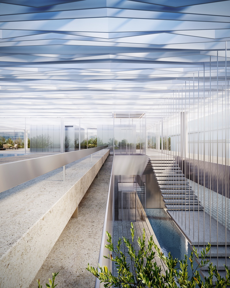
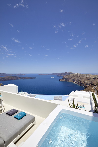
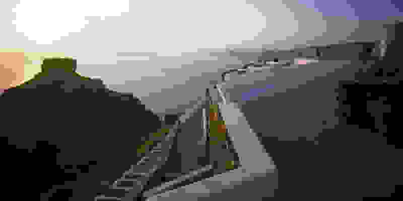
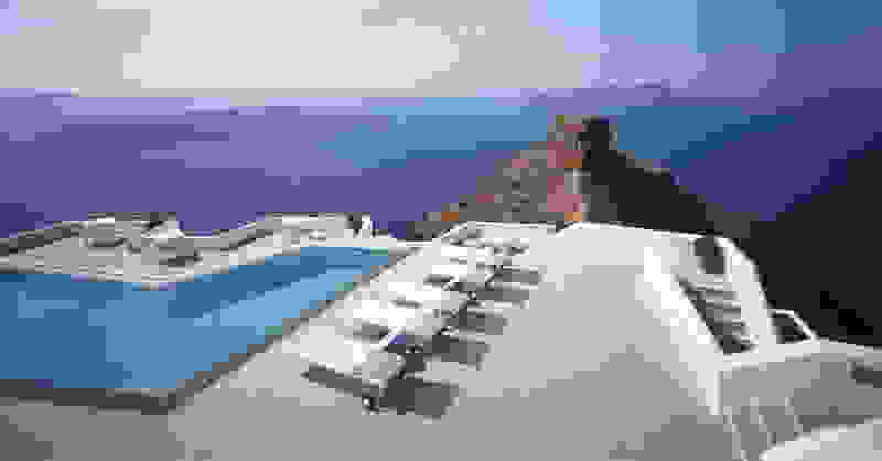
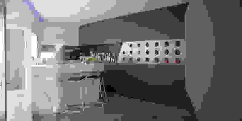
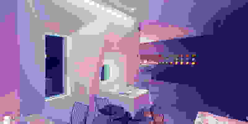
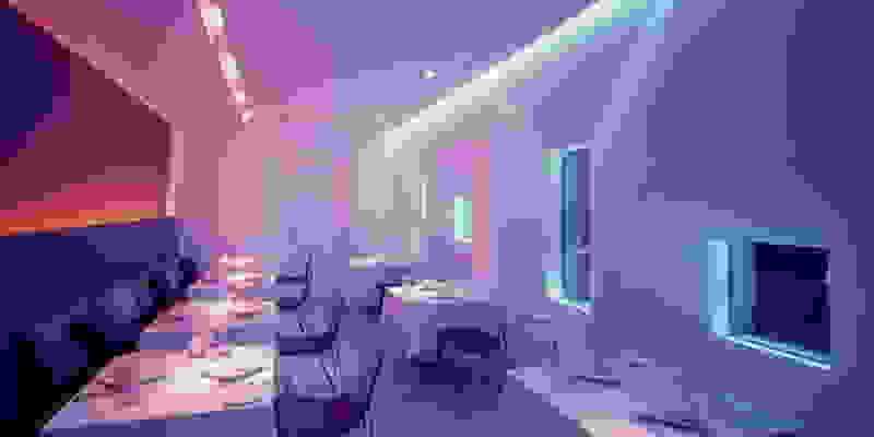
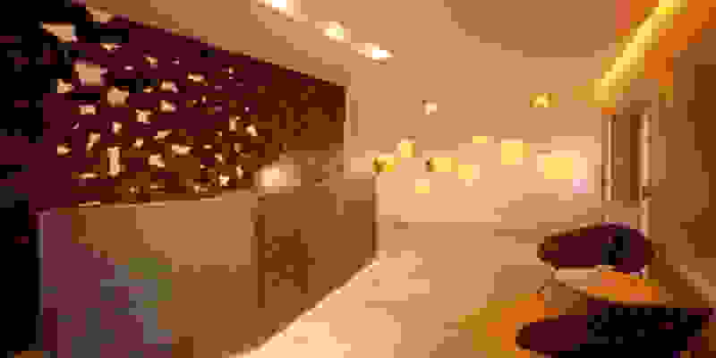
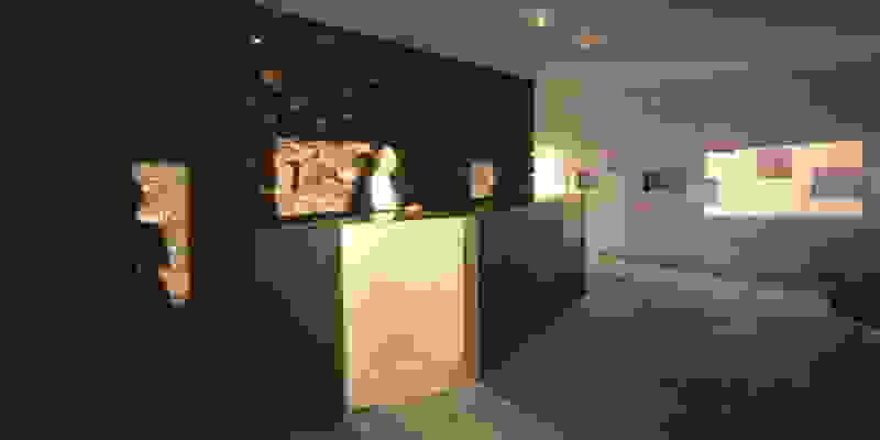
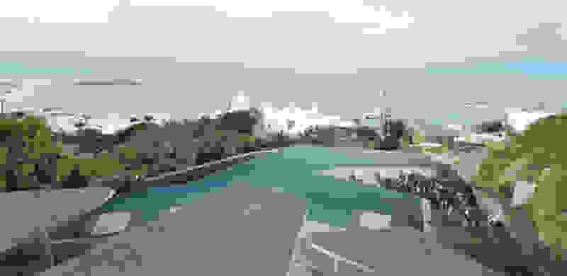
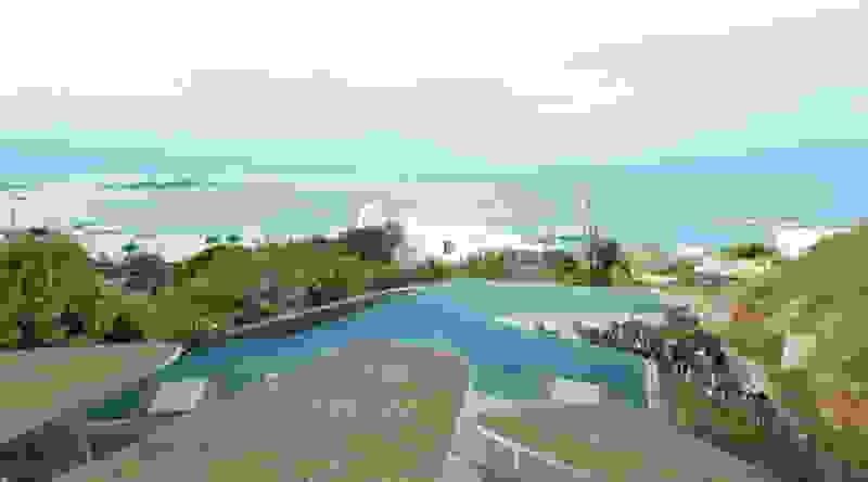
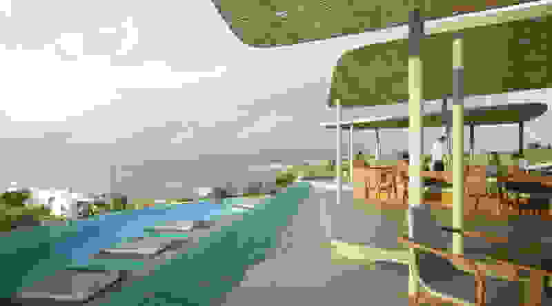
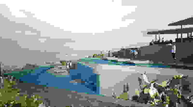
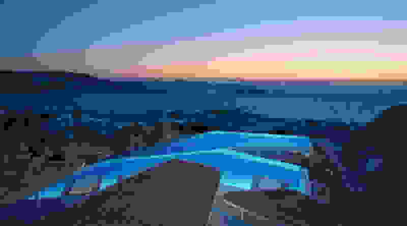
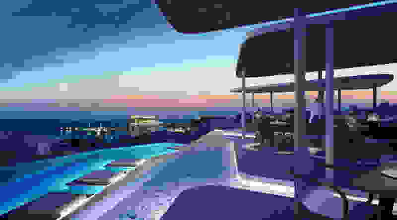
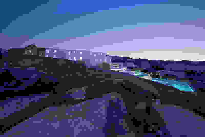
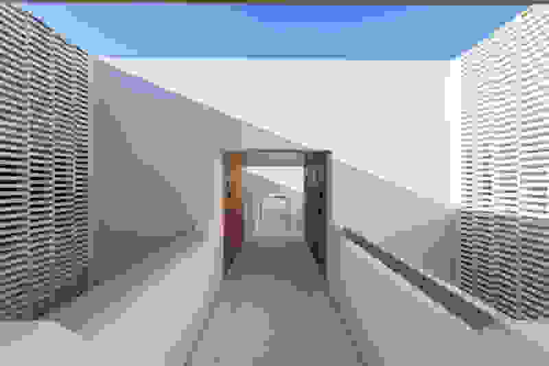
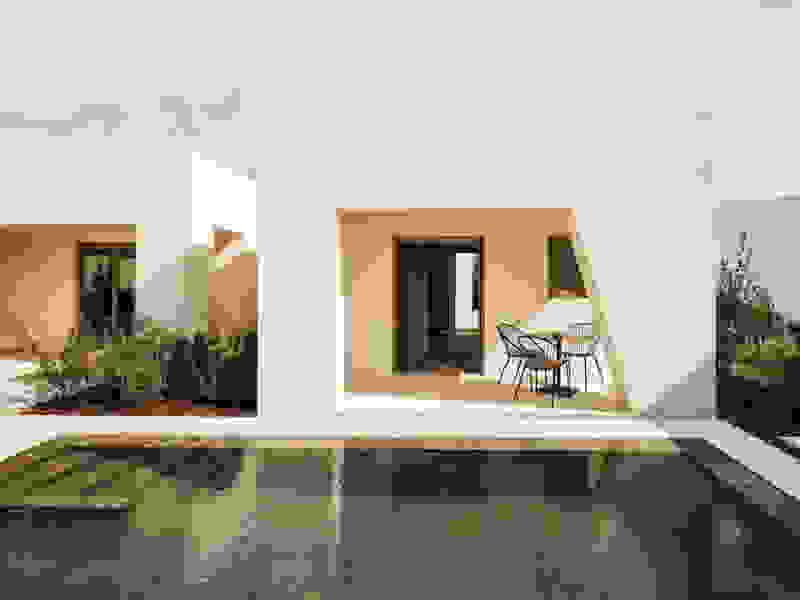
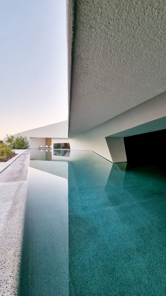
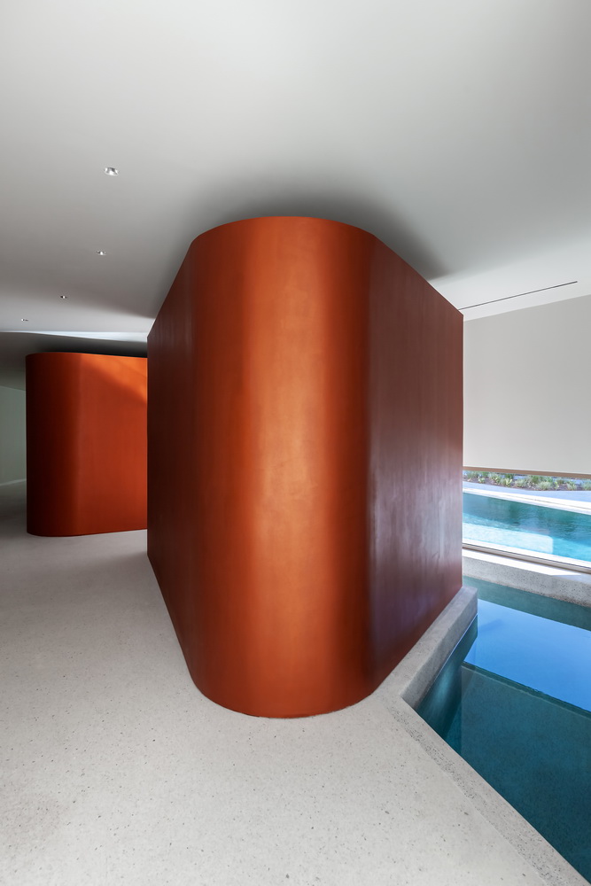
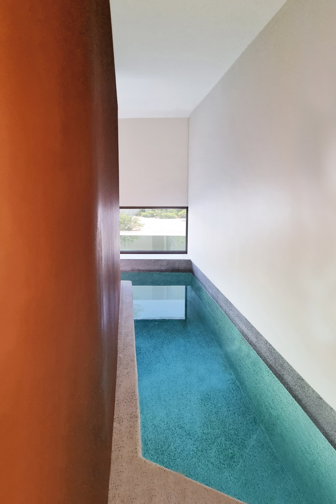
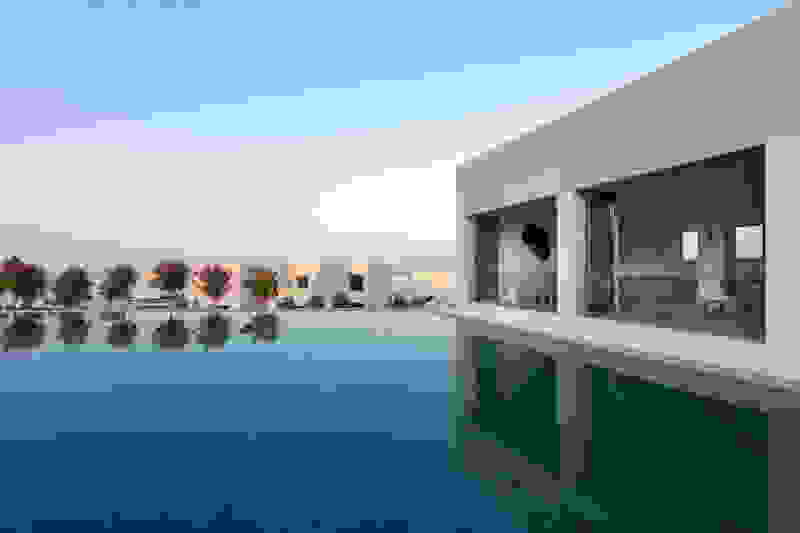
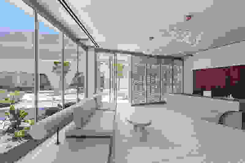
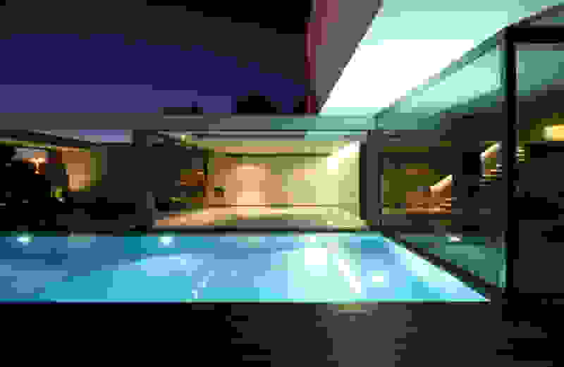
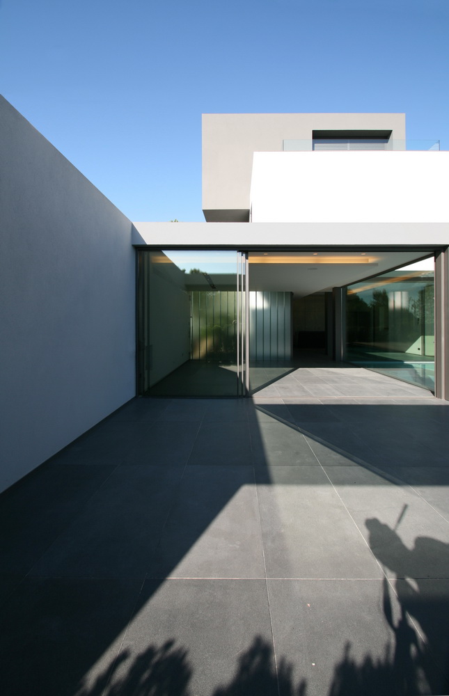
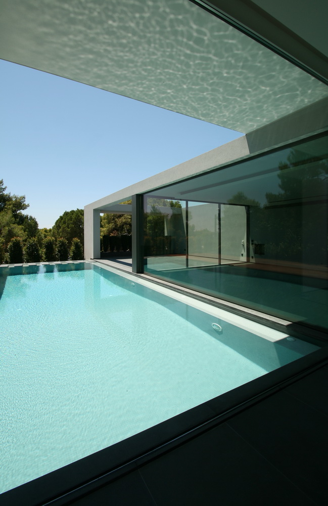
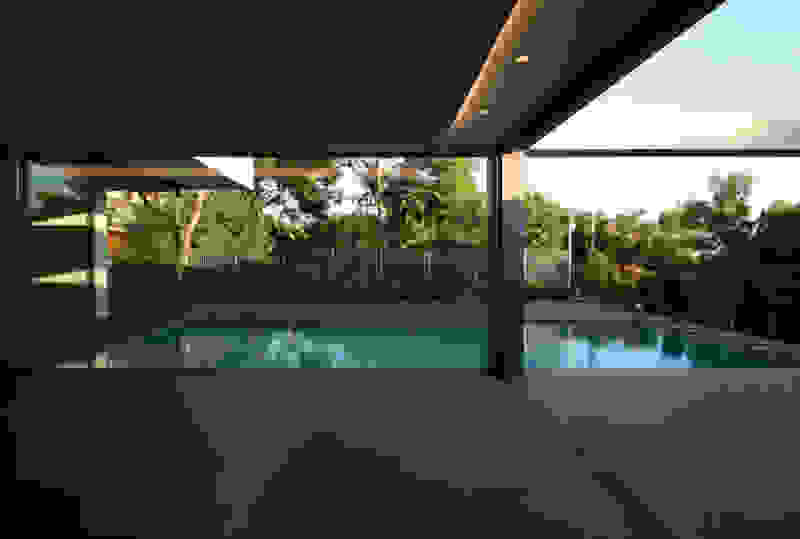
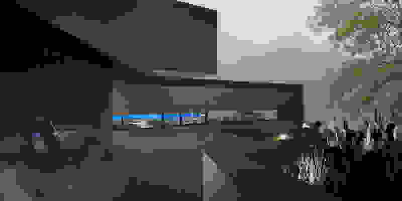
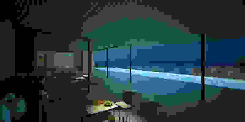
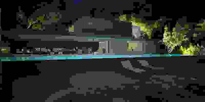
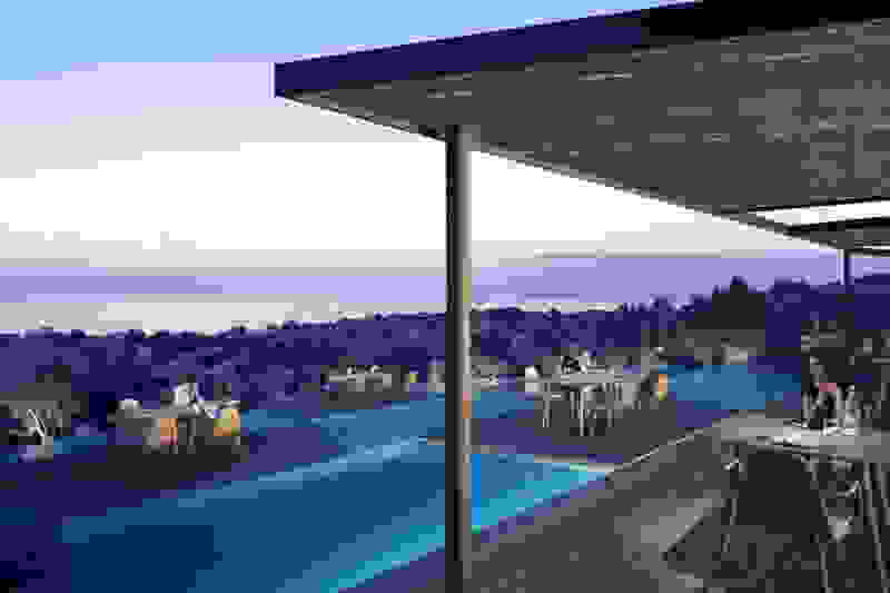
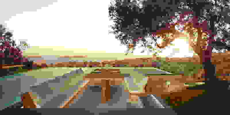
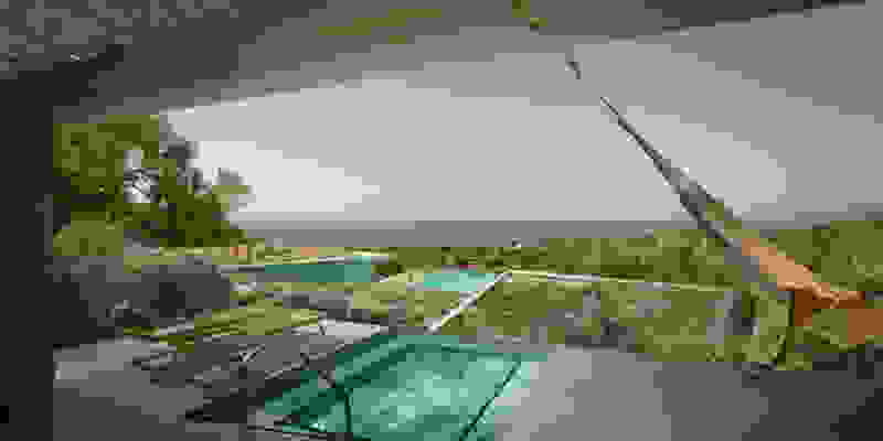
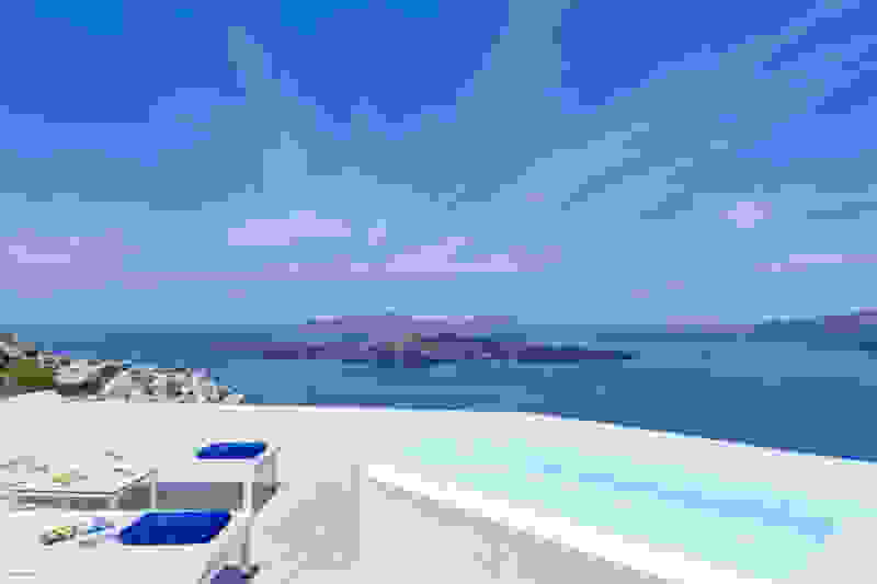
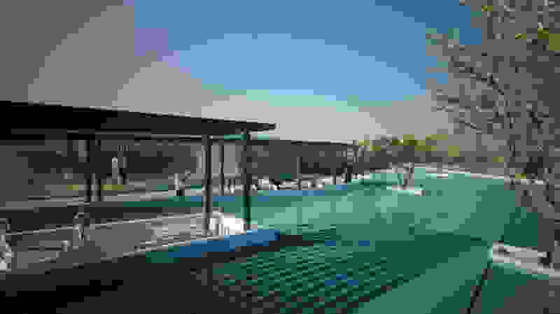
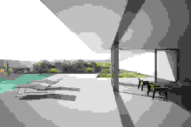
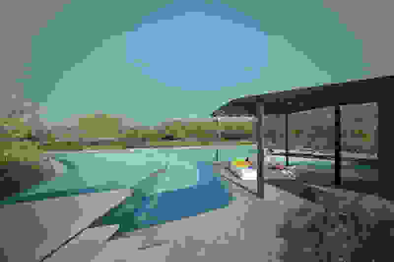
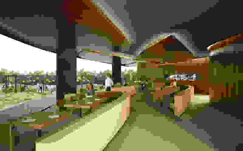
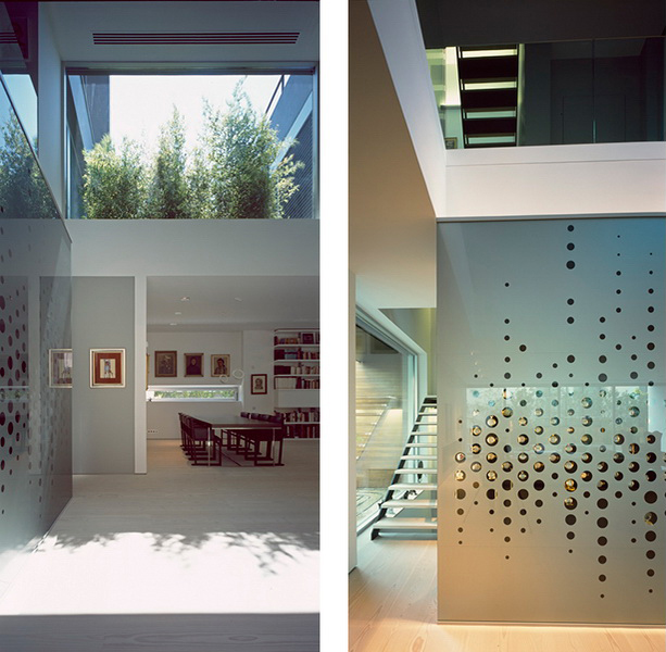
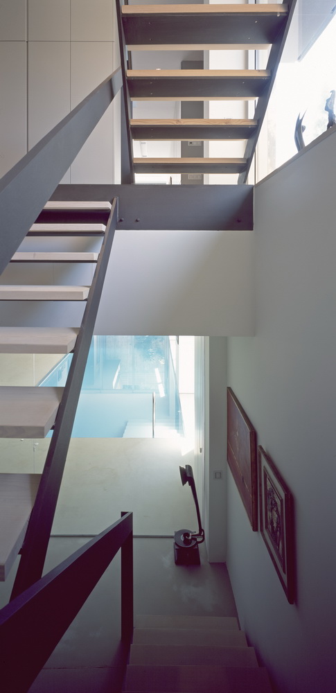
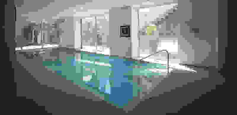
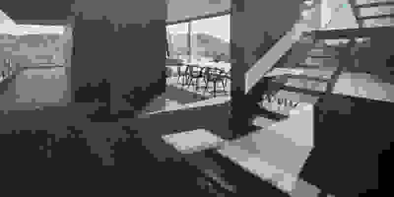
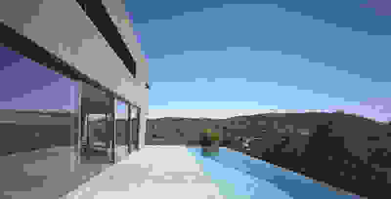
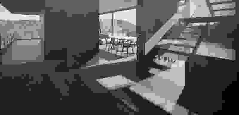
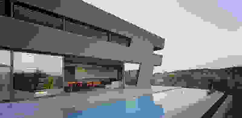
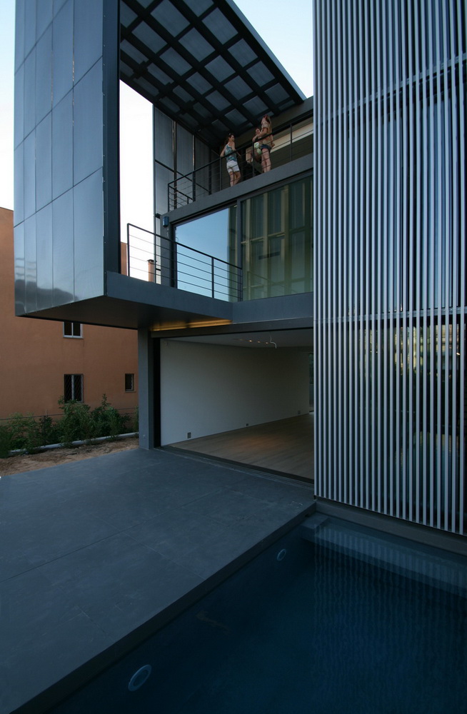
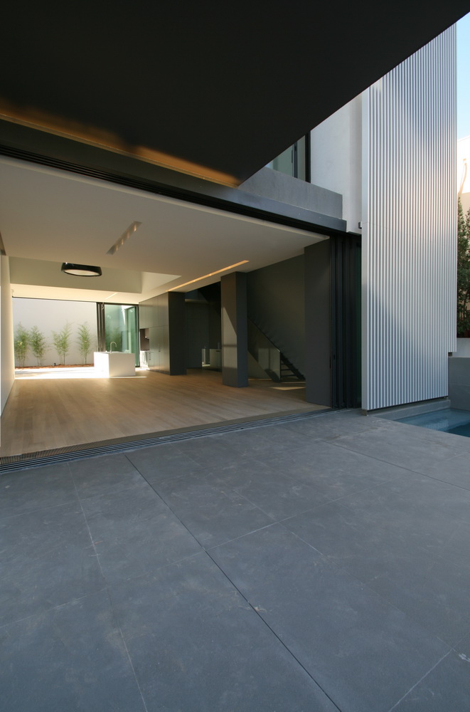
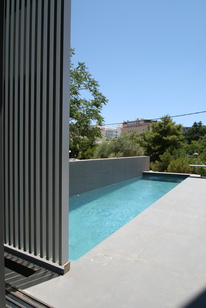
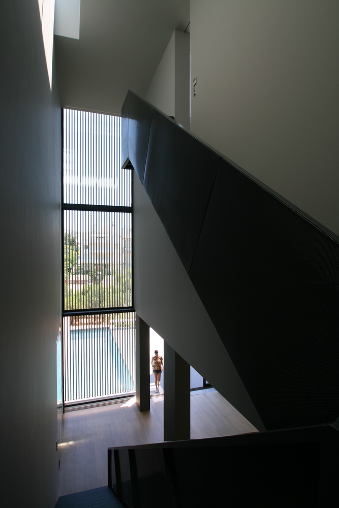
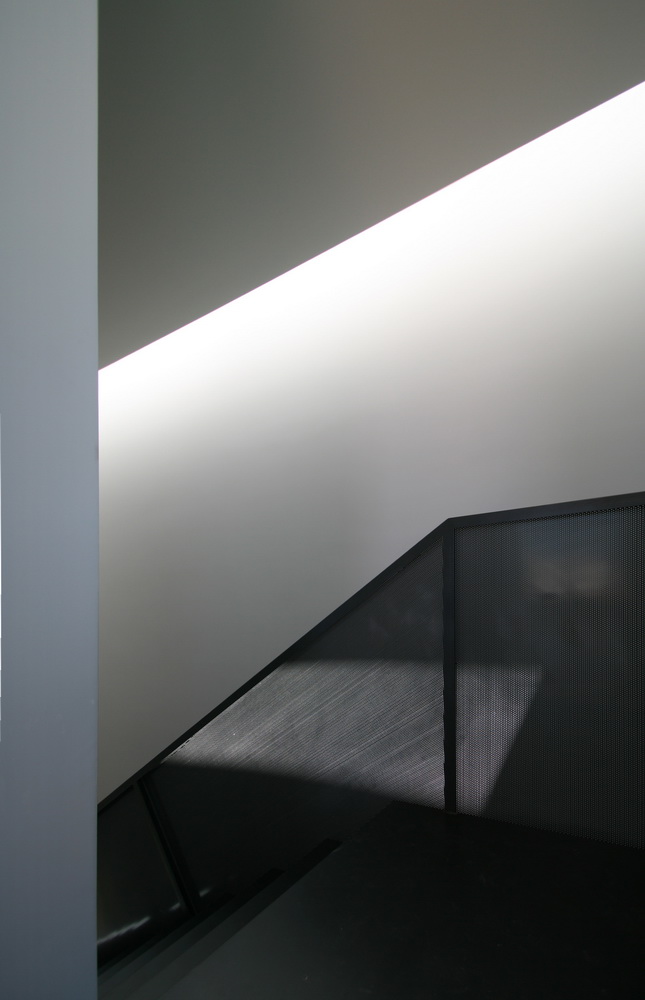
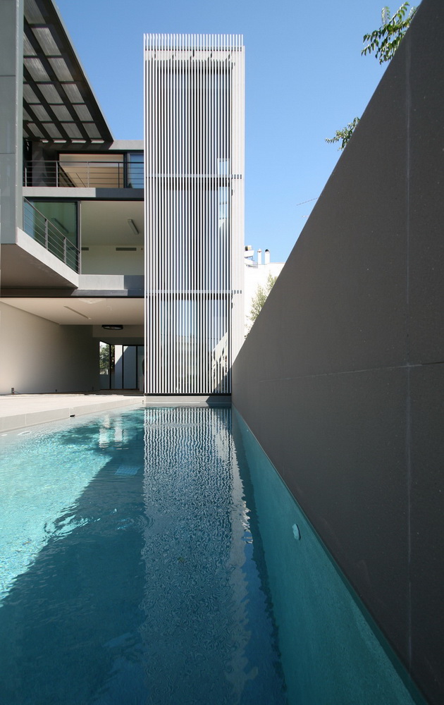
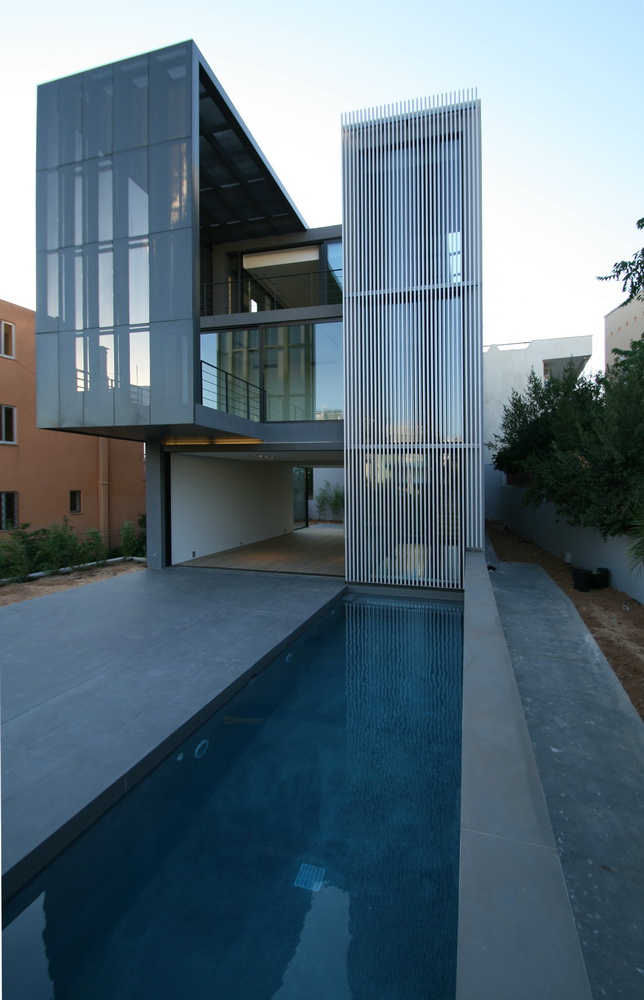
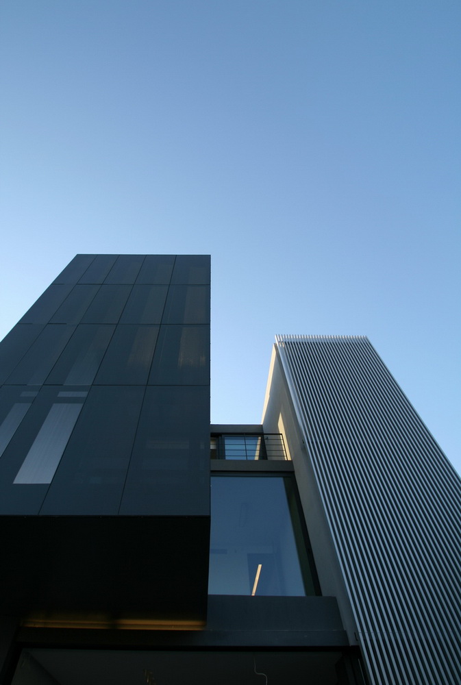
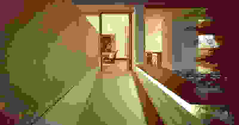
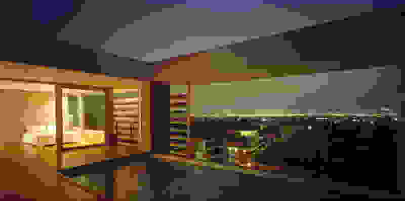
The memory of the mine -not only that of the particular site but also that of the rich mining history of the island- is preserved. Trencadís Hotel refers to the mine indirectly, not to its pre-existing amphitheater shape but to its energy: its public areas are carved in the slope and feature two large excavations, two deep quarries in the landscape, filled with water at their lowest level. Walking through the reception, the spa, the restaurants, one watches the light descend on such a narrow courtyard, an excavated with precision orthogonal quarry, flooded at its deepest point. A second cut, the linear pool overlooking the sea, repeats this geometrical rigor and contrasts it with the earth-anchored public buildings of buried footprints. In a fitting analogy, the road connecting the highest slope with the lowest, coastal part of the plot, crosses under the community road.

A home of your own

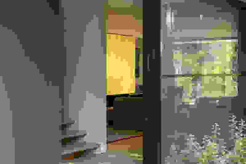
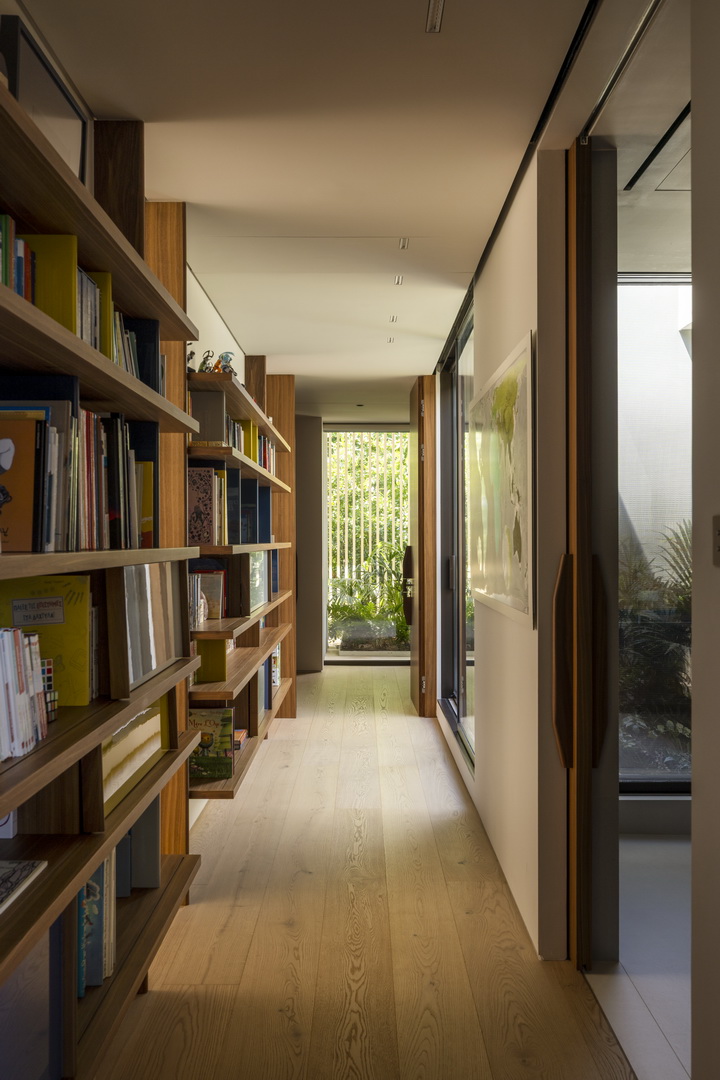
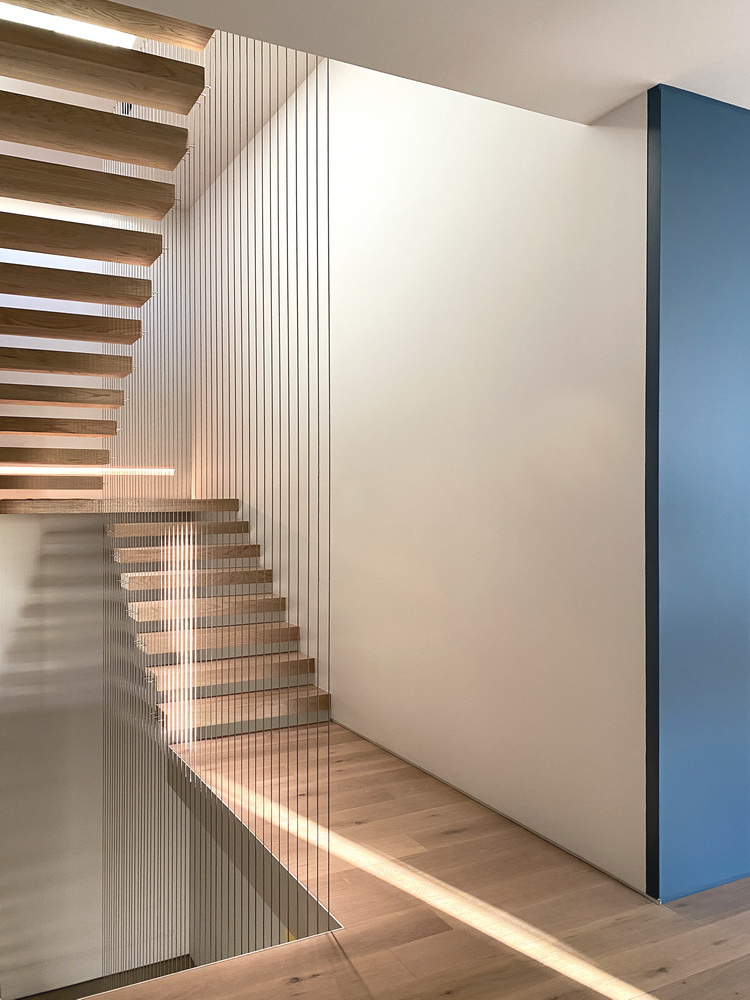
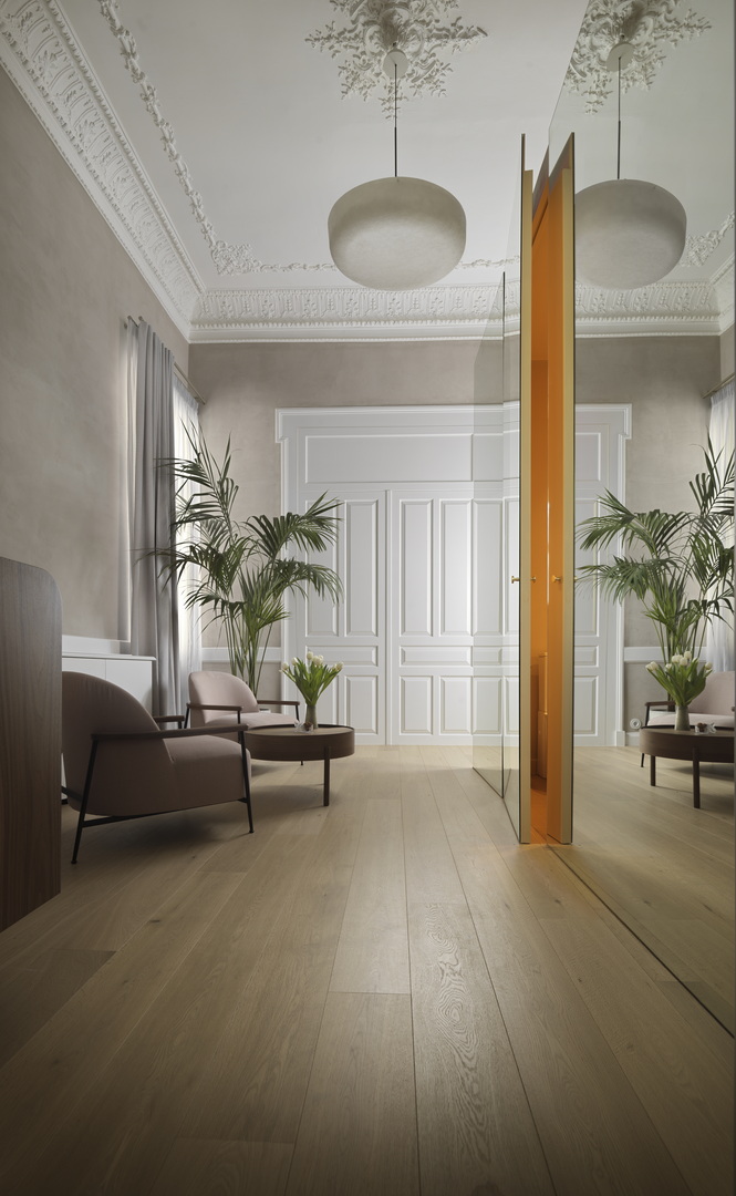
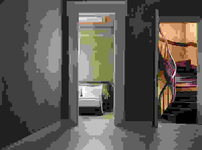
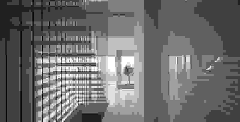
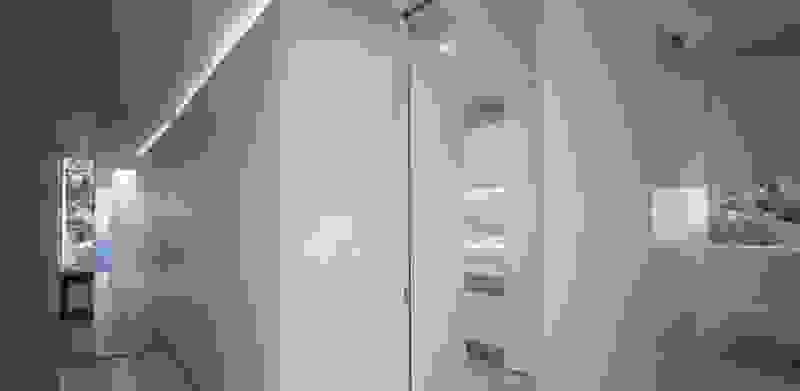
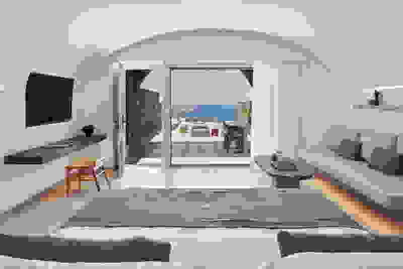
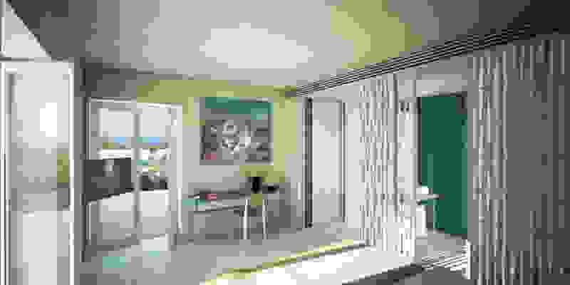
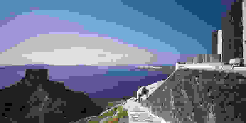
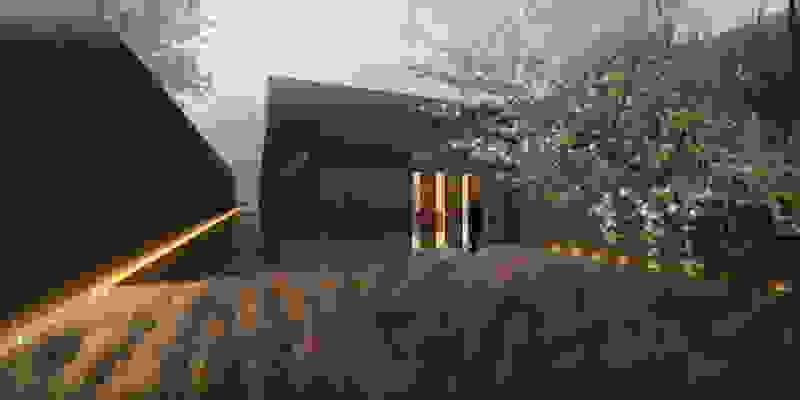
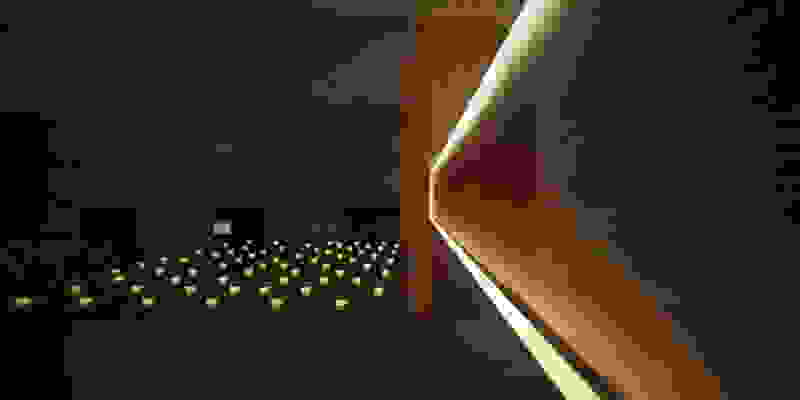
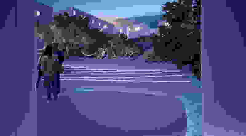
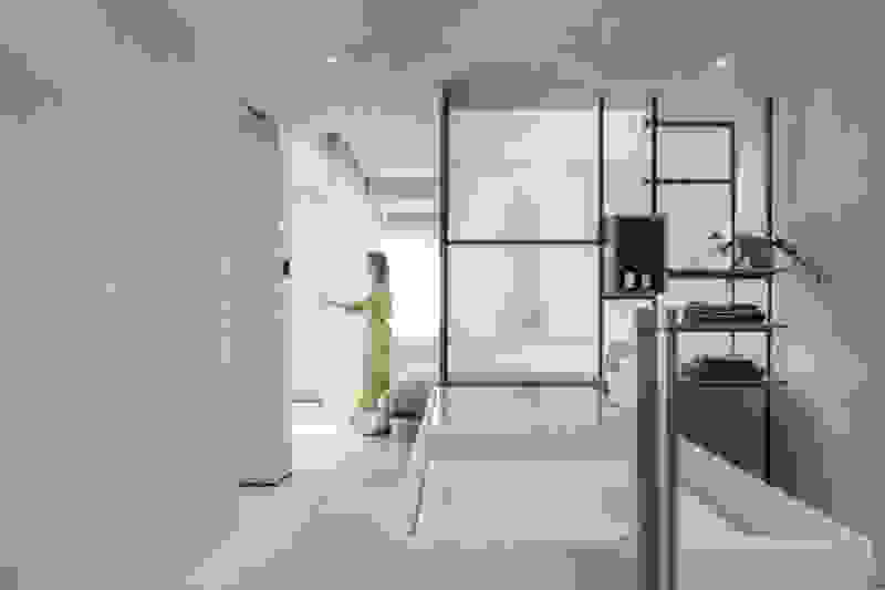
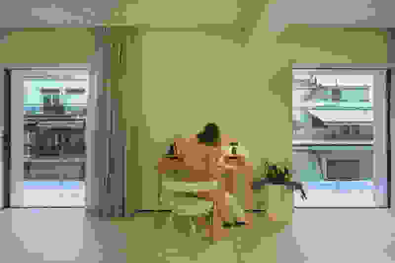
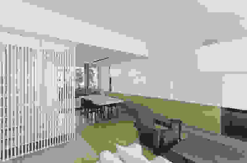
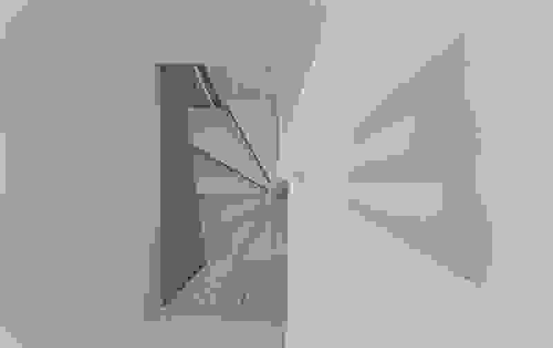
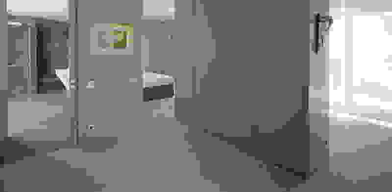
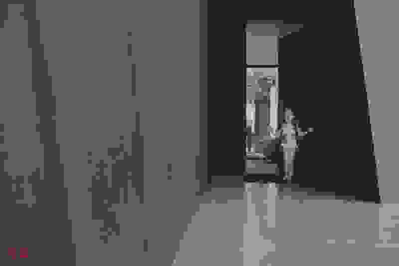
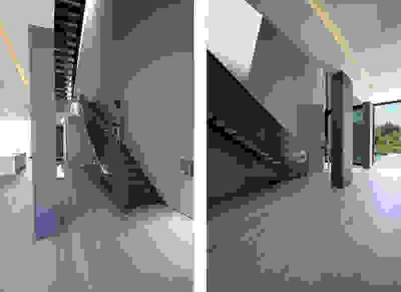
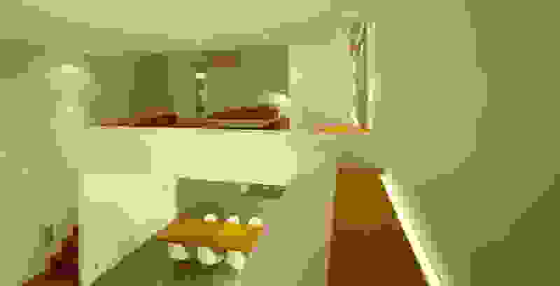
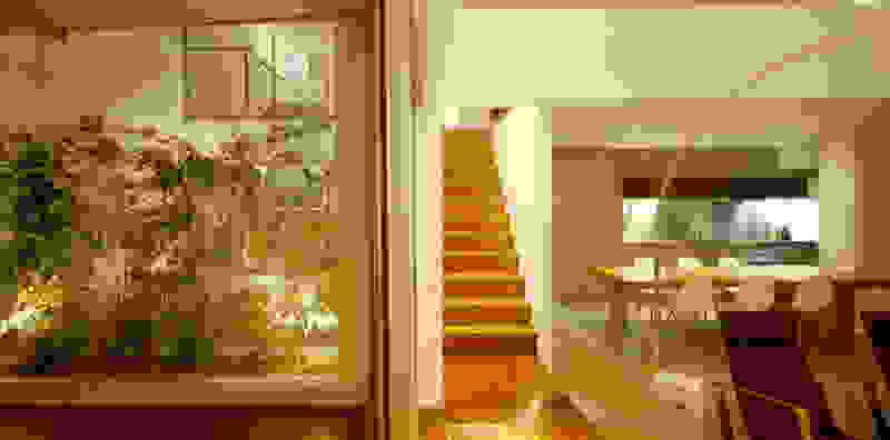
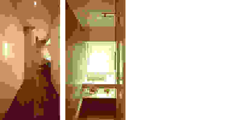
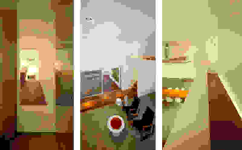
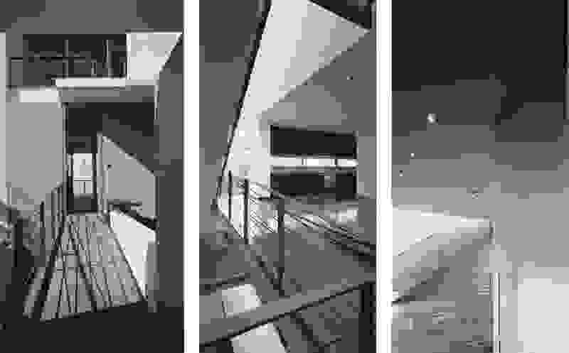
Trencadís’ rooms simulate a promenade at a mountain village. Their paths unfold on the terrain, constantly changing the vistas, enriching our perception with different atmospheres: the first glimpse is not enough -one has to discover where the rooms end, how the road will unfold, what is hidden behind a corner. The narrative of the traditional village is maintained not by its iconography -its picturesque facades- but by the movement of the body within the landscape. The proposal pursues the particular, the local, that which is not readily recognized and consumed because it doesn’t fit a recognizable structure. It encourages discovery.

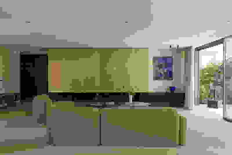
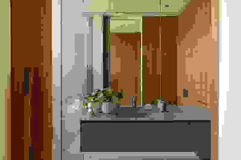
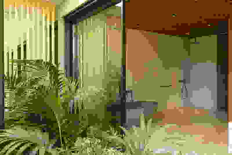
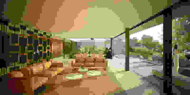
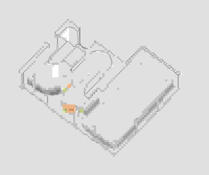
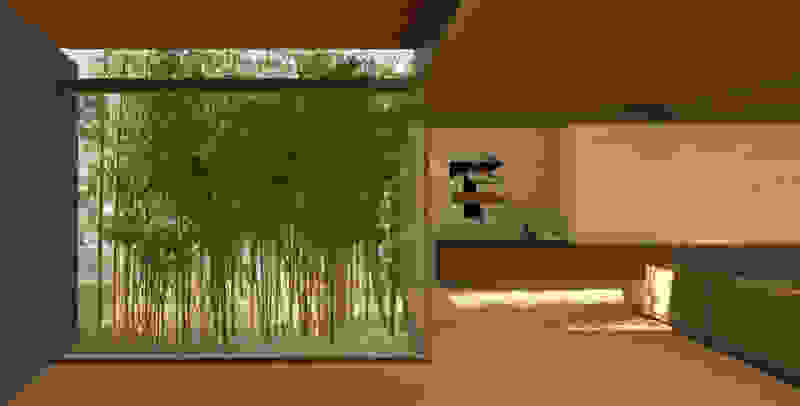
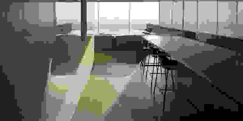
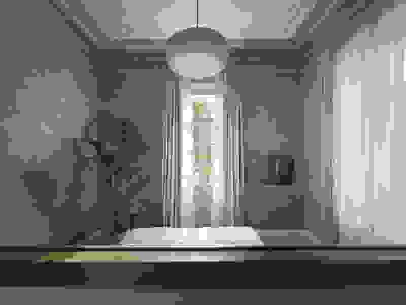
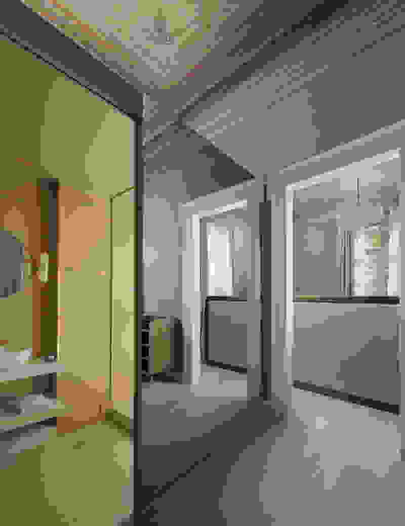
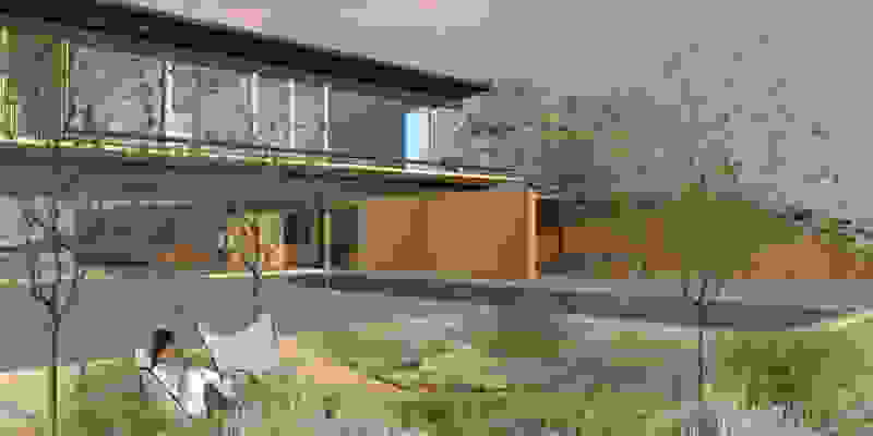
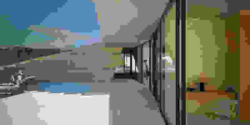
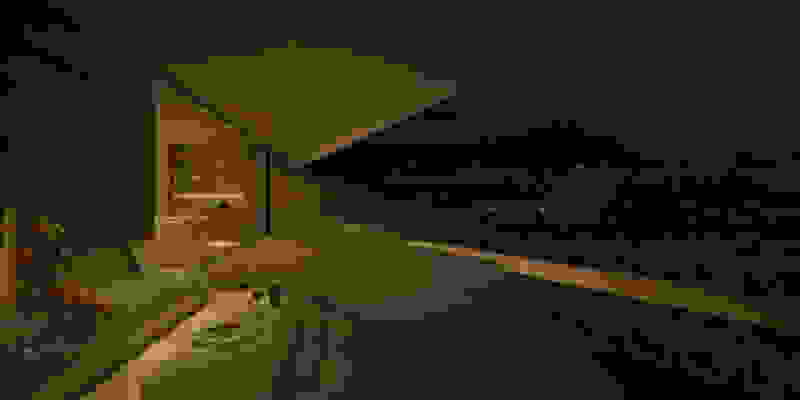
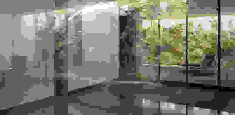
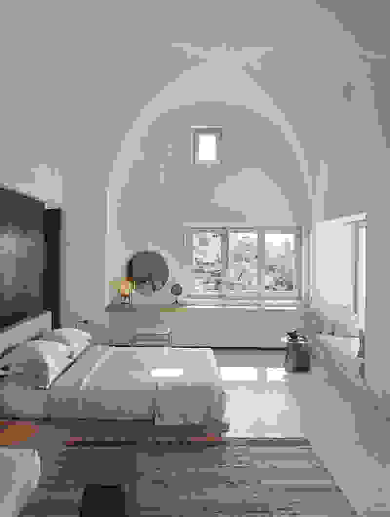
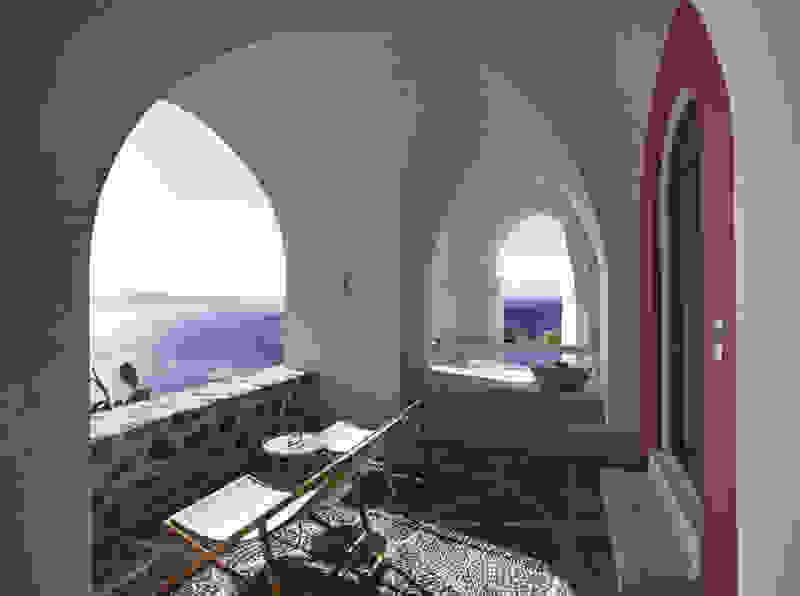
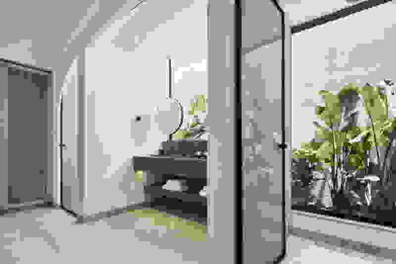
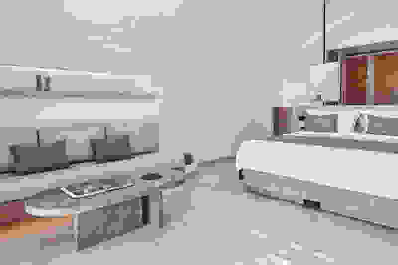
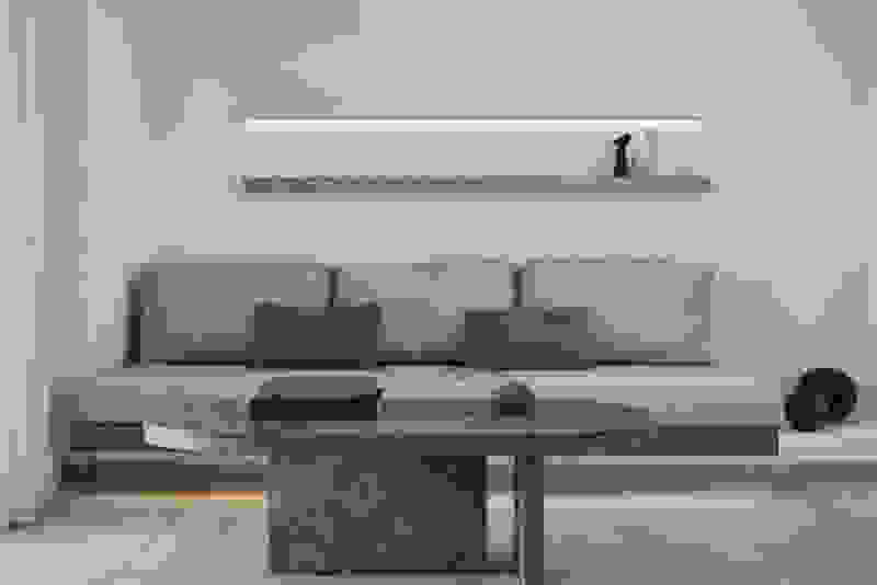
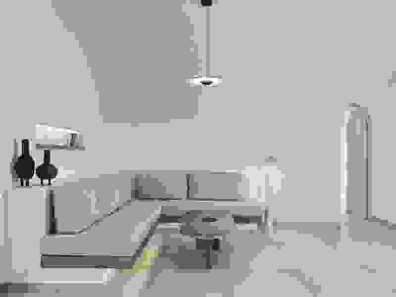
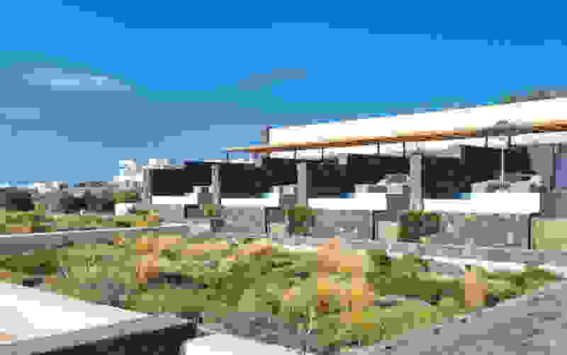
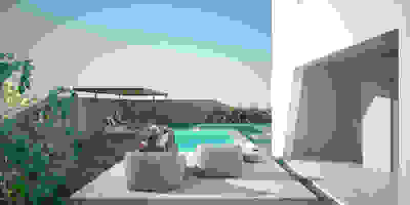
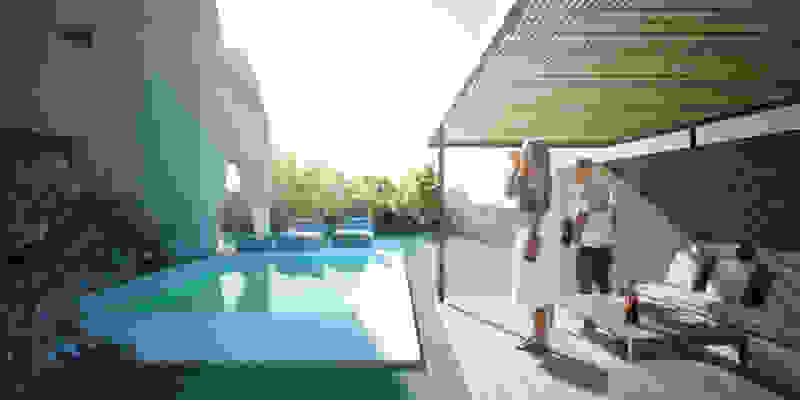
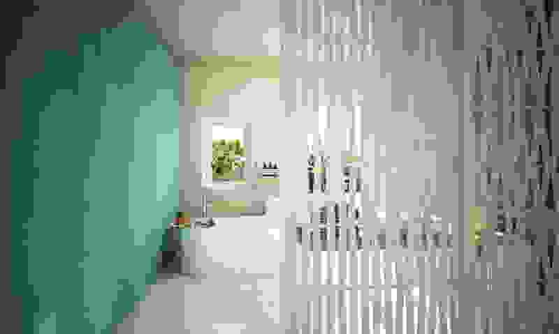
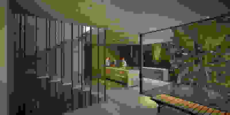
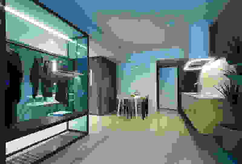
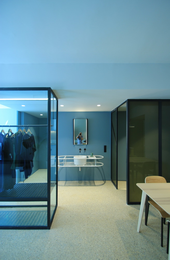
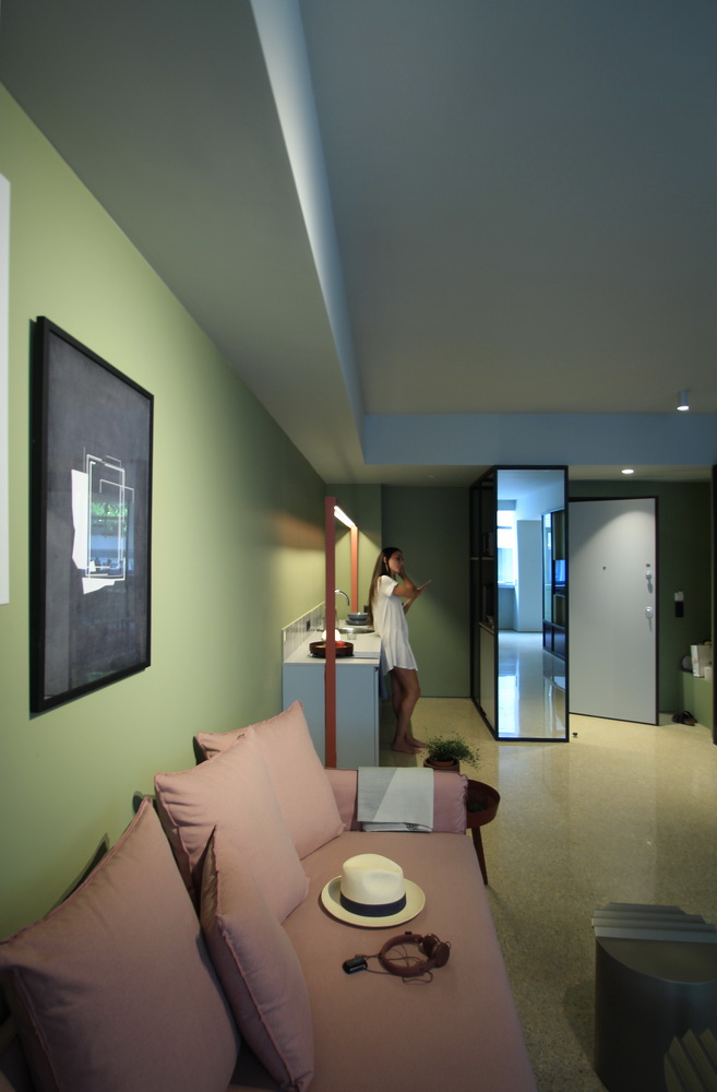
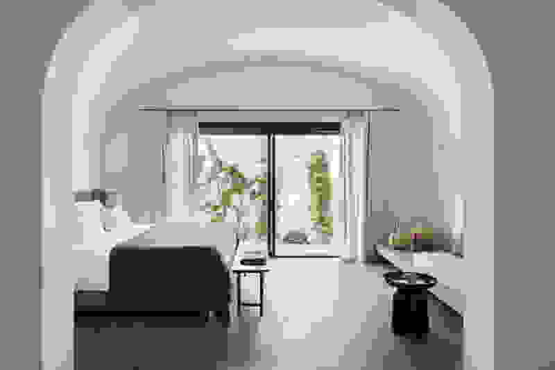
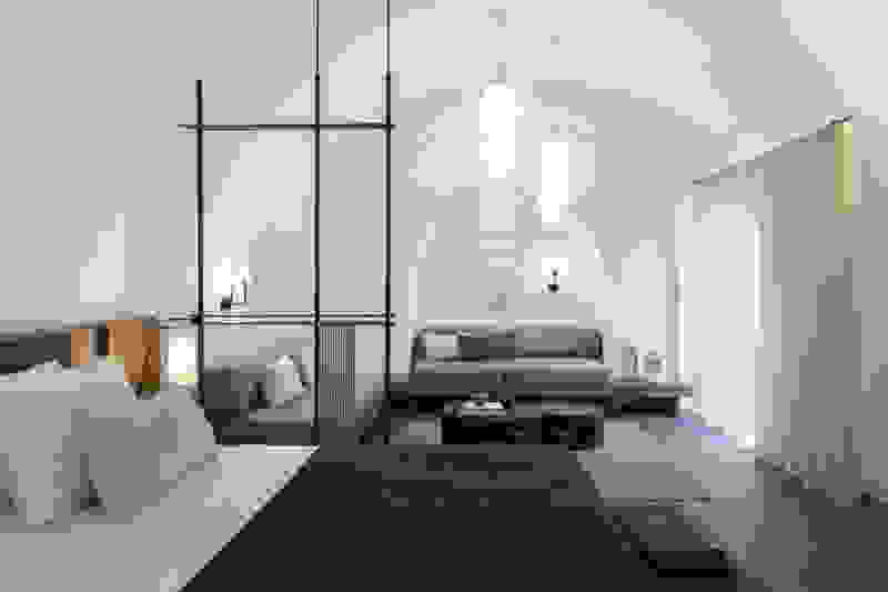
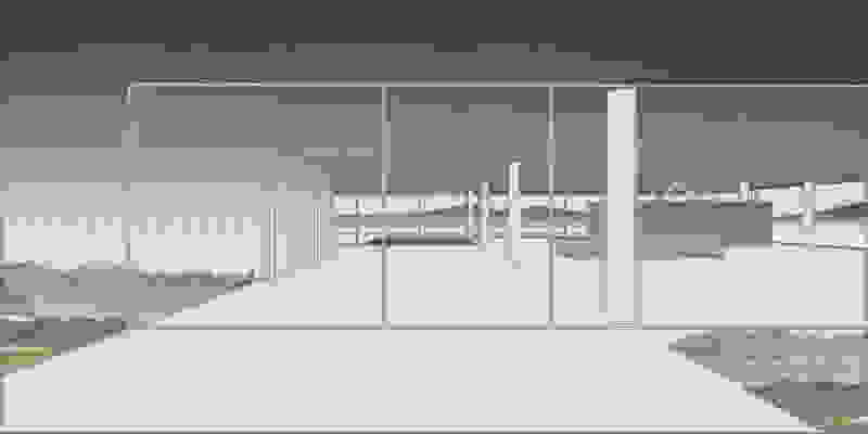
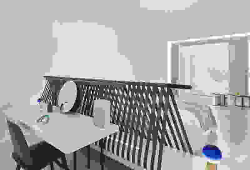
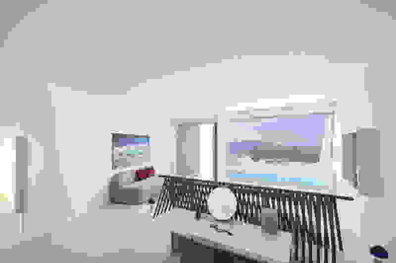
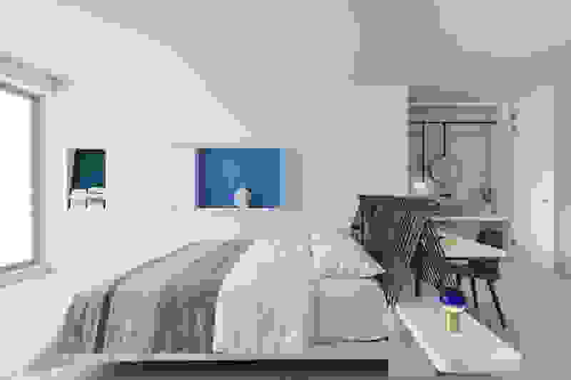
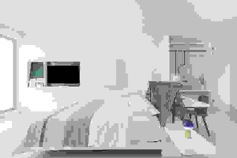
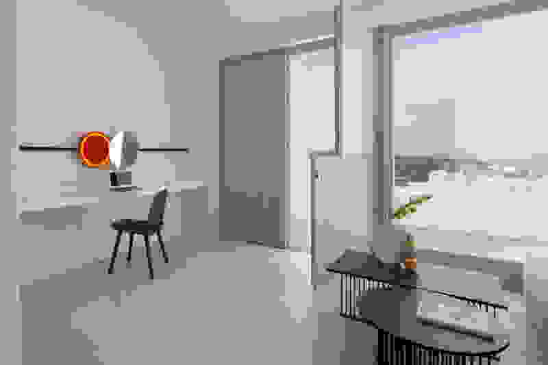
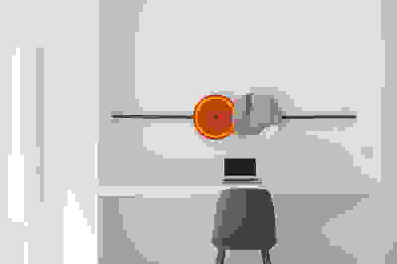
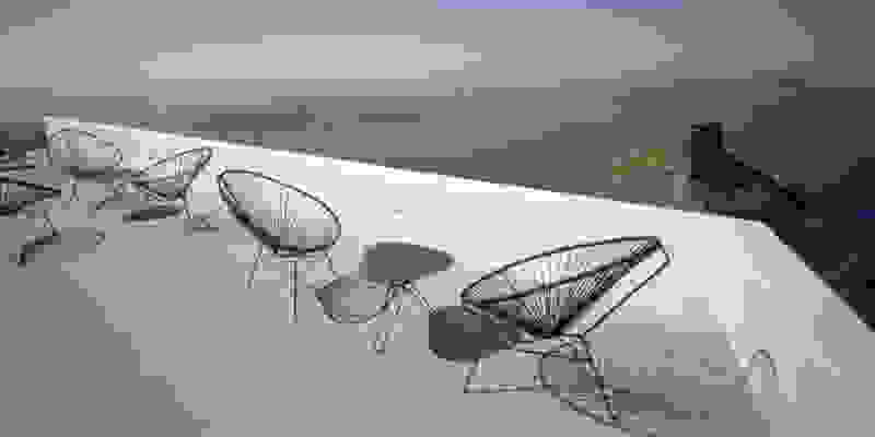
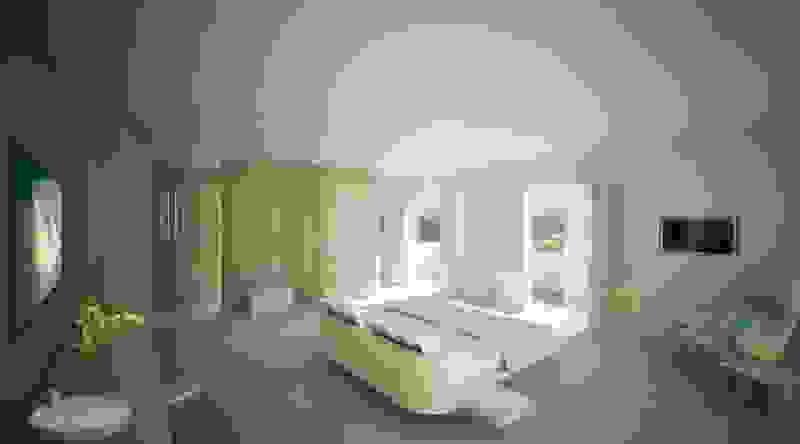
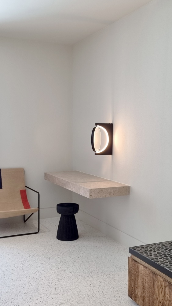
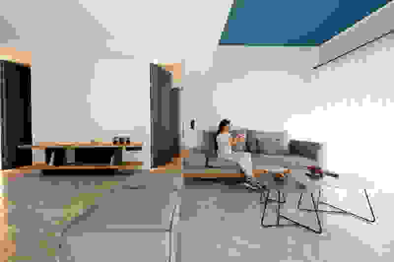
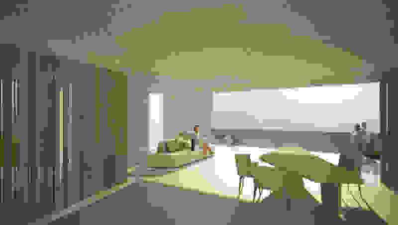
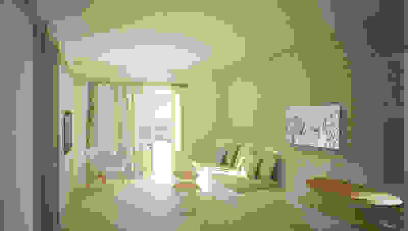
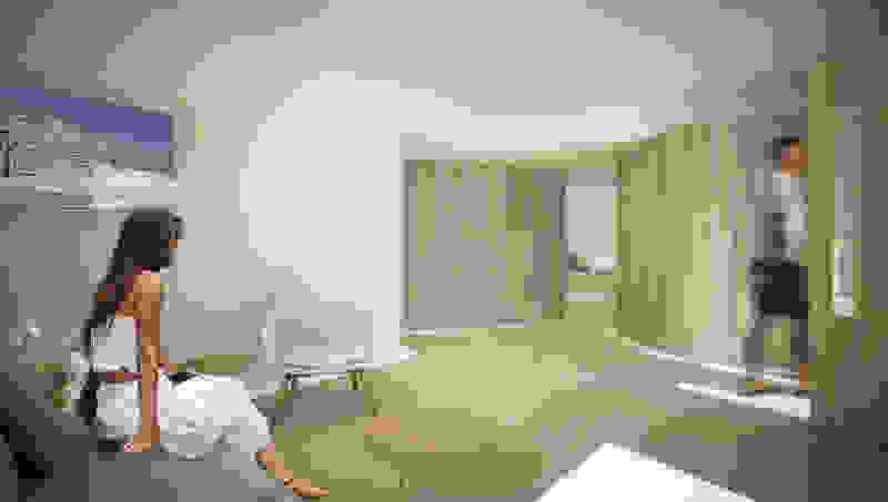
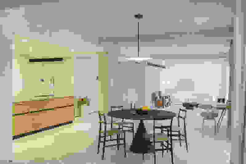
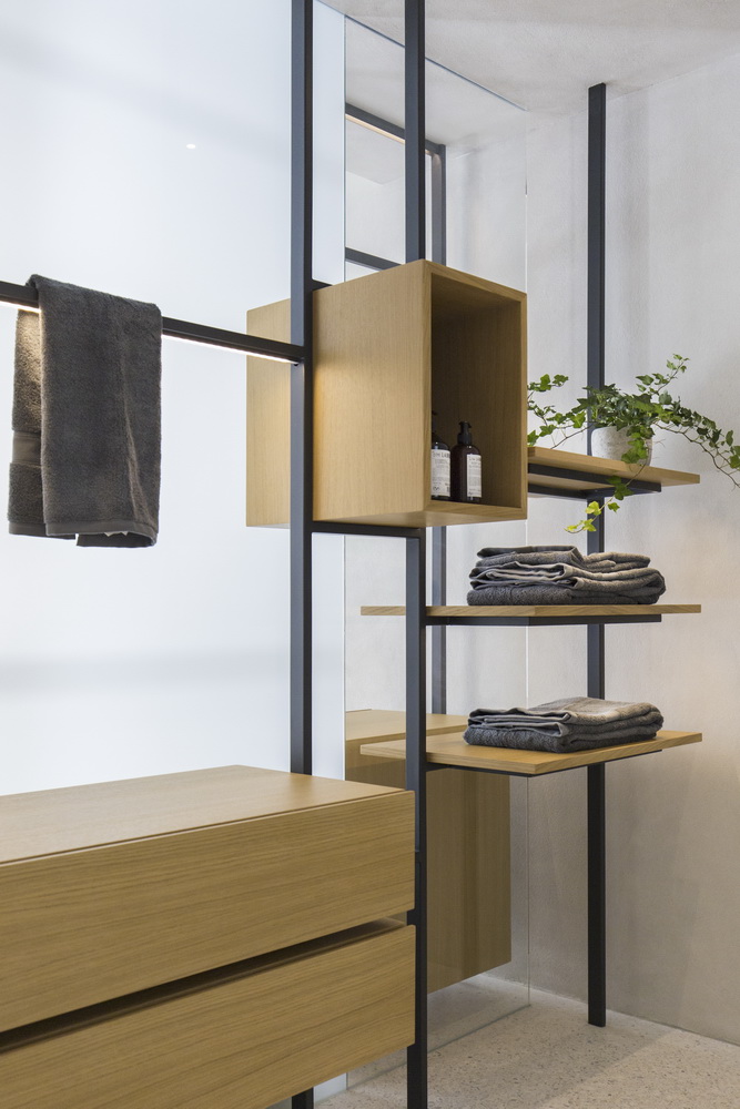
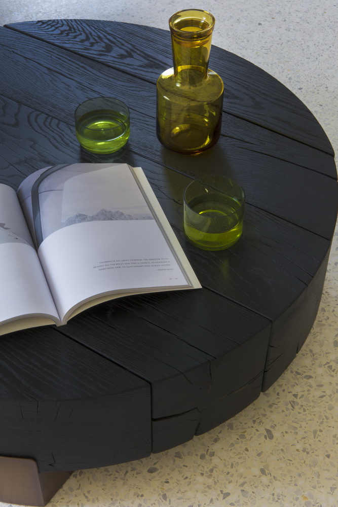
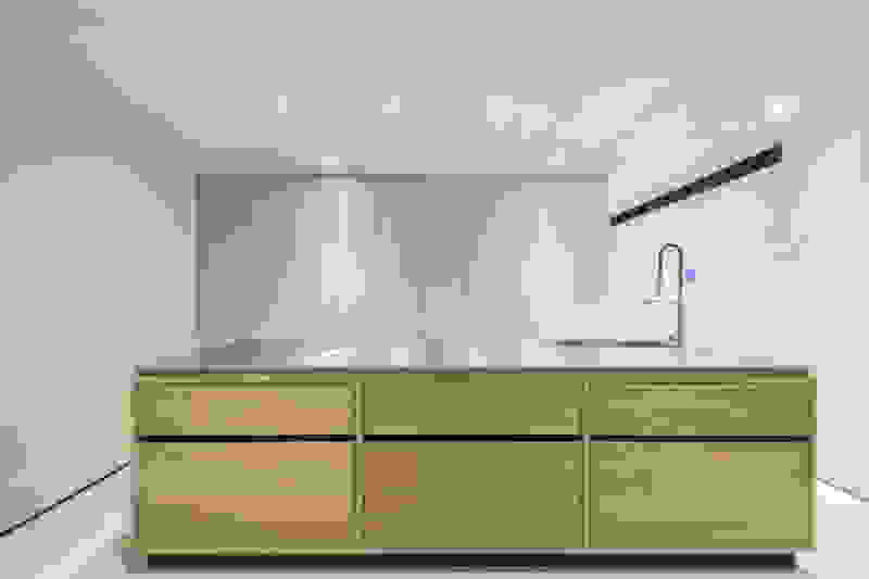
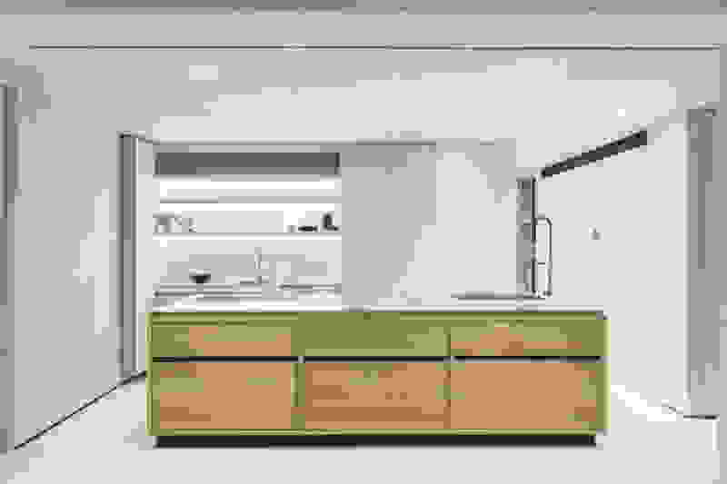
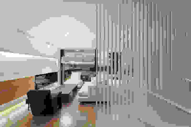
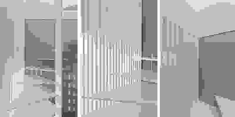
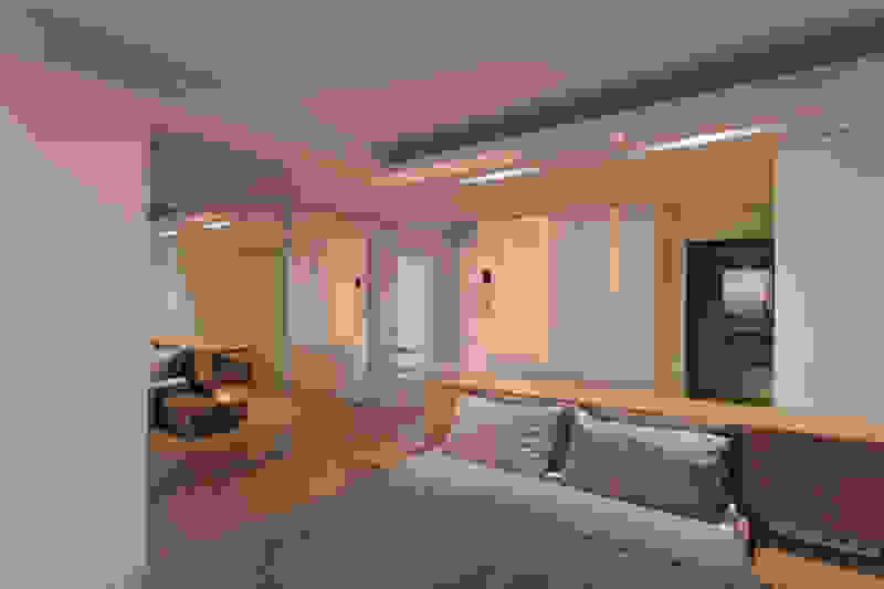
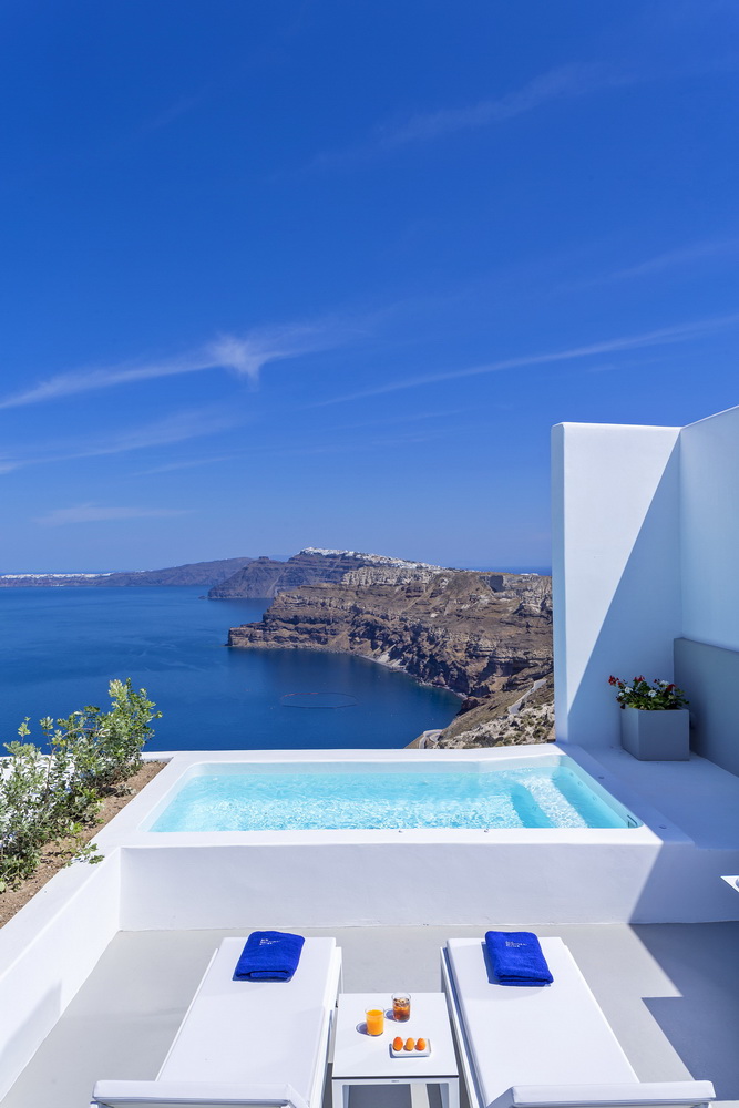
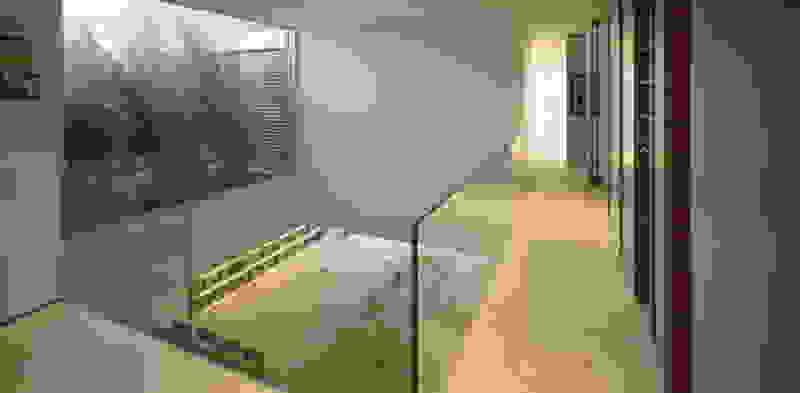
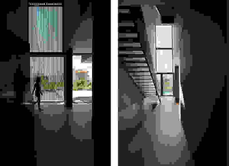
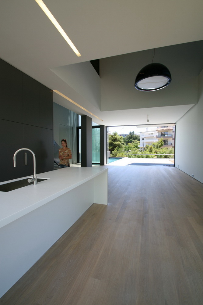
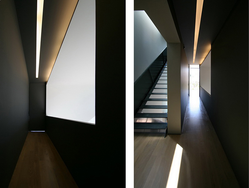
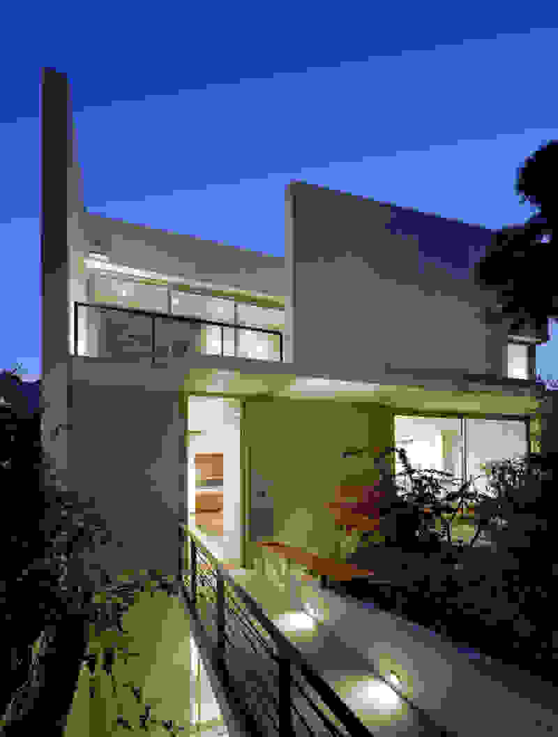
Rooms are grouped in three types with different footprints: types A and B become the predominant types and only at the beach front one is to encounter the Sand Dune Villas. The first two types are grouped in four or five units, under a common planted roof with a polygonal outline -each with a plunge pool and access from the back that ensures privacy, separated with berms and vegetation. The basic principle of both typologies is transparency and natural lighting.

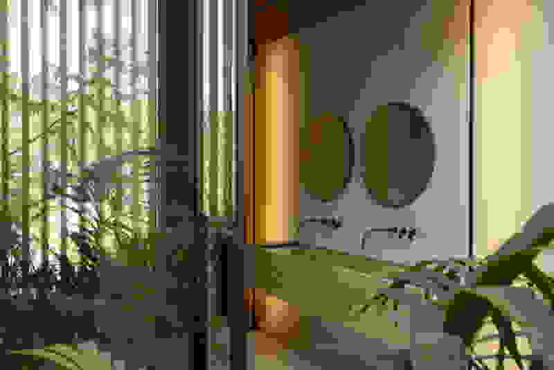
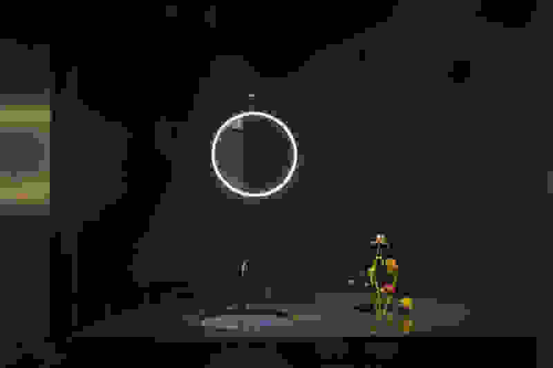
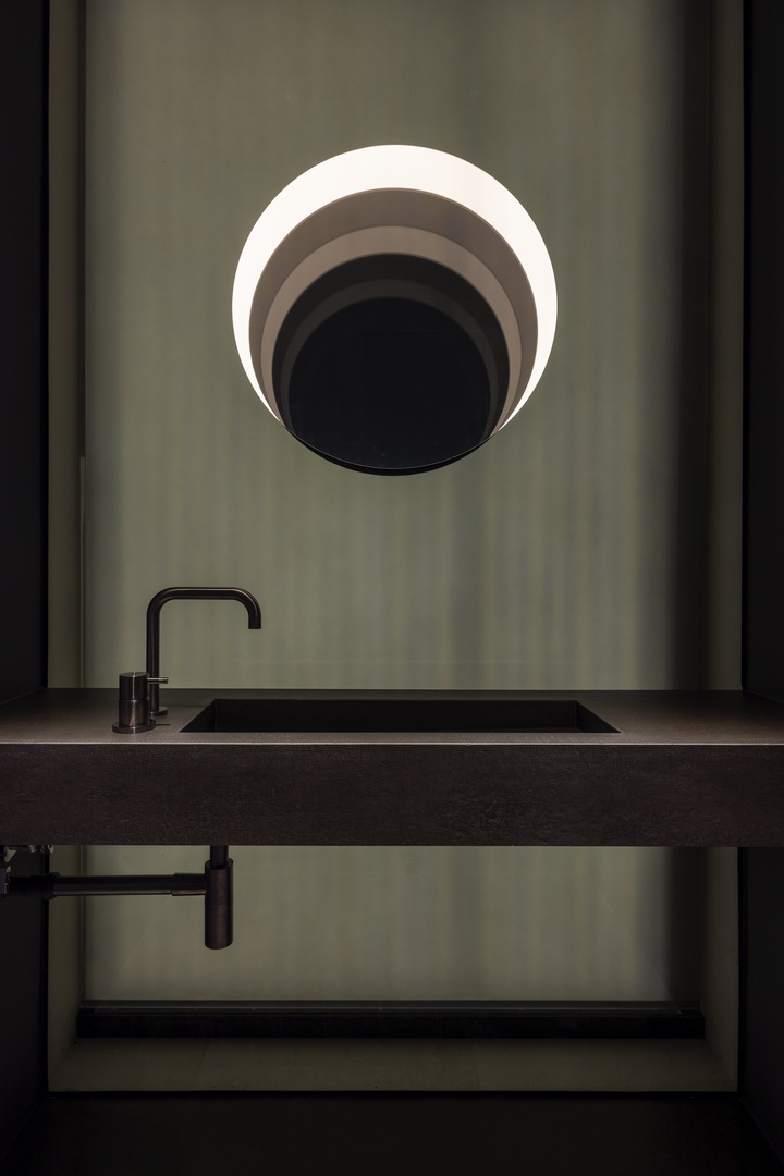
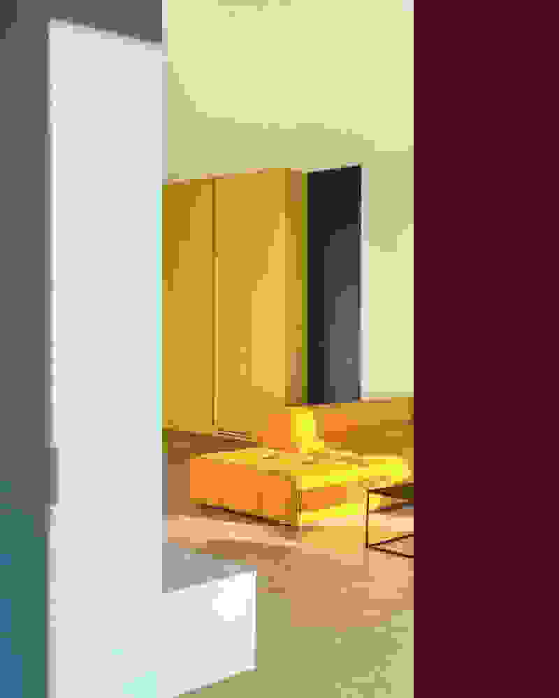
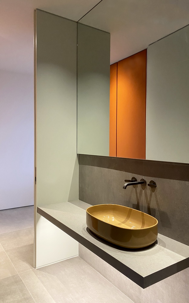
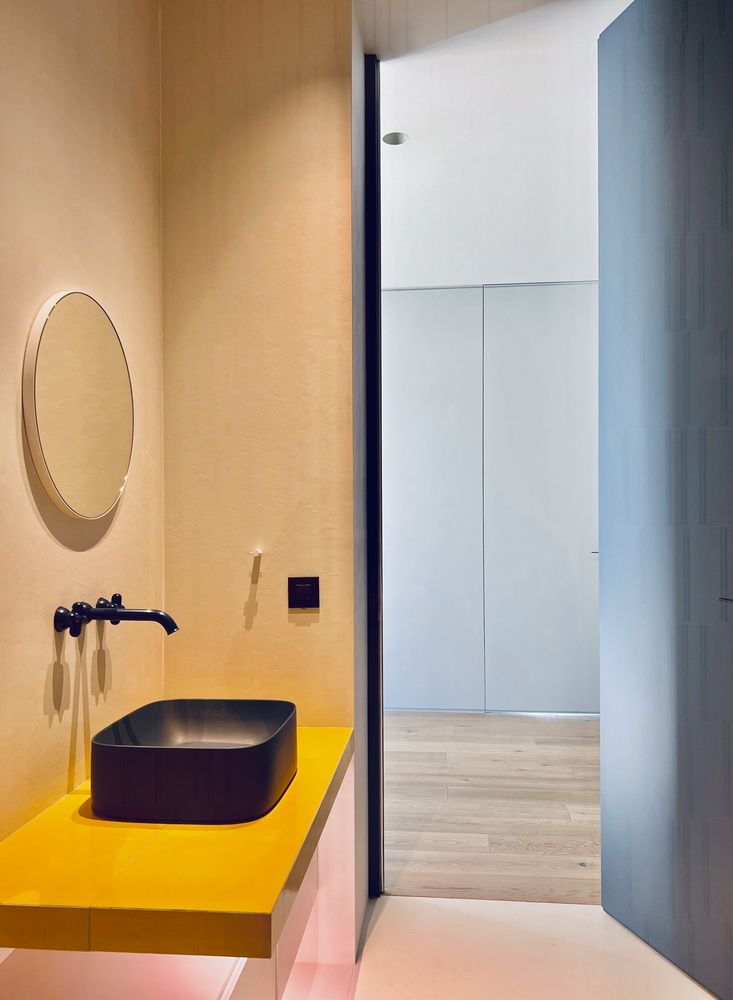
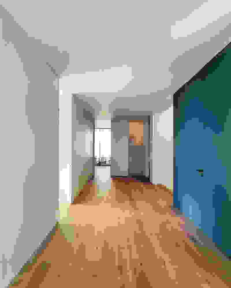
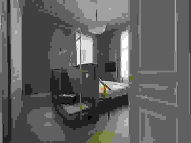
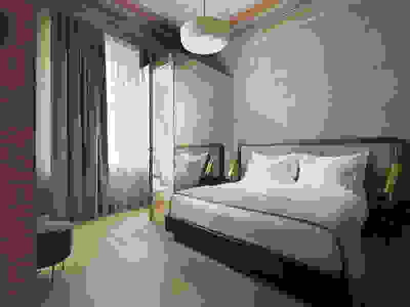
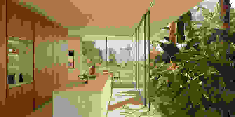
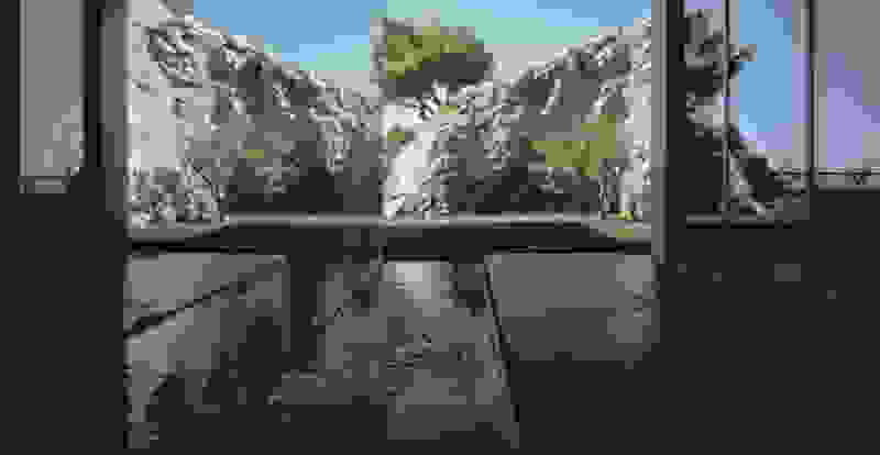
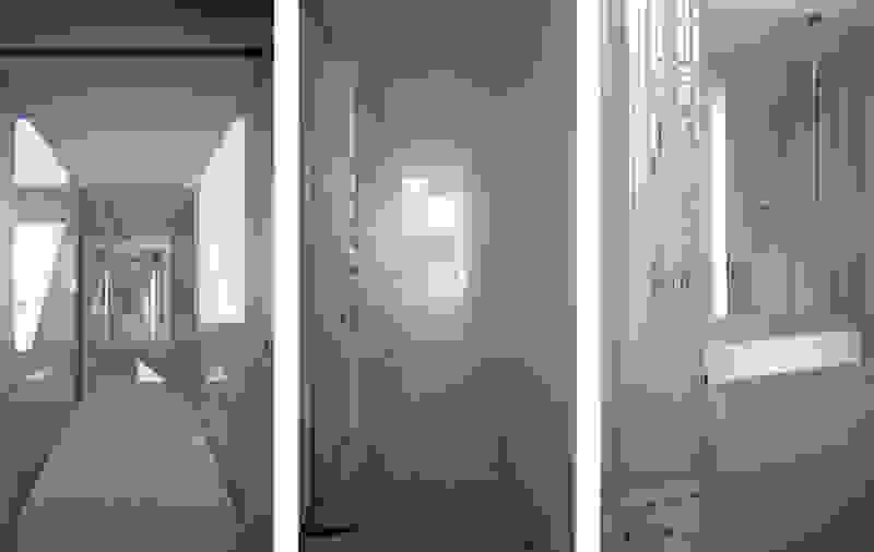
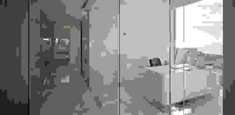
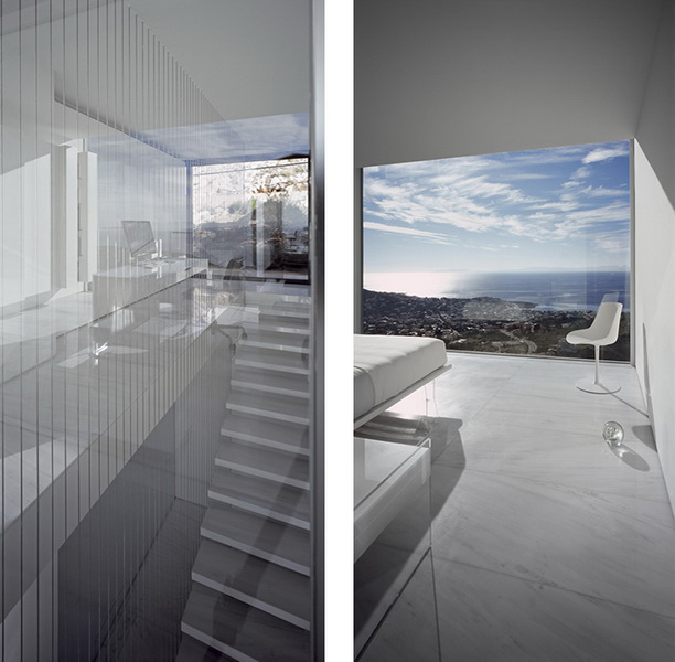
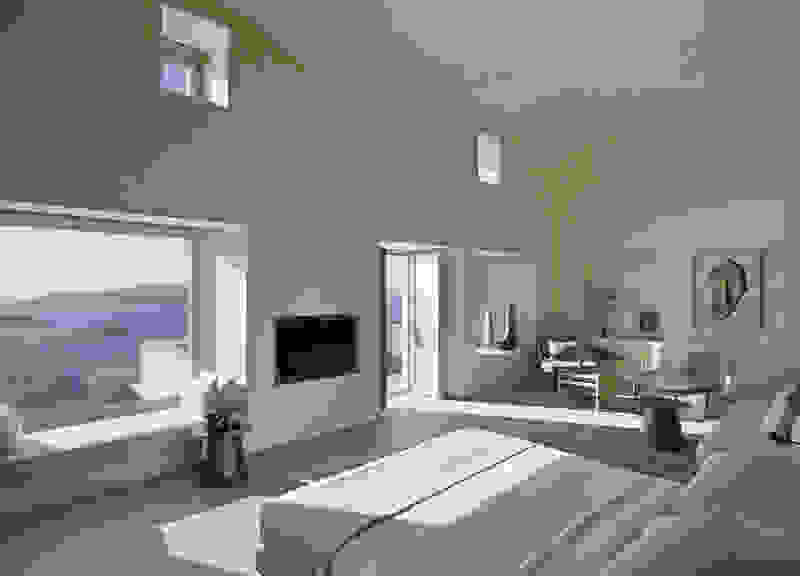
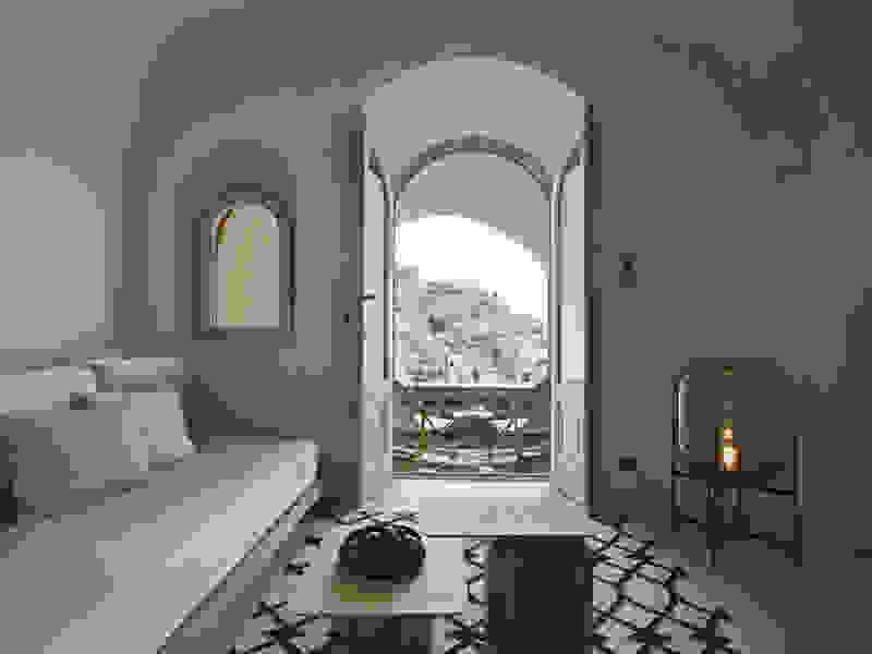
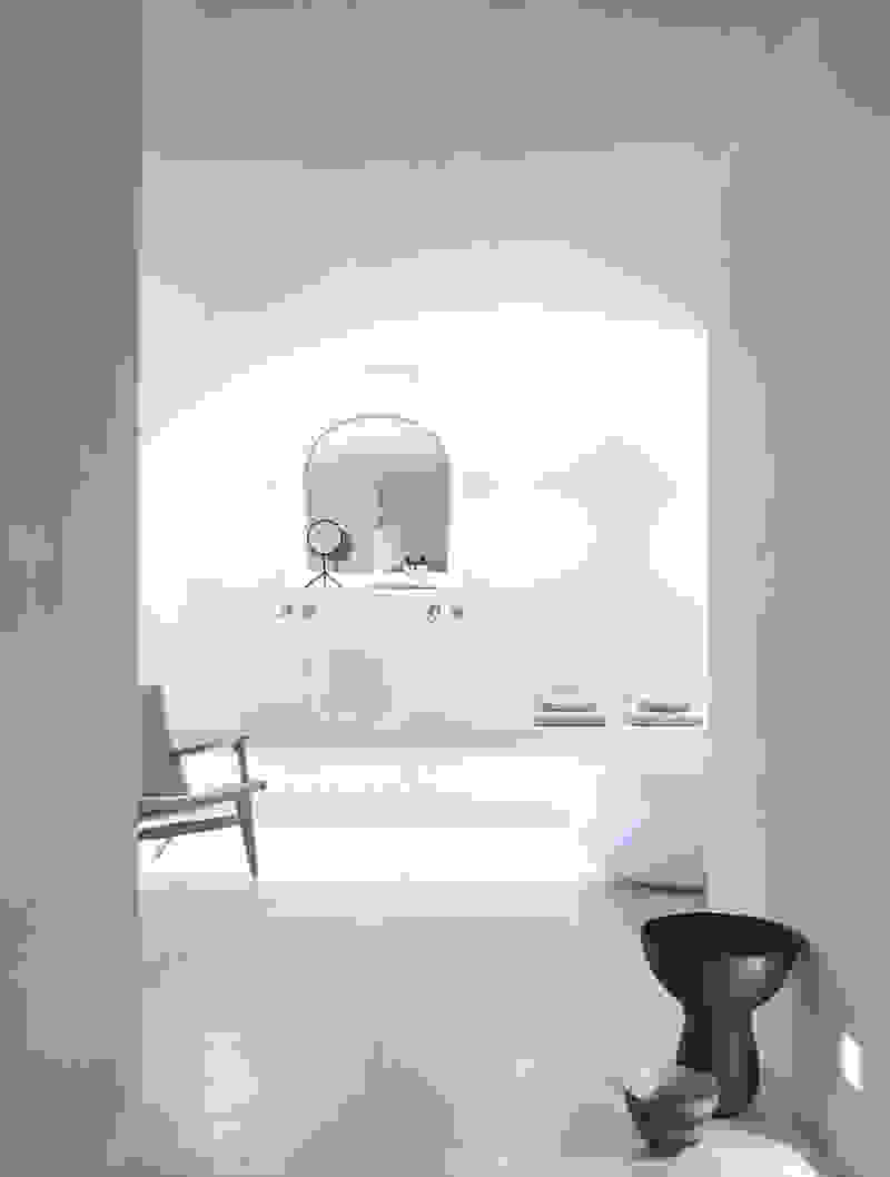
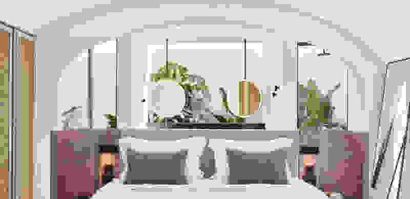
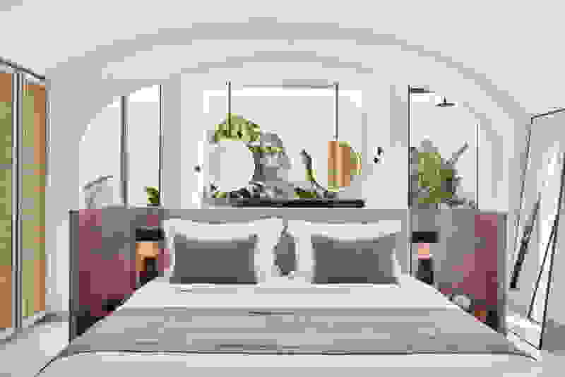
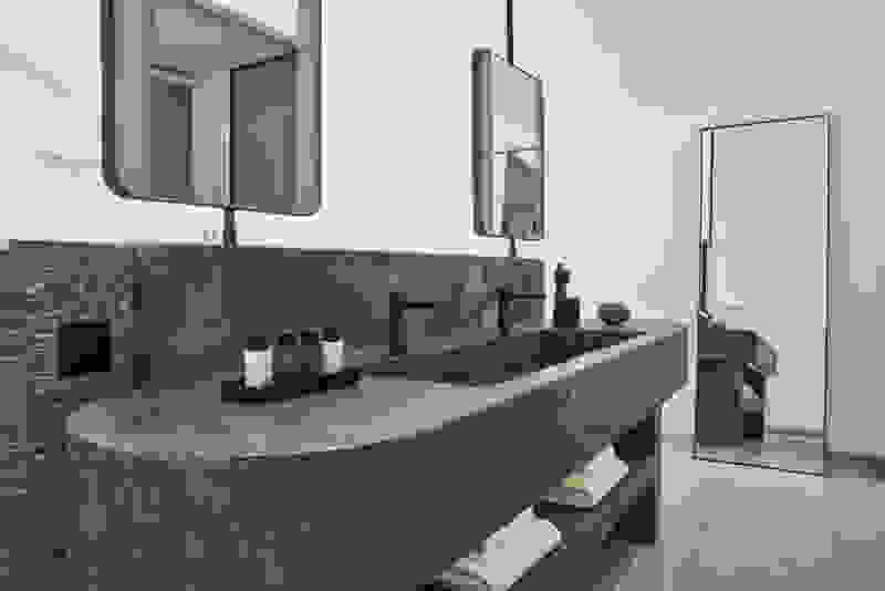
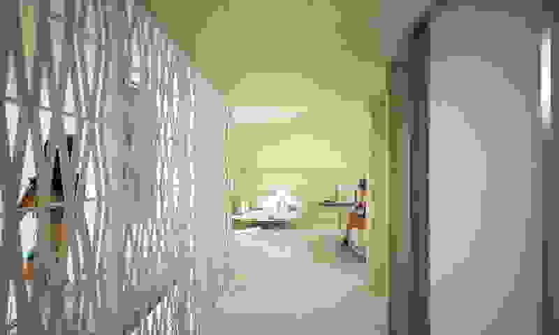
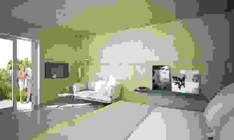
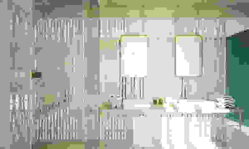
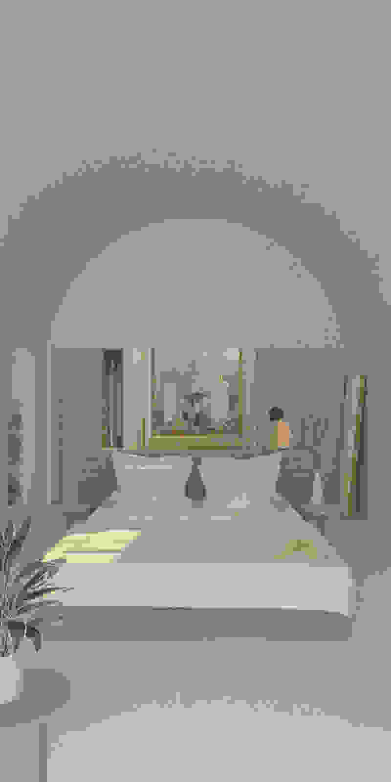
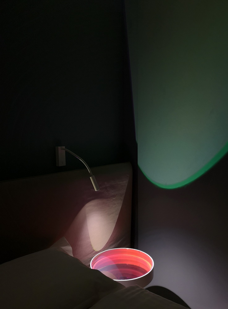
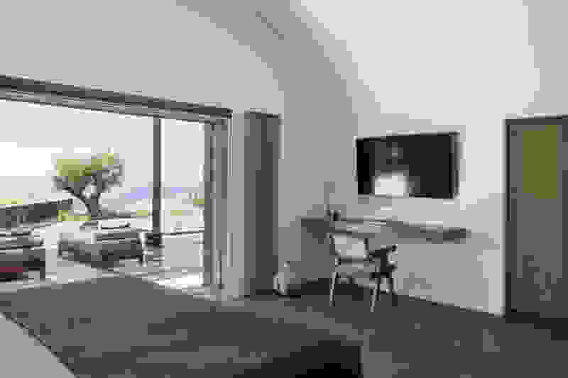
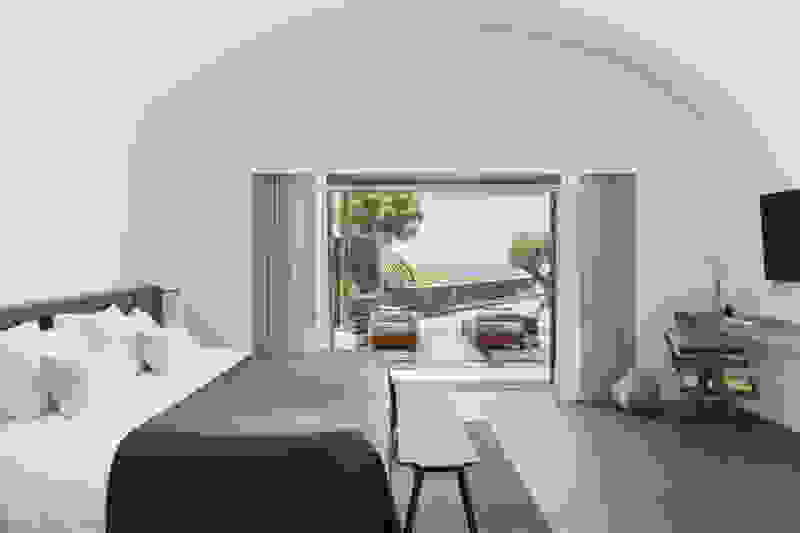
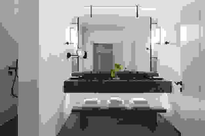
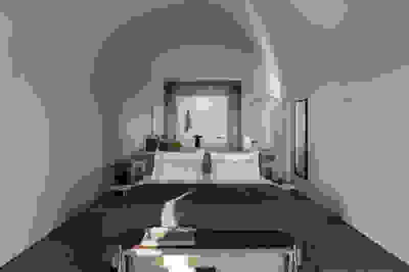
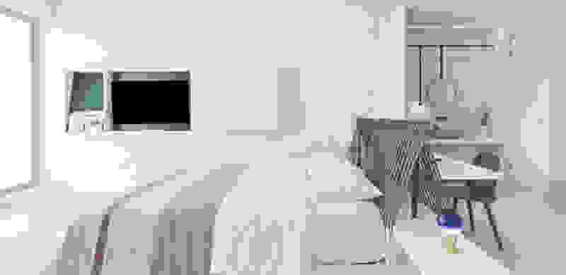
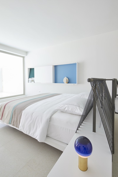
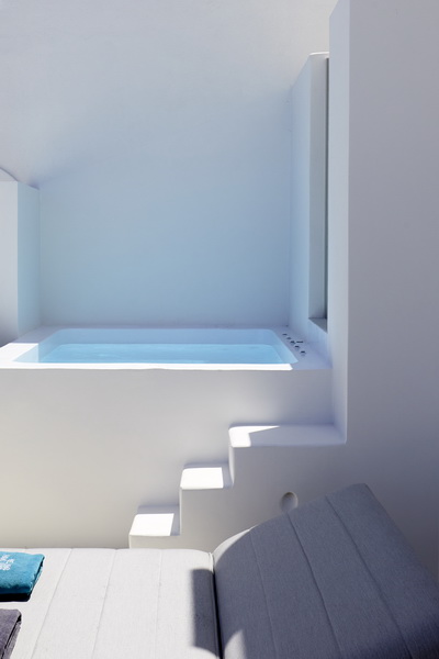
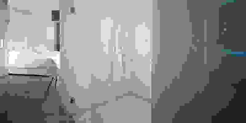
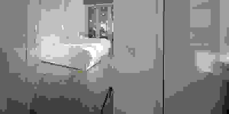
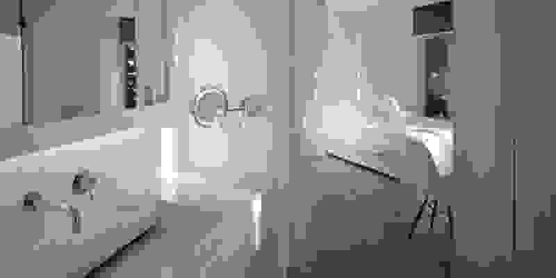
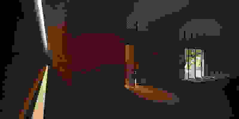
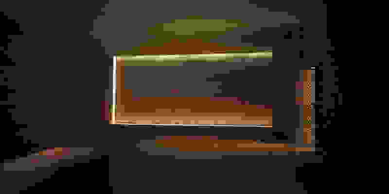
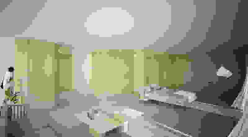
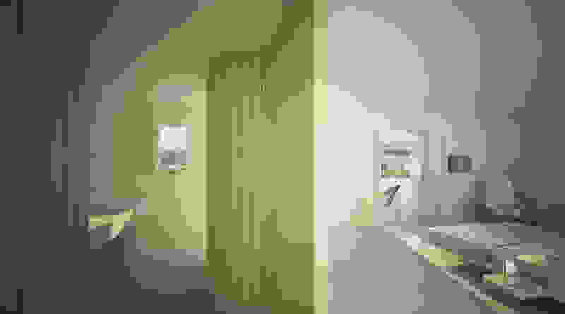
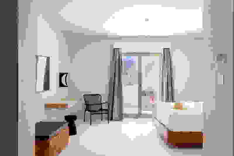
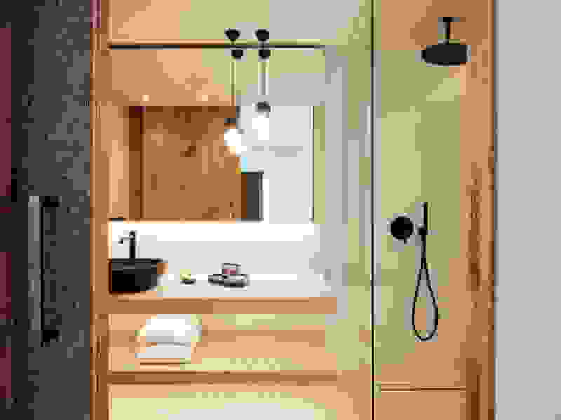
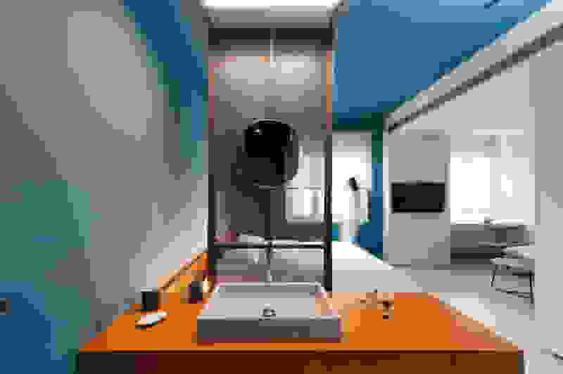
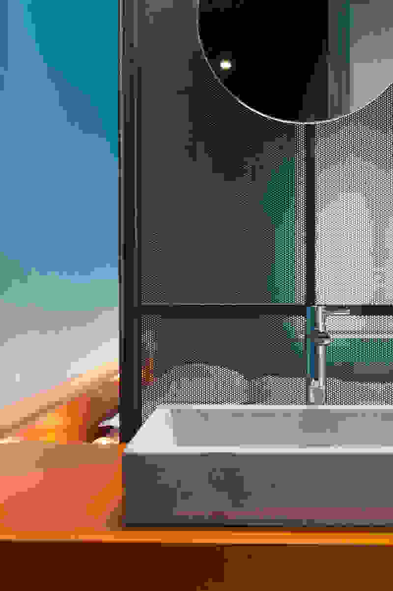
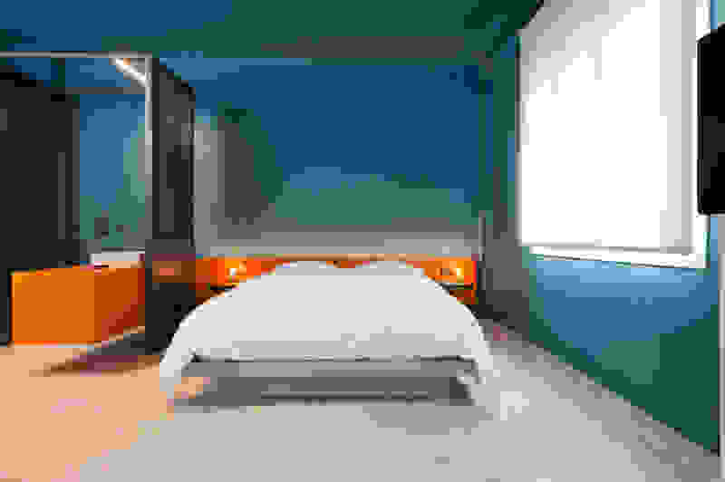
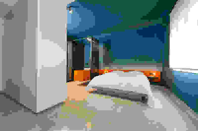
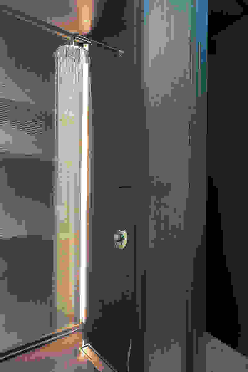
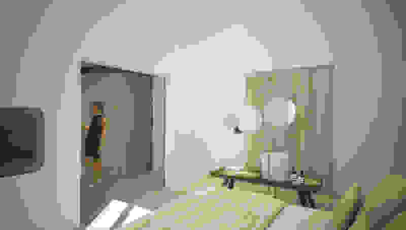
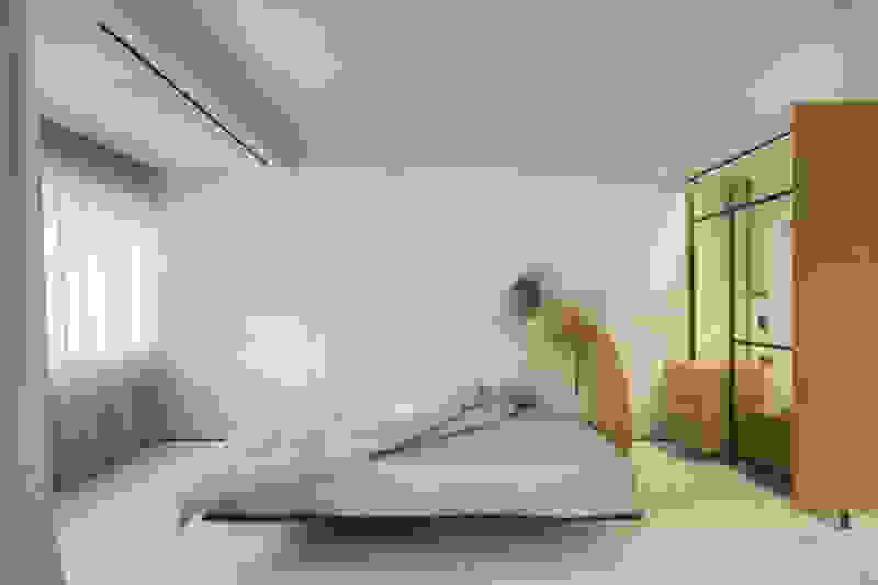
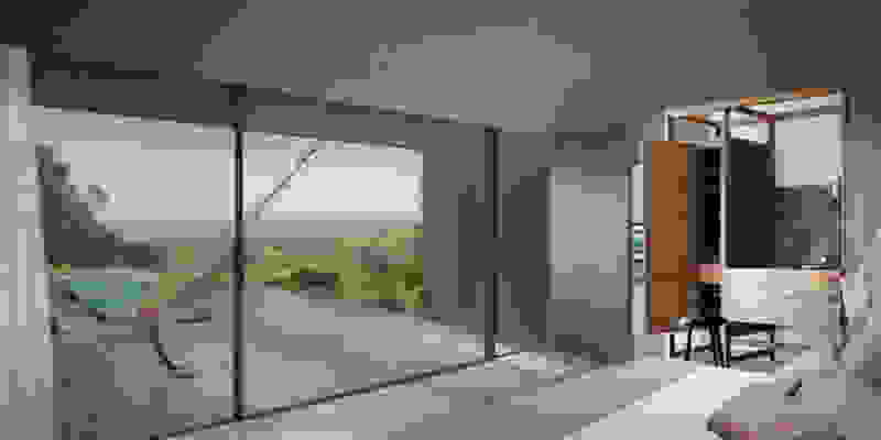
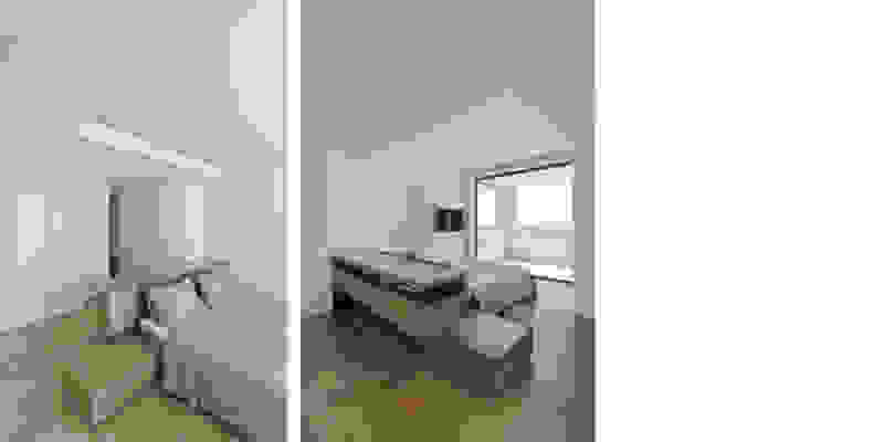
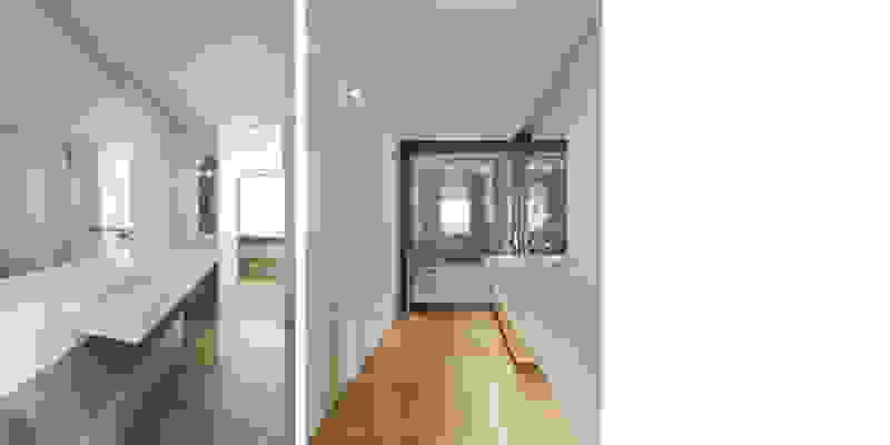
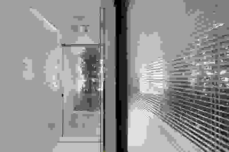
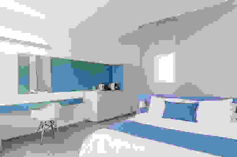
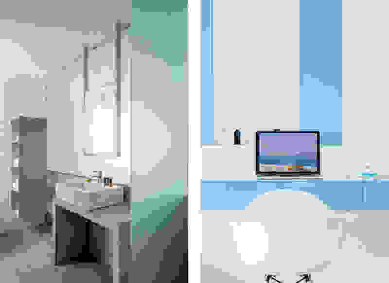
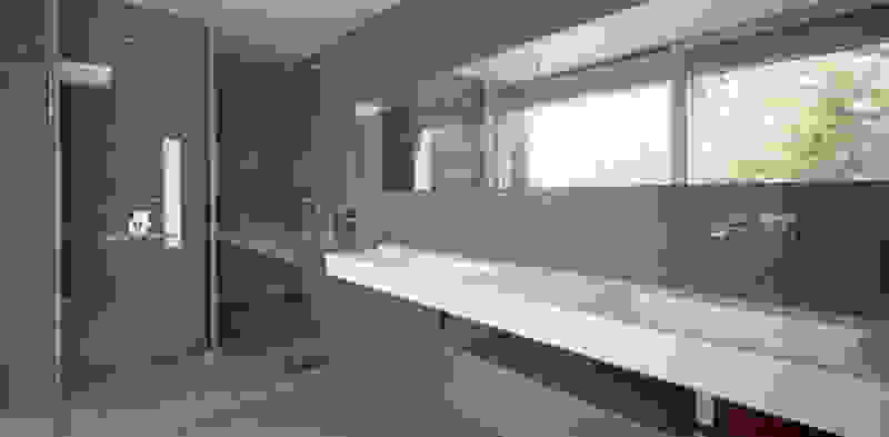
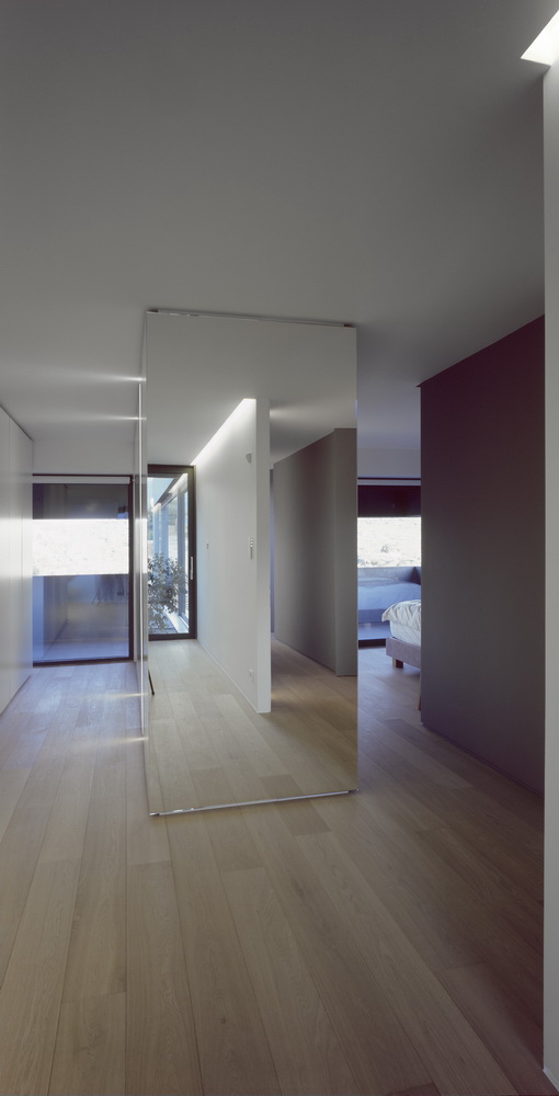
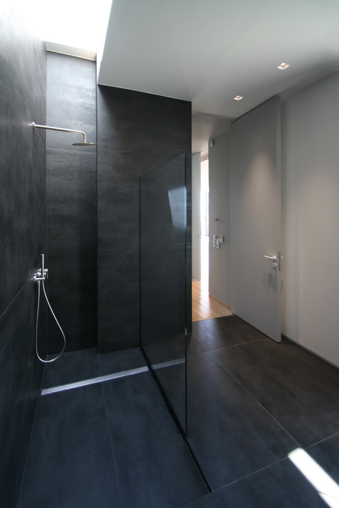
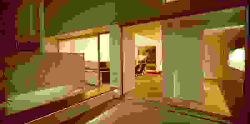
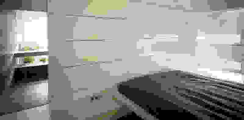
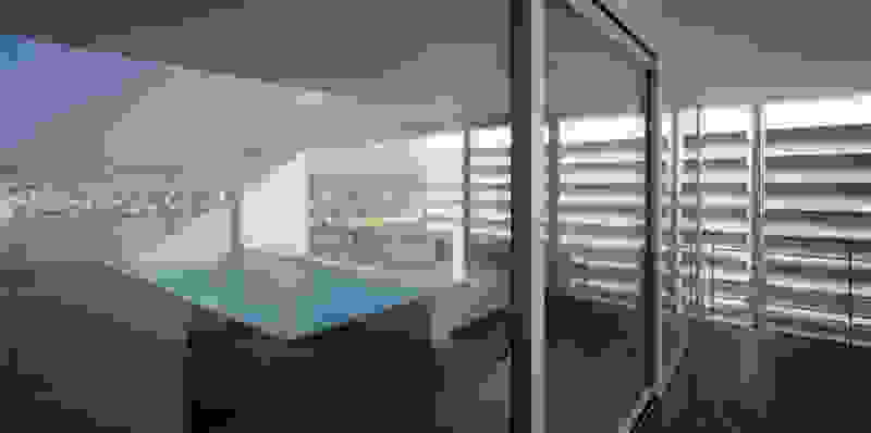
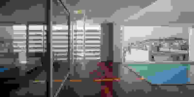
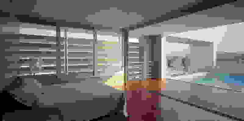
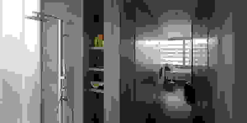
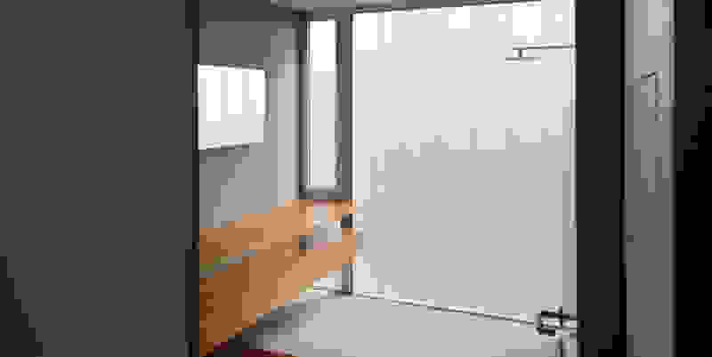
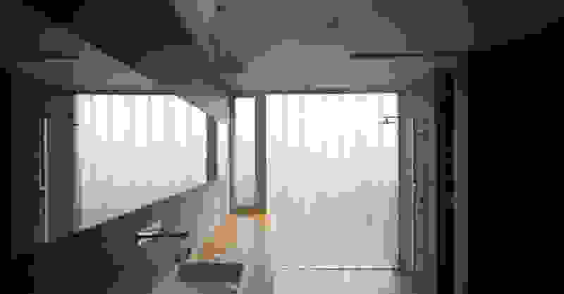
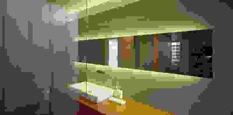
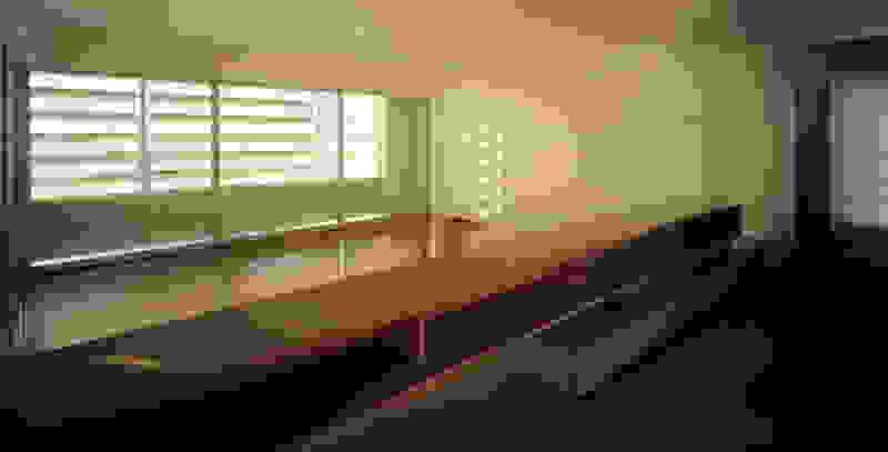
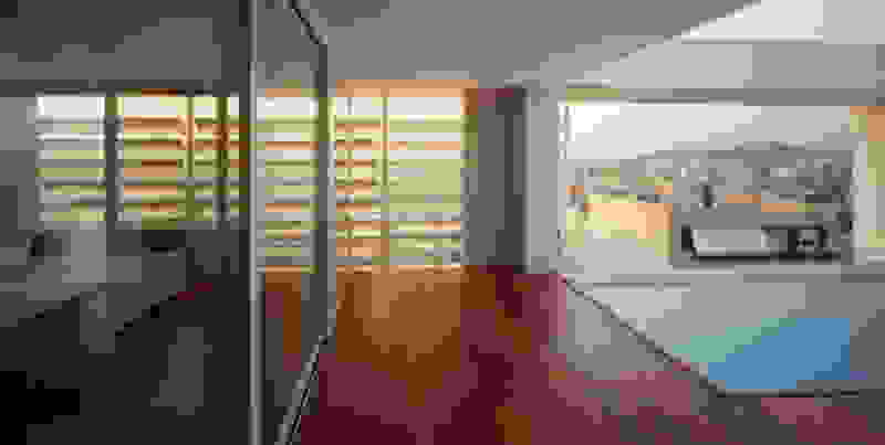
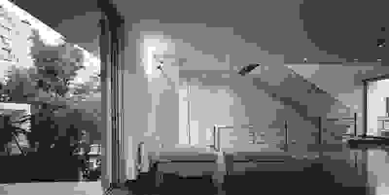
Type A is a rectangular typology with access both from the front view and the backyard. The bed is placed in the center of the room overlooking the private jacuzzi and the sea. The shower is designed on the front side of the room, overlooking the sea and the vegetation.

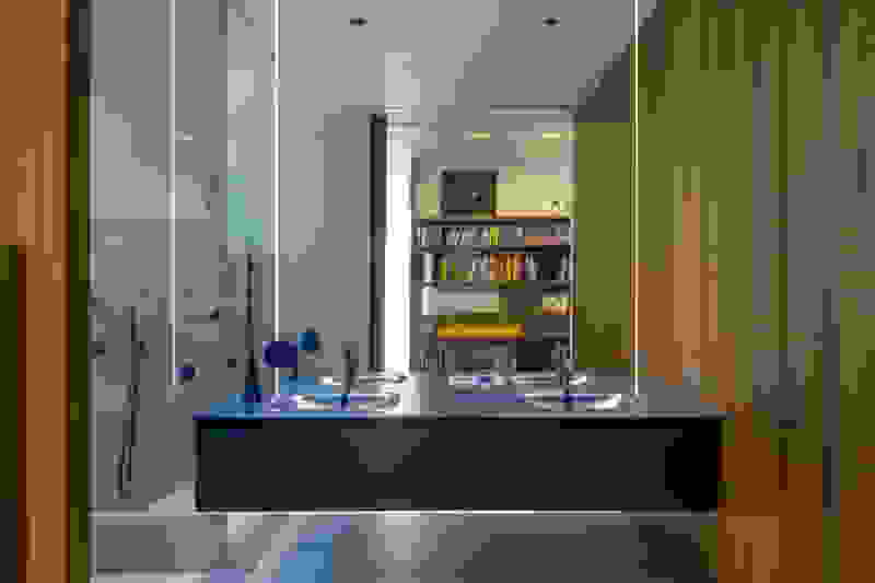
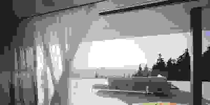
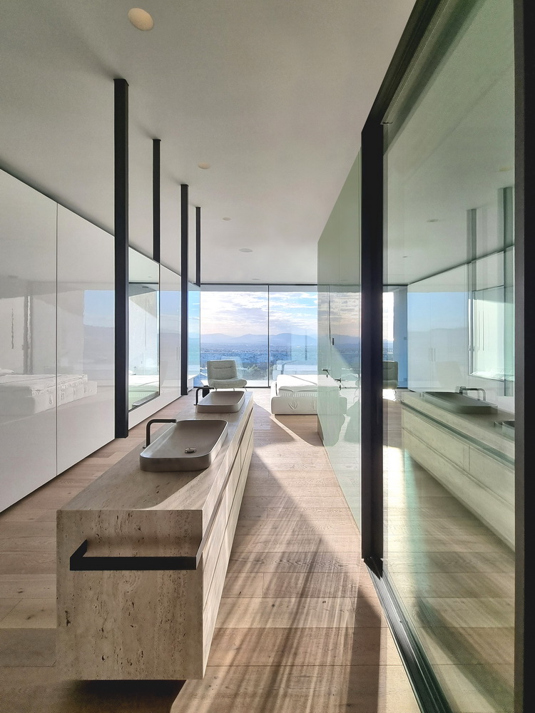
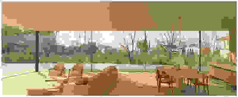
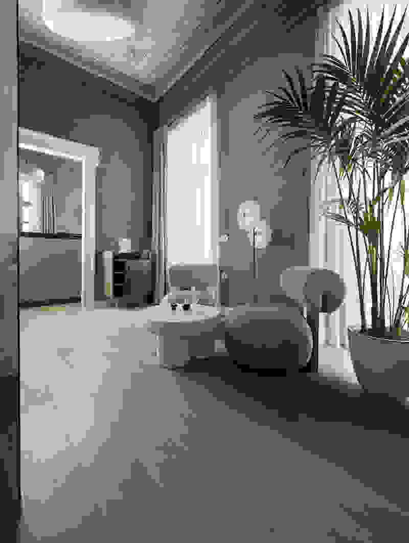
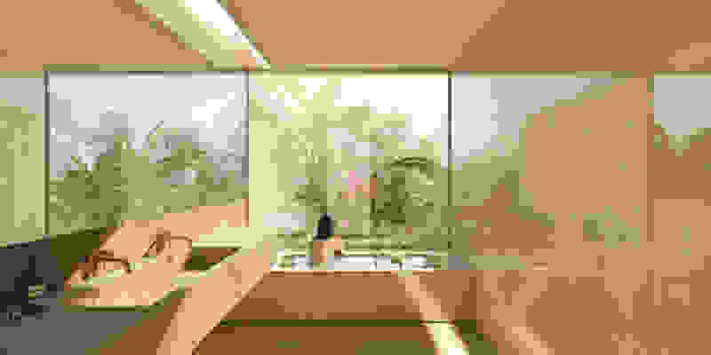
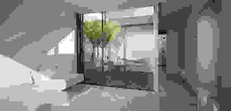
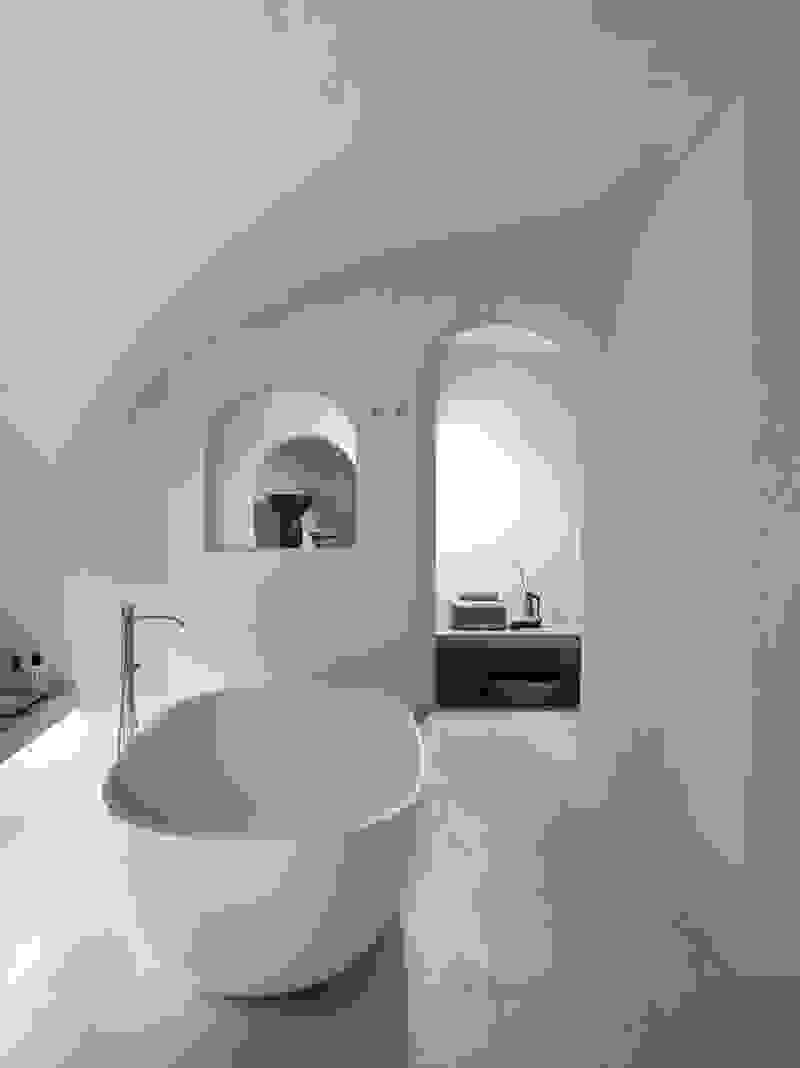
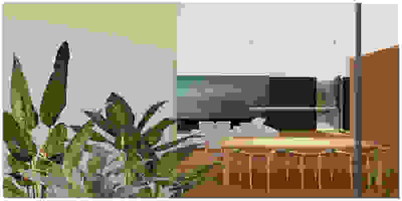
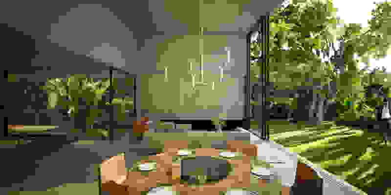
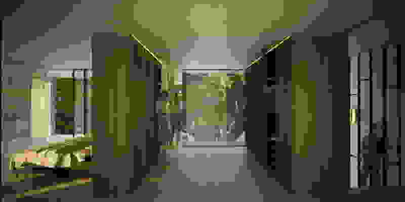
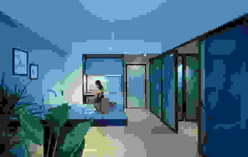
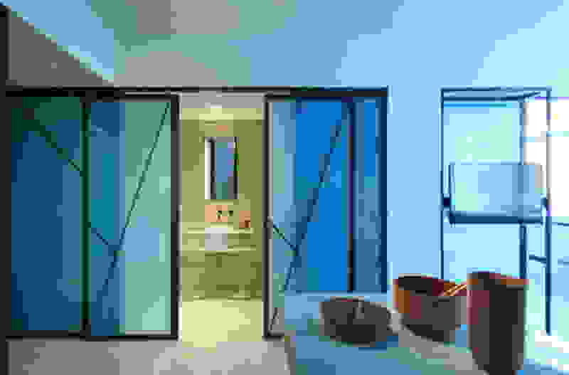
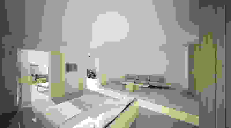
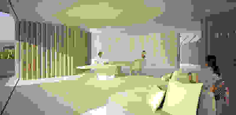
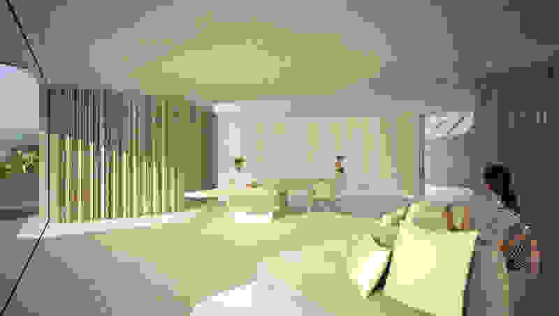
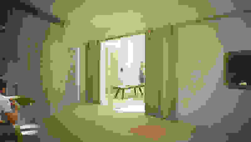
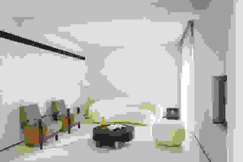
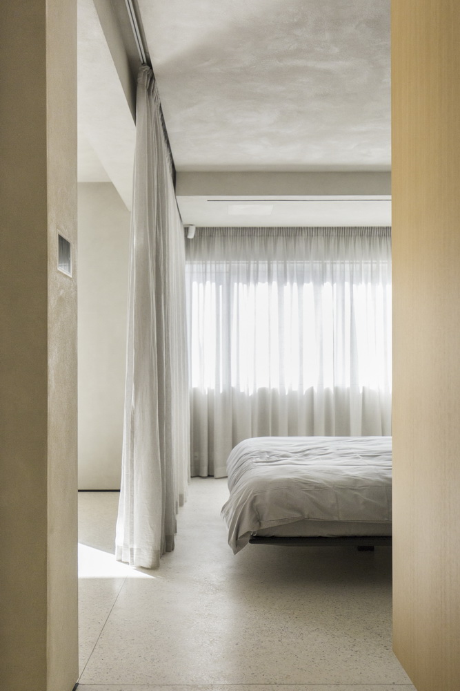
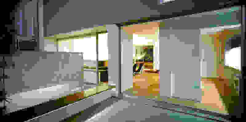
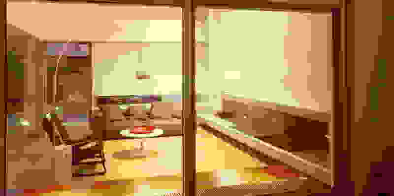
Type B, is a larger, L shaped room with a bedroom and a bathroom, with access from the backyard. It has an unobstructed view of the sea, while the window that separates the inside and the outside at this facade, slides towards the wall, unifying the inside and the outside and practically doubling the living space of the unit. Residents bathe in a partially covered jacuzzi, in complete privacy, as if they were in a cave. The shower is designed on the back of the room, overlooking the planted garden.

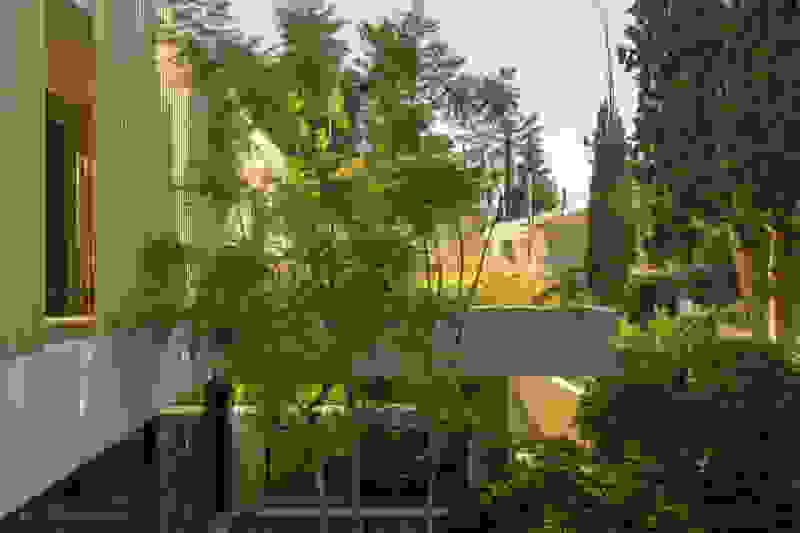
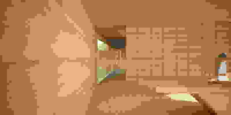
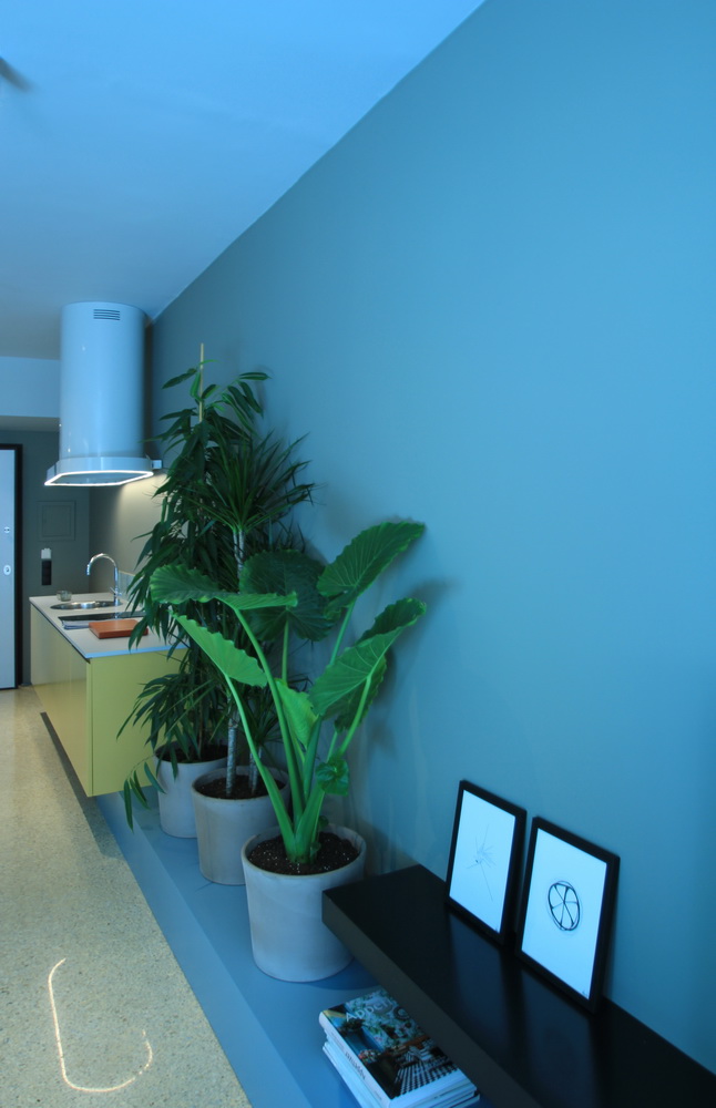
The backyard is a central element of both typologies and plays the role of a hidden garden with prickly pears, aloes and agaves, where the resident can be protected from the north wind, while having maximum privacy.

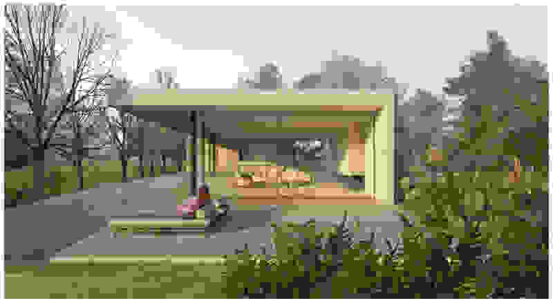
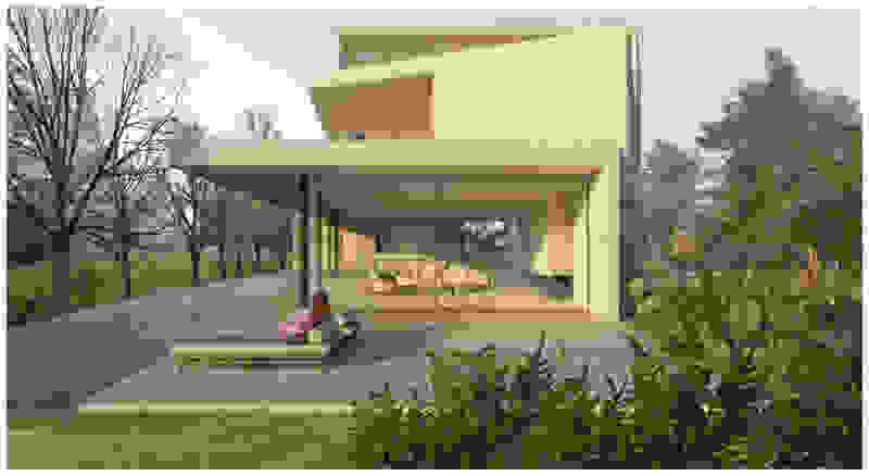
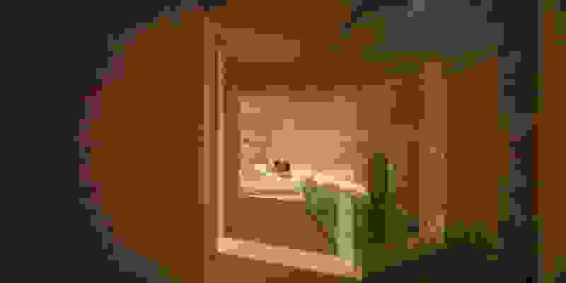
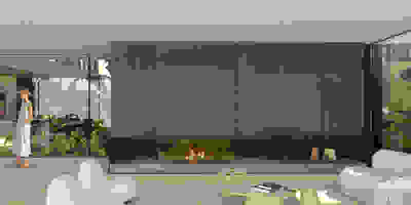
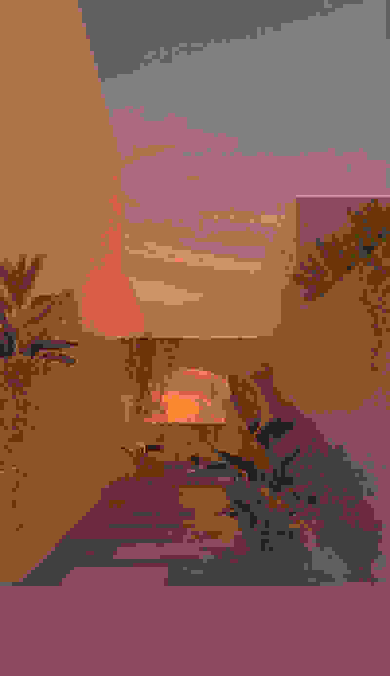
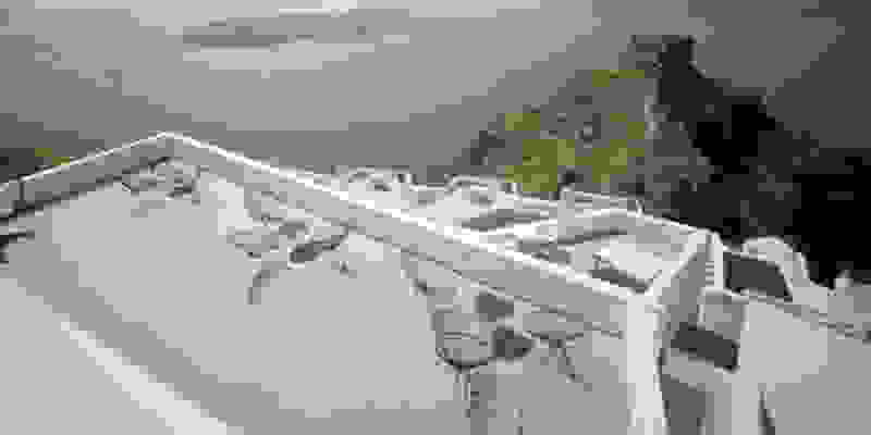
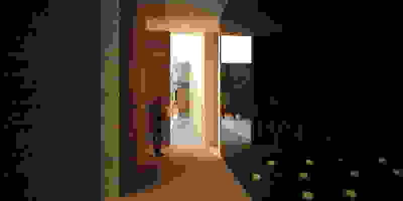
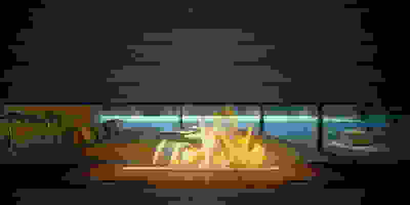
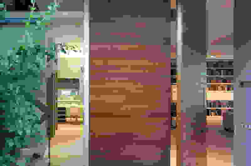
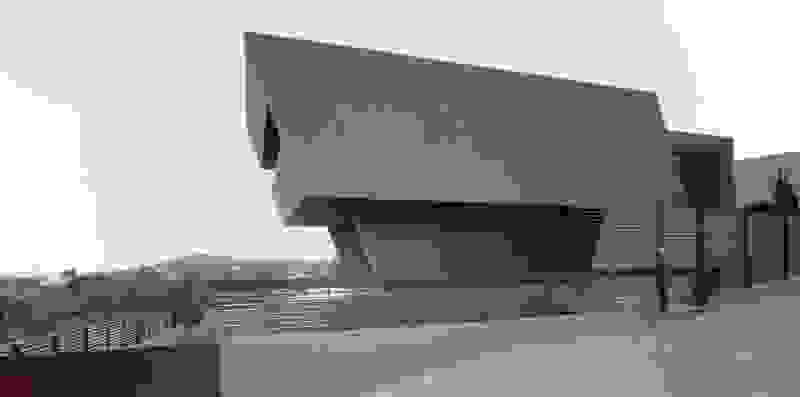
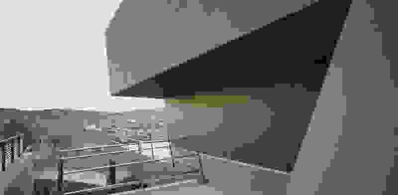
Οn the beach front, the Sand Dune Villas claim a special place in the landscape. They depart from the discreet, “earthy” architecture of the rest of the rooms and stand out more like cabanas upon the beach. Given large autonomous courtyards, you cross your personal garden to reach your door. Their architecture is set to create memorable experiences: Eating in the sunken courtyard with a pool engulfing you, like being on a yacht. Having a shaded yard with aromatic plants that you touch with your fingertips when immersed in the bathtub. Facing the fire on cool days as you ascend the last steps before entering the living room. To be covered with a protruding roof, sharp at its perimeter like obsidian, the glass-like volcanic rock from which the perlite derives from. Smelling the wood on all the walls and having the curtain move from the wind –sensing the summer itself on the beach…

Reflection House

Quite expectantly, from this strongly sloped plot perched on the mountain side, this house would have impressive views towards the city. What was not foreseen was how this view would shape the house itself. How that is we would allow its design to be influenced by this view, instead of parachuting a well proportioned, autonomous building/object that benefited from a good view. It is with this in mind, that we proposed an “elevated platform” on the ground floor –upon it a large balcony, plants, the living room, the dining room, the kitchen and the pool are to be found. The platform forms the base of sight and only the two side walls insulating the neighbors, frame the view -however, the distance between them is such that they tend to hide in the limits of peripheral vision: In the sixteen meters span no column interrupts this view and only an unfolding of the glass facade shapes the interior space. This platform defines quite literally at its shadow the rest of the house, with the bedrooms below, offered access to the garden and one additional storey bellow, all ancillary functions.

Hideaway Pool Suites, Canaves Oia Epitome

In Santorini there is one famous sunset location surpassing all other and that is Oia. More specifically, at the western side of this traditional village, crowds gather every evening to witness this event. They have moved away from the Caldera that focuses on the volcano and they are facing the Aegean, Riva (the ending of Thirasia island at the background) and in the distance (if the atmosphere is clear) island Ios. It is this sunset that is indeed perfectly framed by the Canaves Oia Epitome as it is positioned lower than the main settlement of Oia, on our downhill route to Amoudi beach.


The infinity pool with the pergola overlooks the sunset

Although built in two consecutive phases, Epitome represented from early on a shift in relation to all the other accommodations of the Canaves company that were located at the Caldera: instead of the white plastered aesthetic, it had chosen stone walls and natural materials. After all, the conditions of this plot were different -it had a large surface area, a vehicular road on one side and almost no neighboring buildings. So instead of the cramped plots in Caldera, with its irregular properties on vertiginous slopes, in Epitome extreme privacy is offered by extending parallel stone walls on the East-West axis. This organizing principle was set into place even from the first, western, phase of the hotel, one that was completed by K-Studio in 2018. We decided to retain this repetition of linear elements as the connecting element between the second phase we designed to the east, behind and higher than the first phase that was already completed further west.


The rooms we designed, the Hideaway Pool Suites, retain elements in common with the first phase of the hotel, in the extensive use of local stone and in the color palette of fabrics, woods and marbles. As one arrives at Epitome and starts walking in the zone that joins the two phases of the hotel, he is walking in an oasis with lush vegetation and sounds of birds. From there the Hideaway Pool Suites remain almost invisible –their retreat into a stepped section justifies their name. In addition, the rooms of the new wing, adapted to the relief of the ground, are mostly subterranean with their planted roofs forming gardens. We didn’t apply the familiar external vault, the architectural icon of Santorini -and we had the same inclination in other hotels we designed in the island such as Santorinini Grace (2010) and Nous (2022). For us the connection with the local architecture is made with the materials, with arches in the free standing stone walls that precede the rooms and with vaults that shape them internally. With its planted roofs, the Epitome extension remains “invisible” both when the visitor enters and from above. The variety in the planting of the roofs underlines the landscape design of the hotel -the rich selection of plants sets Epitome apart in the arid landscape of the island. Segments of this new planted landscape have also been highlighted in the rooms: planted gardens form the backdrop of several rooms and large glazed surfaces unify them with the bathrooms. It is in this zone that double circular mirrors infront of glass, upgrade the deeper end of a room, reflecting the greatest asset of the plot: the sunset and the view towards Thirasia.

We designed the common areas around an elevated pool with trees and platforms in the water. Centrally placed, the building that will house the wellness areas is covered by a large swimming pool paved with tiles in dark shades matching the stone walls. The resulting shade of the water resembles that of the sea and the dark tonality of the tile blurs the boundaries between deep and shallow areas of the pool. Marble stepping stones start from the back area of ​​the sunbeds and end on three platforms towards West. Moving these platforms to the center of the pool (instead of its edge), also frees up a zone on the axis of which a more distant temple-like platform is framed, one marked by a wooden canopy. This is a almost ephemeral structure conveys a festive use –opposite it diagonally and in recess, we designed a much larger pergola that houses the restaurant space. Instead of the typology of a roof on stone columns, we have chosen the logic of a light construction that is realized with a metal structural frame its covered in wood. Its chestnut finish not only matches the furniture and the neighboring deck at the pool bar, but also maintains color affinities with the beige stone surfaces that occasionally appear (in a kind of mosaic) in the perimeter stonework. In the interior layout of the restaurant we organized “neighborhoods” of tables, interspersed with planting areas: the metal planters we designed include a floor air conditioner or form seating corners.

The restaurant’s pergola is cantilevered on its three visible sides –its eaves form a strong horizontal line of wood, a modern gesture in contrast to the timeless stone walls around it. And we wanted to combine the familiar typology of pool platforms with what we believe distinguishes Epitome, the planting: that is, to give the character of a garden which is made up of the scattered new trees, metal planters and perimeter planting. Overall, in the Epitome we designed, the landscape takes center stage against the background of local stone masonry walls -it dominates as a wild grass lawn on the roofs of the rooms and, as an acupuncture, with trees at the pool garden.